It’s not unusual for companies to redesign all or some elements of their software products over time to refresh the UI and introduce new features.
But these changes are not always met with open arms. Cases in point are the recent TikTok-style and Messenger or Twitter-like changes that Spotify and Discord respectively made to the UI.
Most Spotify and Discord users weren’t so happy with these UI changes, and so are multiple Microsoft Outlook users following the relocation of the navigation toolbar from the bottom to the side of the UI.
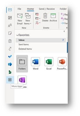
With the new Outlook, you’ll now find shortcuts to Mail, Calendar, People, To Do, Word, Excel and other apps to the leftmost part of the open window.
The changes first arrived on Mac before later making their way to Windows Insiders not long after. But in recent times, more Outlook users have been noticing the new location of the navigation toolbar.
It’s human nature to be afraid of change, which partly explains the outrage. But for multiple Outlook users, this is just an unnecessary change that no one asked for.
Understandably, they now want Microsoft to revert the change. Or at least let them switch to the classic Outlook UI. But before we delve into how users have reacted to this change, let’s try and understand why Microsoft did it.
Why Microsoft relocated Outlook Navigation toolbar
As noted at the beginning, companies often redesign their products to overhaul the existing UI, add new features as well as get rid of old elements that no longer align with their vision.
It started back in 2020 when Microsoft announced a new vision meant to turn Outlook into a personal organizer that will transform workplace communications and time management.
This vision was meant to bring together all Outlook clients to ensure consistency across multiple platforms and deeper connection with the entire Office 365 experience.
If anything, this is what Microsoft aims to achieve with not only the redesign of Outlook, but also other Microsoft 365 apps such as Teams and Excel.
The new Outlook for Windows is “designed to bring consistency across our Windows and web codebases to help you be more productive and stay in control of your inbox,” Microsoft noted during the announcement.
And indeed, with the navigation toolbar appearing on the left of the UI on Mac and web versions of Outlook, it was only a matter of time before the Windows version got this update.
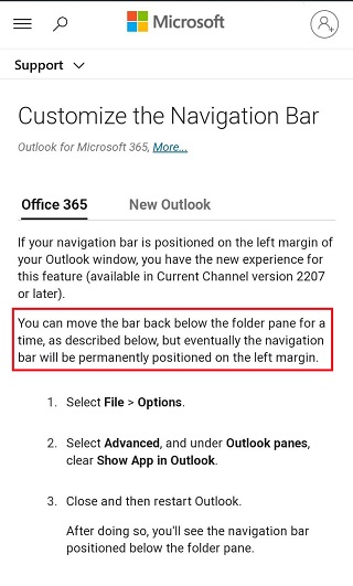
Here’s what part of a support document says about the new changes in Outlook for Windows:
This update is a step towards a consistent experience across apps like Outlook, Teams, and Office.com. From the new location, you can switch apps and it creates room in the UI for more apps to integrate with Outlook. You can easily launch popular apps like To Do, Yammer, Bookings, Word, Excel, and PowerPoint without leaving Outlook, with more to come. Currently, only Microsoft apps such as Yammer, To Do and Bookings are available to users.
While Microsoft believes the new navigation toolbar location makes it easy to find and use apps in addition to Outlook’s core modules, not everyone is in agreement.
How users reacted to the change
As the rollout of the new experience expands to more Outlook users, some have expressed their concerns about the navigation toolbar in multiple forums with the hope that Microsoft reverts the changes.
Having gotten used to a bottom navigation bar, it’s understandable that this sudden change is causing unrest among Outlook users, who argue that the new UI is a waste of space, especially since the bottom is still empty.
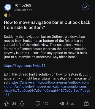
Navigation Bar after the update moved to the left, and i can not change it back to the bottom, as Show Apps in Outlook option does not work at all (pelase see the screenshots attached). The new feature and design makes the work with emails absolutely inconvinient and horrible. Is there any possiblity to move the navigation bar to the bottom in this case?
Source
This makes absolutely NO sense at all. Recently clicked the coming soon button to on, then spent the next hour trying to figure out how to move/adjust the navigation pane. It gets moved to the far left, with a bunch of wasted space under it. And no options to move it, just stuck there.
Is UI design team now smoking weed on the job? Drinking maybe? Both? I can’t even comprehend the meeting where someone said this is a great idea, and team all nodded in agreement. At LEAST give us the option to move it around?
Source
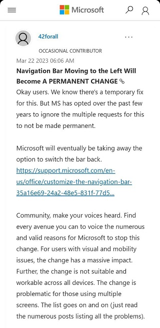
Again, change isn’t everyone’s favorite, which explains why the first reaction from most people was to find ways to disable the new UI. Unfortunately, Microsoft has confirmed that this workaround will eventually be disabled.
As I pen this, the new Outlook for Windows is now the new norm. The navigation pane now permanently lives on the leftmost side of the UI with no way to revert to the classic view.
What you can do to convince Microsoft to revert
Despite the massive outrage that has been ongoing for months, Microsoft has seemingly given users a deaf ear and moved on with its plans to roll out the changes widely.
Of course, the company has reasons to push forward with this change. After all, no one wants an inconsistent app across various platforms, especially in terms of design and other UI elements. And I totally agree with them.
With the company also looking to streamline its Office 365 experience — which Outlook is a major part of — having a consistent UI across all products is something I fully subscribe to.

But there are always ways users can make big companies listen to their grievances. And one such way is through providing feedback.
Some might argue that Microsoft has already ignored plenty of feedback over the past several months, so nothing much could twist their arm. However, with more people sharing the same feedback, there’ll always be a chance.
For instance, Discord recently reverted the option to swipe left to reply to messages following an outrage from disgruntled users who preferred accessing the members list with this gesture.
Similarly, Outlook users who are unconvinced by the location of the navigation bar should keep sending feedback to make it clear that they want the old UI back. Or at least an option to switch between the new and classic UI.
I am for the latter, which is why I have already submitted my feedback. And I recommend you do the same to make your voice heard.
Using avenues like Change.org to amplify these grievances is also an option, but there’s no guarantee that Microsoft will listen and revert the changes.
Luckily, the new Outlook for Windows is still a product in development, with several other gaps to be filled in the course of the year, among them support for multi-account and offline mode, so there’s still some hope.
Looking at the massive outrage regarding this change, it will be interesting to see if Microsoft indeed listens and reverts the location of the Outlook navigation bar to the bottom or provides a toggle to switch to the classic UI.
Only time will tell, but you can chime in right now with your views via the comments section or the poll below and let us know what you think about this change.
PiunikaWeb started as purely an investigative tech journalism website with main focus on ‘breaking’ or ‘exclusive’ news. In no time, our stories got picked up by the likes of Forbes, Foxnews, Gizmodo, TechCrunch, Engadget, The Verge, Macrumors, and many others. Want to know more about us? Head here.

Hillary Keverenge
2484 Posts
Tech has been my playground for over a decade. While the Android journey began early, it truly took flight with the revolutionary Lollipop update. Since then, it's been a parade of Android devices (with a sprinkle of iOS), culminating in a mostly happy marriage with Google's smart home ecosystem. Expect insightful articles and explorations of the ever-evolving world of Android and Google products coupled with occasional rants on the Nest smart home ecosystem.
Next article View Article