YouTube is a platform that’s always evolving, making some things better, some worse, and introducing new features. The video-streaming service has been playing around with its UI on various platforms for the past few months.
They’ve recently made significant changes to their desktop UI as well as the mobile application. Unfortunately, a lot of these changes were not received well by the community.
And now, the team is rolling out another update that changes how Playlists are displayed on the mobile application.
YouTube new Playlists UI criticized
YouTube users are disappointed (1,2,3,4,5) by the new Playlists UI on mobile as it’s inconvenient or unintuitive. The previous ‘vertical list’ format of Playlists in the Library tab was changed to a horizontally scrolling list.
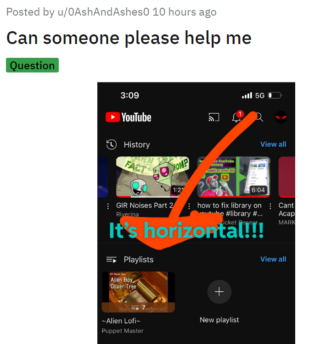
The Playlists are now displayed just like the videos in your watch history. To find your favorite playlists, you now have to constantly scroll in a horizontal direction.
Expectedly, users are disliking the change as it encourages unnecessary scrolling and hurts easy-of-use. Some have taken to social media platforms like Twitter and Reddit to complain about the same.
The playlists are displayed horizontally. That may look better, but I have to scroll horizontally which is worse and harder to use one handed, then vertically.
Source
I hate the new mobile update trying to go to my playlist has become even more inconvenient than it already was
Source
Several users are annoyed by the recent UI change and are asking the developers to revert the changes or add a toggle to switch layouts. Do note that the update hasn’t been rolled out to everyone yet.
Potential workaround
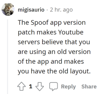
Unfortunately, as the update is so new, there isn’t a proper fix for it even on modded clients like YouTube Revanced. This means that users may have to wait indefinitely for a toggle to switch between layouts.
However, a user recommends using the ‘Spoof app version patch’ on Revanced to make YouTube servers believe that you’re running an older version. If you can’t stand the new UI, this is currently the only solution.
YouTube is yet to comment on the matter and it’s highly unlikely if they ever will. Generally, UI changes tend to stick around despite backlash from users.
We hope the YouTube team looks into the situation, takes feedback into consideration, and makes decisions accordingly. We’ll keep an eye on this matter and update this story to reflect noteworthy developments.
Note: You can also checkout our YouTube bugs and issues tracker.
PiunikaWeb started as purely an investigative tech journalism website with main focus on ‘breaking’ or ‘exclusive’ news. In no time, our stories got picked up by the likes of Forbes, Foxnews, Gizmodo, TechCrunch, Engadget, The Verge, Macrumors, and many others. Want to know more about us? Head here.
Tags
YouTube app playlist ui YouTube app playlists change YouTube new playlists change YouTube new Playlists UI YouTube new Playlists UI on mobile YouTube Playlists change YouTube Playlists mobile
Jaspreet Singh
119 Posts
I have always been passionate about smartphones, cameras, computers and basically everything technology related. Writing content for PW allows me to express that nerd inside me and talk about things i love.
Next article View Article