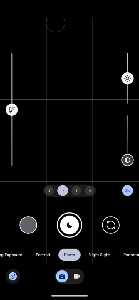
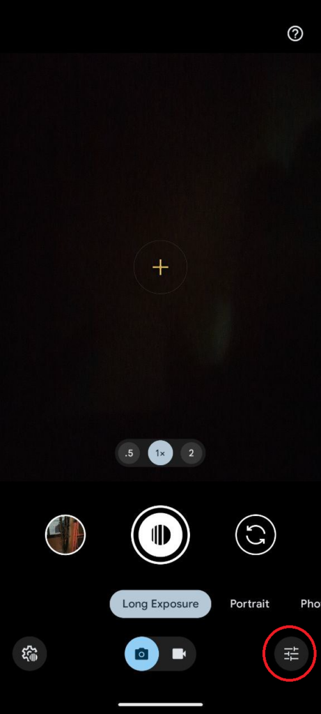
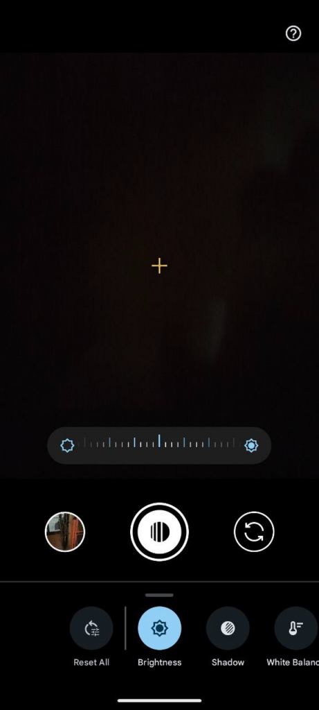
The December update for Google’s Pixel Camera app, version 9.2, brought a fresh coat of paint and some revamped controls. While the new design boasts streamlined accessibility and a sleeker look, not all Pixel users are singing its praises. One of the biggest changes sits right in the viewfinder: gone are the dedicated dials for adjusting brightness, shadow, and white balance that hugged the left and right sides. Instead, users are now greeted by a compact carousel tucked away in the bottom-right corner.
This shift towards a single, consolidated menu hasn’t gone down smoothly with everyone. Seasoned Pixel enthusiasts accustomed to the quick thumb tweaks of the old system find the new carousel cumbersome and less precise. “I acknowledge that maybe most people don’t/didn’t actually use these, but I liked that these sliders were persistently present in the viewfinder and easy to casually adjust at any time,” lamented one user on Google’s Pixel subreddit. Others voiced concerns about the carousel’s size and responsiveness, but some think it’s a good change for one-handed use especially given the size of Pixel phones.
![]()
One of the main points of contention revolves around the accessibility and ease of use of the new carousel system. Users accustomed to the traditional placement of controls along the edges of the camera viewfinder argue that the shift disrupts muscle memory and adds an unnecessary layer of complexity to adjusting settings on the fly. The bottom-right corner placement, some contend, requires additional finger movement, making quick adjustments less intuitive. Click/tap on the images below to view the old vs new Pixel Camera UI.
This backlash isn’t entirely unexpected. In any software update, catering to all user preferences is a tightrope walk. While the streamlined carousel might appeal to casual users and newcomers, it also risks alienating the core base of Pixel camera enthusiasts who value efficiency and customization.
Google, for its part, remains tight-lipped about the possibility of addressing user concerns. Whether the company will listen to the growing chorus of discontent and offer a classic control option remains to be seen. Until then, the debate between carousel and left/right brightness, shadow and white balance sliders is set to continue, leaving Pixel users caught in the middle – some adapting to the new, others reminiscing about the old UI.


