Update 12/4/2024 07:23 pm (IST): Ditching the recent two-line design, Google Messages beta (version messages.android_20240404_01_RCO0.phone.open_beta_dynamic) brings back the familiar single-line input field. This new design streamlines the typing experience by removing extra space and only showing the attachment button for adding media.
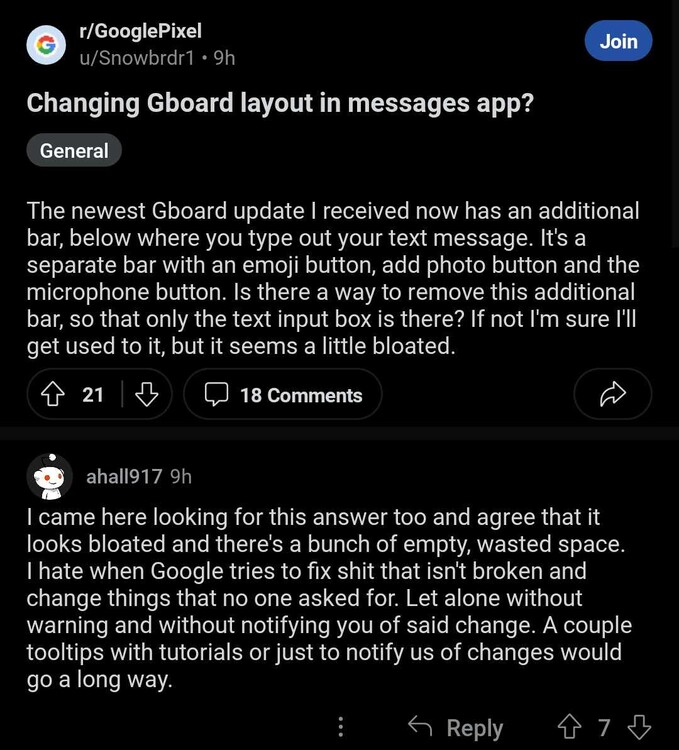
Since last year, Google has been working on revamping its Messages app, filling it with new features and options to attract users from other much more popular messaging services. Most of the tweaks have been well received, as they have been new functions, but a recent one is raising some criticism: the latest text input bar redesign that is being deployed more broadly.
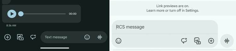
In the classic design, the text input bar of Google Messages was pill-shaped where both the text area and the additional options occupied only one ‘line’. But now, the new design doubles the size of the bar, showing a rectangular shape where the text area is at the top and the additional options at the bottom. The new look seems to have a lot of wasted space, which is especially noticeable when seeing the distance between the ’emoji’ button and the buttons for the rest of the options, although some suggest that this space could be occupied in the future with new functions.
Normally, design tweaks tend to be the most difficult to accept, especially when users have been accustomed to a particular look for a long time. Also, backlash can be greater than normal when the new design appears to be a step backwards compared to the previous one, which seems to be happening in this case. Some of the people who have received the update do not understand the reason for the change, since it does not seem to bring anything positive.
This is not the first recent redesign of the Google Messages text input bar
It’s worth noting that this is not the first redesign that the Google Messages text input bar has received lately. However, the previous one respected the classic ‘one line’ format, so it was not so shocking to users since it seemed more of an aesthetic refinement than something radical, as the screenshot below shows:
Considering that we have seen at least a couple of redesigns in a short period of time, it is possible that Google is A/B testing several design changes, so the latest UI tweak could also be discarded at any time in favor of another look. Be that as it may, it seems that the company is determined to make Google Messages a service as or more attractive than the competition, and this ranges from adding several features to finding the perfect UI.

Jean Leon
1613 Posts
A tech enthusiast since ever. I like to always be up to date on the latest news in the industry and write about it. Twitter: @jean_ERdC

Next article View Article