


Google’s app on Android is no stranger to interface tweaks, and it seems the search giant is once again revisiting the idea of a bottom-placed search bar. This design choice has a rocky history within the Android version of the app, with initial tests as far back as 2021 and a more recent flirtation in late 2023. But now, it’s back – this time with a Material 3 design twist, as highlighted by 9to5Google.
The latest redesign aims to modernize the Google app’s look and feel. It introduces Material 3 elements, notably the pill-shaped tab indicator that iOS users have already enjoyed. This change alone promises to boost consistency across the app on different platforms. Here’s a screenshot shared by a user on X:
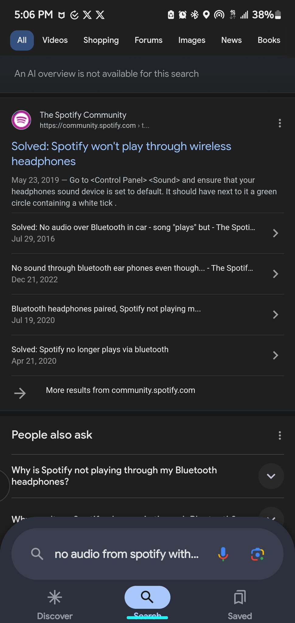
Notably, the search field, previously a fixture at the top of the Discover feed, now gets promoted to occupy a prominent position above the bottom bar. Unlike the older iterations, this search field remains persistently visible even on the search results page.
The redesign has a fresh aesthetic and could improve one-handed usability on larger phones. The trade-off is a slight decrease in usable screen space for search results and the search field’s somewhat oversized appearance. Additionally, ditching Dynamic Color in favor of a standard blue tint might feel less integrated with the rest of the phone’s theme.
Nevertheless, apart from the bottom search bar placement, we also spotted Google testing a new Gemini toggle in the app. The toggle was first added to the Google app on iOS when the company rolled out a dedicated Gemini app for Android.

Dwayne Cubbins
1080 Posts
My fascination with Android phones began the moment I got my hands on one. Since then, I've been on a journey to decode the ever-evolving tech landscape, fueled by a passion for both the "how" and the "why." Since 2018, I've been crafting content that empowers users and demystifies the tech world. From in-depth how-to guides that unlock your phone's potential to breaking news based on original research, I strive to make tech accessible and engaging.