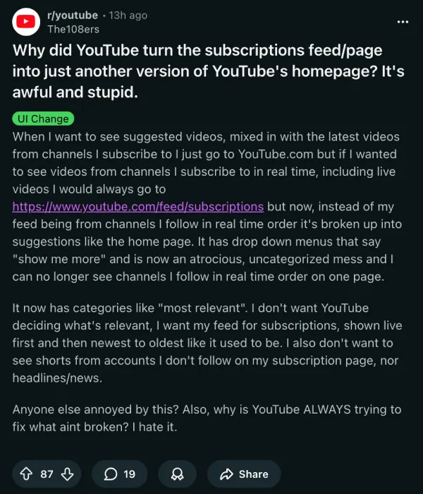
YouTube is now putting a Most relevant block right at the top of the Subscriptions feed for some users, so the page you open to catch new uploads can start with recommendations instead. If you use youtube.com/feed/subscriptions mainly to keep up in simple newest-first order, that change is already getting a lot of pushback.
The complaint is pretty straightforward: people do not want the Subscriptions page turning into a second Home page. In one thread, users say they are seeing dropdown-style sections, suggestions mixed into the feed, and a general loss of that clean “everything from channels I follow” feel.
This also lands right after YouTube effectively shut the door on the old flow=2 workaround that many used to force the classic list layout. As we covered earlier, the list view toggle started disappearing for some, and ?flow=2 stopped doing anything, leaving users stuck with the newer grid-style Subscriptions view.
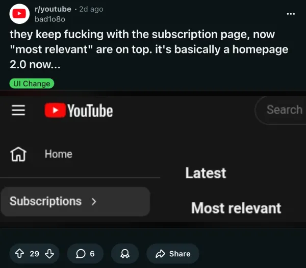
So the timing stings a bit. First the list layout and the flow=2 trick go away, and now there’s a Most relevant section taking the top slot, which pushes the actual latest uploads further down the page. This is why some users feel that the Subscriptions page is starting to feel like “homepage 2.0.”
Some users are also sharing quick workarounds, mostly through ad-block filters. One example people say works is targeting the “Most relevant” section renderer directly, like: youtube.com##ytd-rich-section-renderer:has-text(Most relevant).
That filter is being passed around in comments and also via uBlock Origin-focused threads, plus a couple of posts on X like this and this.
If you’re trying to fix the layout problem too (the forced grid-style Subscriptions view), there’s also a more involved workaround floating around. Reddit user GoingPostal13 shared a Tampermonkey script that attempts to convert the Subscriptions grid into something closer to a list view again, with multiple updated versions and links (Pastebin and a GreasyFork listing) in the same comment.
To be fair, YouTube has been testing subscription sorting for a while, including experiments that rearrange what you see in subscription feeds. There have even been earlier reports of a Most relevant carousel showing up in the Subscriptions feed on mobile. Still, this change now seems to be hitting more people.
For now, if you rely on the subscriptions page to track uploads in order, your best bet is either to scroll past “Most relevant” or try one of the community filters at your own risk. As always with YouTube UI changes, nothing feels permanent until it is.


Dwayne Cubbins
2677 Posts
I cover fast-moving stories across apps, online platforms, and everyday tech — phones, wearables, consoles, and whatever else people are fighting with this week. Bugs, rollouts, scams, policy enforcement, and the occasional internet-culture rabbit hole are all fair game. My goal is simple — make confusing tech news readable. When I'm not working, I'm working out or chilling with my dog. Got a tip? You can find me on X @dcubbins.
Next article View Article