


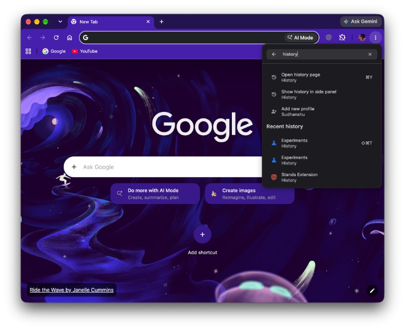
The search box in Chrome's redesigned block-style 3-dot menu is finally functional in Canary. Typing in the box shows not only actions related to the menu itself, but also results from your bookmarks and recent history: https://t.co/doZETxJ7qK pic.twitter.com/HH5TBhxnHG
— Leopeva64 (@Leopeva64) November 3, 2026
Google Chrome is vastly improving the functionality of its three-dot menu. The changes are currently available for some users in the latest version of Chrome Canary.
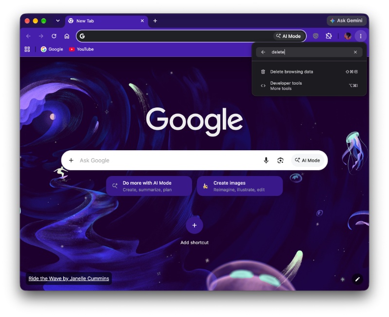
The primary change is the search box, which sits at the top of the menu. It remains visible even when you scroll through the rest of the three-dot menu. The feature is actually functional in the latest version of Chrome Canary, and it does return some results when you type something in the search box.
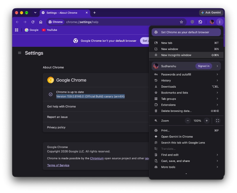
To put this to the test, I updated to the latest version of Chrome Canary, and that’s version 159.0.8146.0 on macOS. Initially, I was unable to find any changes to the three-dot menu. I still saw the old interface, and there was no search bar.
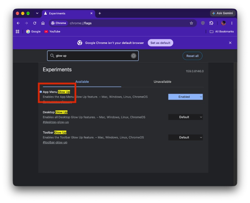
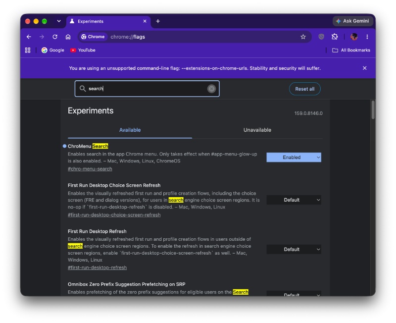
To use this feature on Chrome Canary, there are two specific flags that you need to enable. The first one is “App Menu Glow up,” and the second one’s called “ChroMenu Search.” Do note that the first flag has to be enabled if you want to try out the search bar.
Sure enough, the updated three-dot menu showed up after restarting the browser. There are actually multiple changes here.
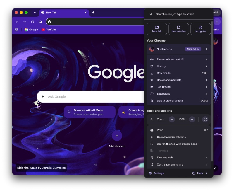
When you use the search bar, you can also obtain results for previously saved and visited pages. Furthermore, you can use the queries to bring up options such as opening Gemini in Chrome, Passwords, Autofill, History, and more. Google also separates these results into separate categories, making it easier to navigate through.
That’s not all. Google has also moved the New Tab, New Window, and Incognito options to the top. Other options now sit inside rounded corners. There are various subtle changes to the three-dot menu, such as the placement of some features.
The whole redesign isn’t exactly new. Chrome has been testing various gradual changes for a while now, buried behind flags. However, the search bar is the first meaningful functional addition in a while.
It’s worth noting that Google hasn’t officially announced this feature, so there’s no ETA for a stable release. It’s just an experiment on some versions of Chrome Canary for now.
The additions were initially demonstrated by @Leopova64 through a post on X. We have attached the post below, and it also contains relevant media that explains the changes.

We stand out from the tech-media crowd because we break news stories; we mainly bring you stuff that you won’t find anywhere in the mainstream tech media. Our stories have been picked up by some of the world’s most popular websites and media outlets—more info is available here.

Sudhanshu K
368 Posts
I have been a consumer technology enthusiast for over 5 years. Thanks to my experience in software beta testing and product reviews, I've understood and learnt a lot about what bugs and issues bother people, and I spend time trying to simplify their solutions. I cover smartphones, software, social media, apps, AI, and most consumer tech gadgets. Actively pursuing a Computer Science bachelor’s degree. I'm mostly active on Twitter/X (@TechWhirlUlt), drop a DM or tag me if you want to share info or connect!