





![The three-dot menu on Chrome is getting a design update [U: Key tab options get distinct and larger buttons at the top]](https://piunikaweb.com/wp-content/uploads/2026/07/chrome-logo-gradient-dark-background.webp "The three-dot menu on Chrome is getting a design update [U: Key tab options get distinct and larger buttons at the top]")
The "New tab", "New window", and "Incognito" list entries will be replaced with a row of block-style buttons in Chrome's redesigned 3-dot menu. There will also be a row of pill-shaped buttons at the bottom for options like "Settings" or "Help". Here's what they look like: https://t.co/kyzXGoY0rJ pic.twitter.com/crmMFIxaWQ
— Leopeva64 (@Leopeva64) August 28, 2026
Update 28/08/26 – 09:50 pm (IST): On Chrome Canary, the “New tab,” “New window,” and “Incognito” options will get separate large-size buttons at the top, which are distinctly in an area at the top of the menu options. Some buttons like Settings, Help, and Exit have also been shifted, with pill-shaped buttons at the bottom/end of the menu.
At the time of writing, I still don’t see the menu segmentation update on the latest version of Chrome Canary on macOS. So, you can view the reference images below from the original source of this information.
Original article published on August 25, 2026, follows:
The familiar three-dot menu that expands to reveal various options for Chrome (desktop) is getting an update soon. It includes a refreshed UI with rounded corners, neat segmentation of the settings, and spacing adjustments to make the UI look more modern.
This was initially spotted by @Leopeva64 on X, who has been posting the progression of the feature for a while now.
Google has added more entries to the redesigned 3-dot menu, so we can get a better look at this block-style layout. Here is how it looks in the latest Chrome Canary build: https://t.co/jOmJgjate4 pic.twitter.com/edv8UWuqTz
— Leopeva64 (@Leopeva64) August 22, 2026
The folks at Windows Report have also managed to find this option in a Chrome Canary build; credit goes to them for the comparison image. This design update is part of Google’s ‘GlowUp’ project for 2026, which aims to modernize the UI elements in the browser.
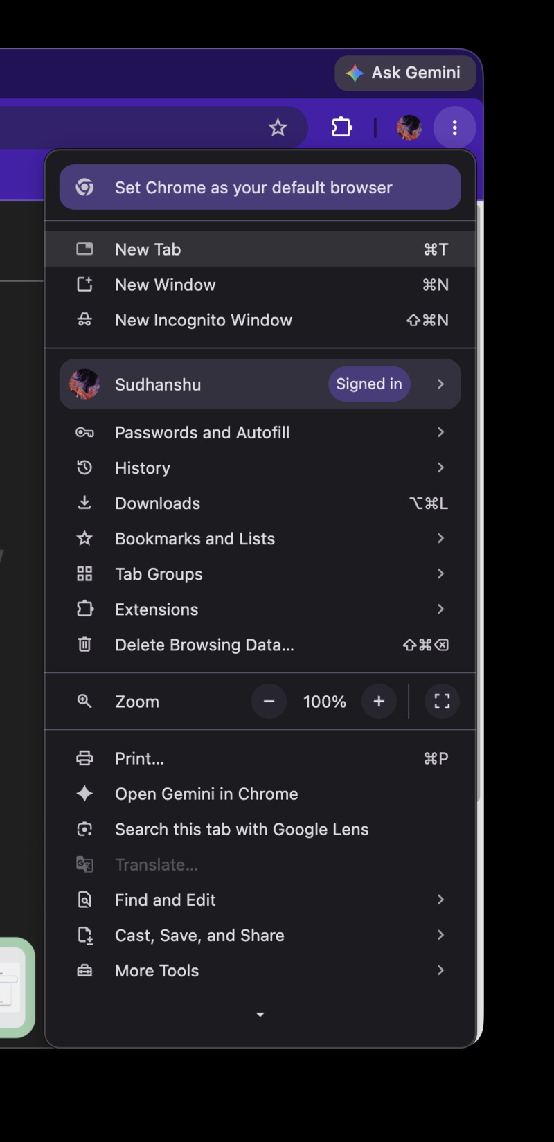
If you open your Chrome browser and click on the menu, you’ll see what’s shown in the screenshot below. That’s what Google is changing.
The image attached below shows the updated UI. Three important functions- New tab, New window, and Incognito are at the very top, and they’re the first three options in the menu. Then, it’s neatly divided into a section called ‘Your Chrome,’ which also carries the browser’s color theme. This section contains the Password manager, Downloads, History, and more.
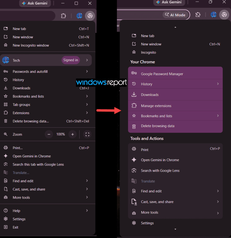
The final segment is called “Tools and actions,” consisting of Print, Gemini in Chrome, and other related settings. Some options have been shuffled around too.
You’ll also notice that the menu is now more compact, and the list isn’t as long. That’s because the other settings/options have been moved into “More tools,” which is the final option in the menu and is located at the bottom. Options like “Find and edit” also consist of further sub-menu expansions for more options.
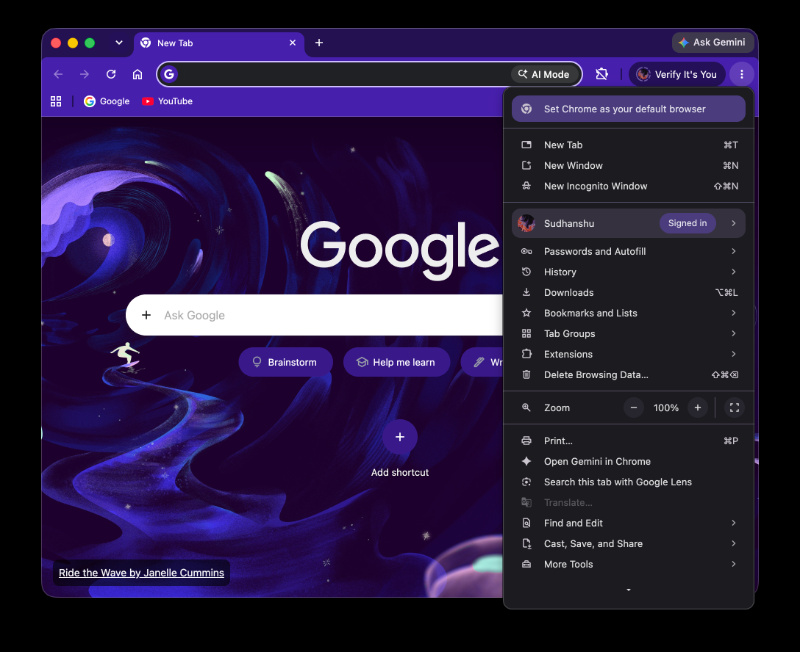
Curious about these changes, I’ve updated to the latest version of Chrome Canary on my MacBook. However, the test hasn’t shown up so far; Google is probably rolling it out to limited batches. It’s worth noting that the main sources we’ve used for this info show these changes on Windows systems.
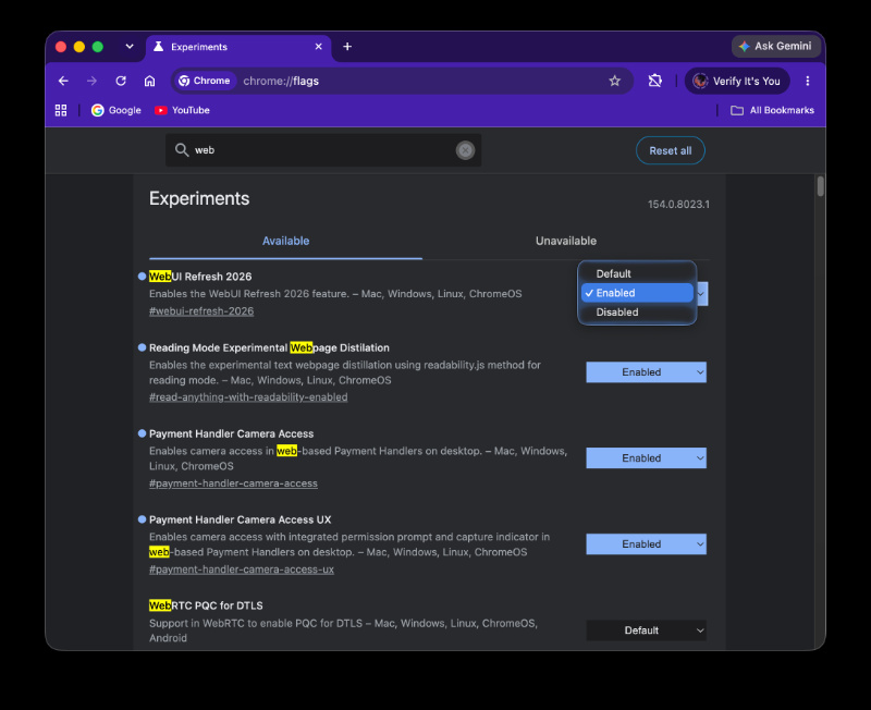
As far as I was able to observe, many Chrome-related changes hit the Windows Canary version much faster than the macOS one. Enabling the “WebUI Refresh 2026” toggle from Chrome Flags also doesn’t update the menu on my device.
It’s worth noting that Google hasn’t officially announced or confirmed any of these changes. Since this is still an early test for a limited batch, things could get more polished by the final release.
In other Chrome news, Google is bringing Gemini Enterprise directly into Chrome’s side panel. More on that here.

We stand out from the tech-media crowd because we break news stories; we mainly bring you stuff that you won’t find anywhere in the mainstream tech media. Our stories have been picked up by some of the world’s most popular websites and media outlets—more info is available here.

Sudhanshu K
284 Posts
I have been a consumer technology enthusiast for over 5 years. Thanks to my experience in software beta testing and product reviews, I've understood and learnt a lot about what bugs and issues bother people, and I spend time trying to simplify their solutions. I cover smartphones, software, social media, apps, AI, and most consumer tech gadgets. Actively pursuing a Computer Science bachelor’s degree. I'm mostly active on Twitter/X (@TechWhirlUlt), drop a DM or tag me if you want to share info or connect!
Next article View Article
AI Mode hits Chrome address bars in the UK following last month’s Gemini expansion
Last month, Google rolled out its Gemini integration in Chrome for users in the UK after a long delay. Now, the company is expanding its AI-powered search feature, dubbed...
Aug 26, 2026 2 Min Read