





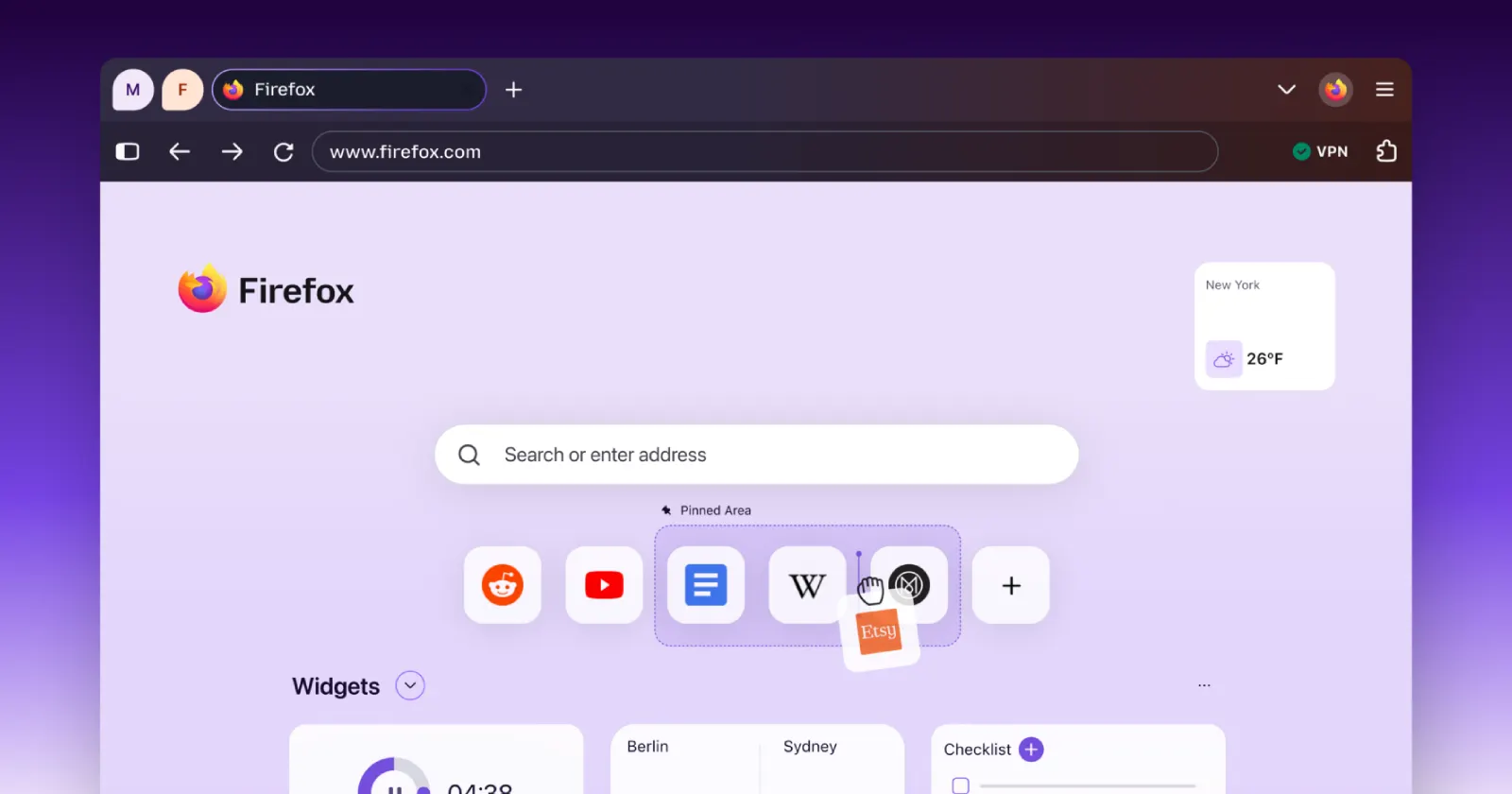
When Mozilla released the Firefox 157 update recently, the new Nova interface quickly got everyone talking. Visual updates often divide opinions, but this time, the criticism goes beyond personal preferences or complaints about rounded corners.
Many users, especially those with color vision deficiencies, soon noticed that the new design affected one of the browser’s most helpful features. Now, it is much harder to tell container tabs apart at a glance.
Before, container tabs had bright, easy-to-see color markers. With vertical tabs, a thick stripe made it clear which container you were using. Nova replaced this with a thin horizontal line and switched to softer pastel shades.
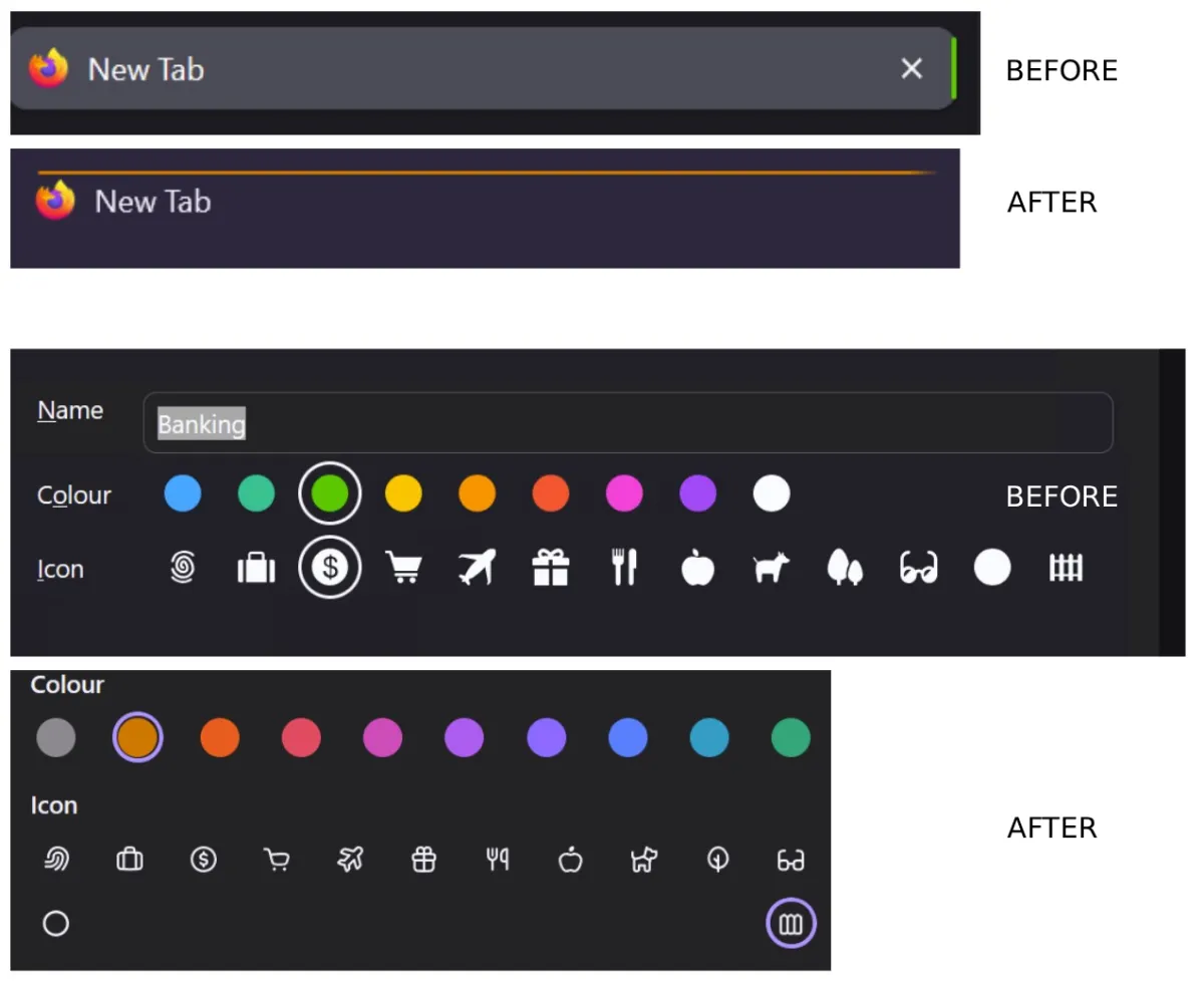
If you use containers to keep multiple work profiles separate from personal browsing, confusing one tab for another is a genuine headache. One user pointed out on Reddit that these subdued tones make it nearly impossible for color-blind individuals to tell blue from teal, or pink from purple.
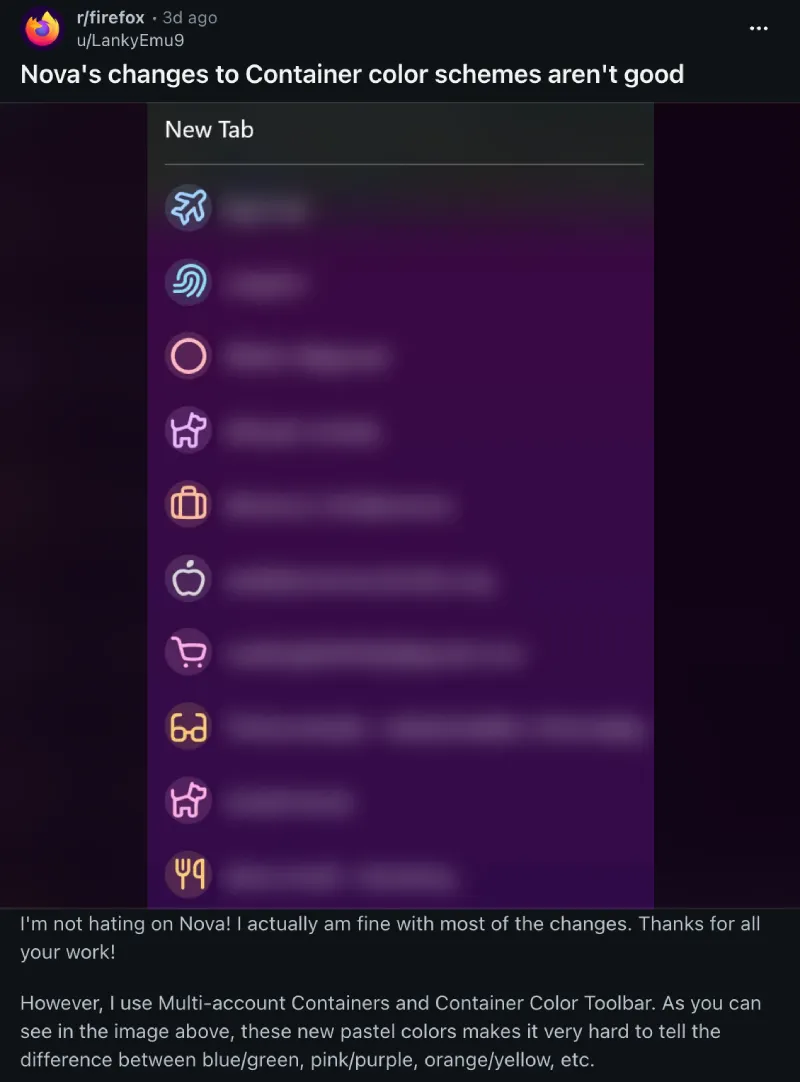
A frustrated user even filed a complaint on Bugzilla, asking for an urgent accessibility review. In the meantime, you can check out our guide to disable the new Nova interface. This workaround might not last long if Mozilla removes the underlying code in the future. Still, it’s a good option until the company fixes the accessibility issue with the new interface.
Speaking of which, a Mozilla employee stepped into the discussion on Reddit to reassure users that accessibility checks are an ongoing part of their development process.
The employee said the team cares a lot about accessibility and confirmed they are looking into the problem. They added, “Updating containers on vertical tabs is a priority for us, along with a few updates to themes”.
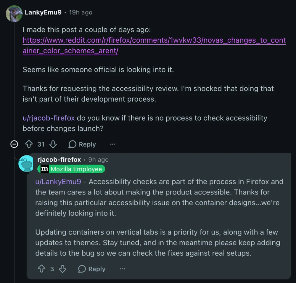
Another Mozilla staff member confirmed that the report is already being handled internally, so fixes can be tested with real user setups.
This is good news for power users who need high-contrast styles to find the right tabs without guessing.


Dwayne Cubbins
3080 Posts
I cover fast-moving stories across apps, online platforms, and everyday tech — phones, wearables, consoles, and whatever else people are fighting with this week. Bugs, rollouts, scams, policy enforcement, and the occasional internet-culture rabbit hole are all fair game. My goal is simple — make confusing tech news readable. When I'm not working, I'm working out or chilling with my dog. Got a tip? You can find me on X @dcubbins.