Google is testing a redesigned text-selection menu in Chrome that shows exactly what words you are interacting with. The new context menu pops up when you highlight text and right-click. It now includes a small preview snippet of your highlighted words right next to the action buttons. You will see these text previews sitting directly next to options like Copy, Print, Reading Mode, and Translate.
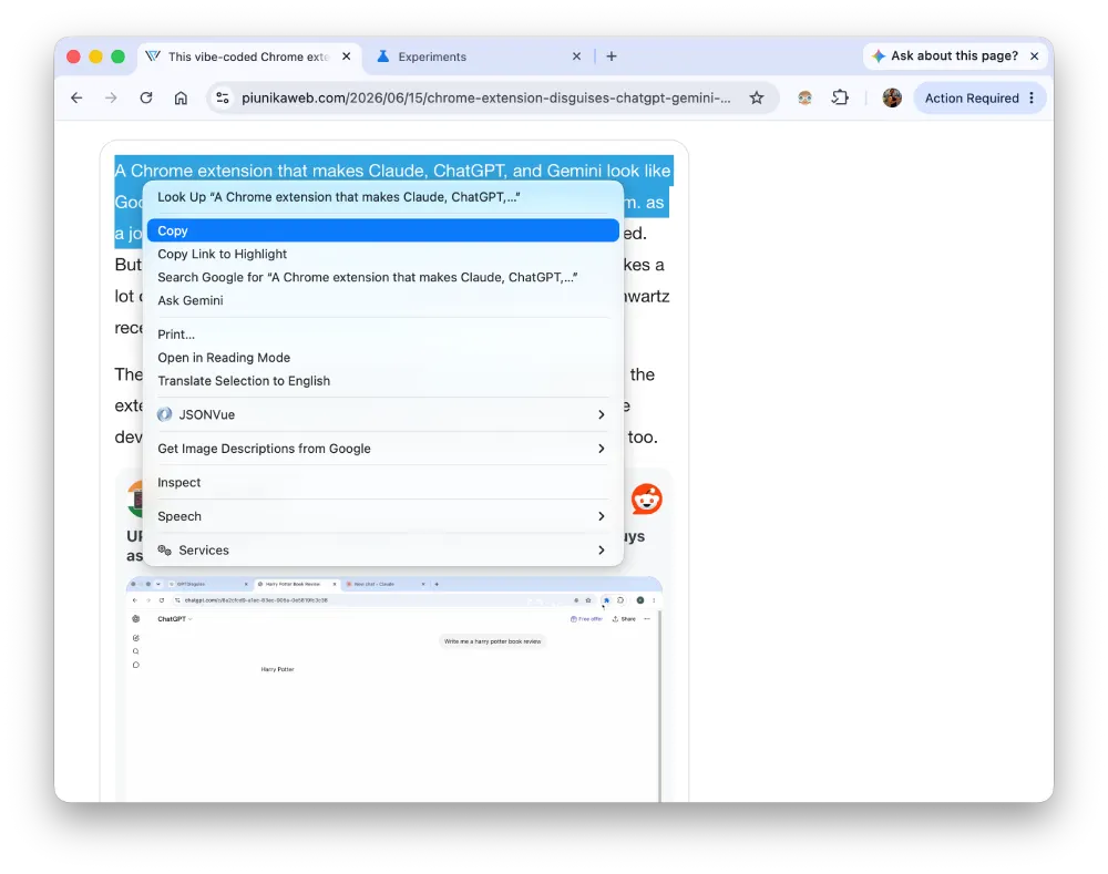
We’ve captured before/after screenshots for reference. Here’s what it looks like currently:
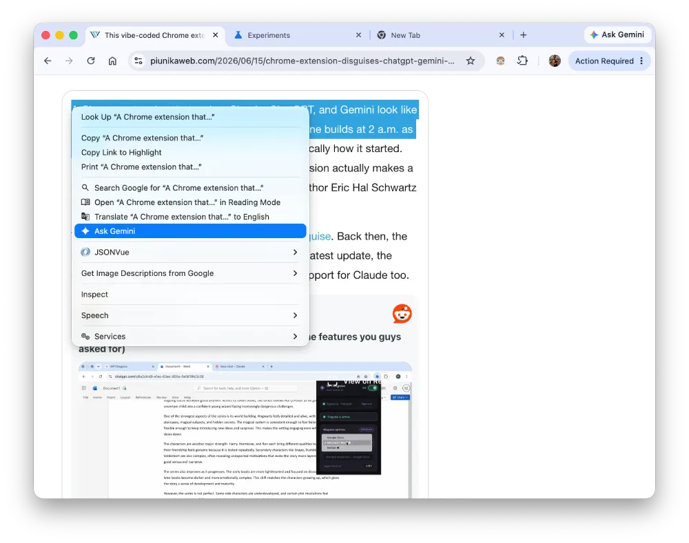
And here’s what it looks like after:
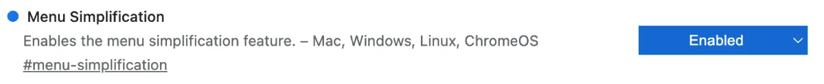
The change is live in the Chrome Canary channel, but it’s not enabled by default. You’ll have to head to chrome://flags and set the ‘Menu Simplification’ flag to ‘Enabled’. At least that’s how we managed to get the new menu to show up.
As seen in the screenshots above, the updated menu brings in new icons for the text-selection options in the list. Those icons make the whole box much easier to scan quickly, but the text snippets are the real star here. They give you a quick visual confirmation that you grabbed the right sentence before you actually hit copy or translate.
The current stable version of Chrome just gives you a plain text list of actions. You highlight a paragraph and right-click, and you just see the word “Copy” sitting by itself. The new version changes that layout entirely. It pulls the first few words of your selection into the menu item itself. Highlighting the name of a company will make the copy button say “Copy Google” instead of just “Copy”.
This context menu update is part of the massive WebUI Refresh 2026 planned for the browser. Google is steadily tweaking almost every part of Chrome right now to look a bit more modern. We already know the team is overhauling the main window frames and internal settings pages, and Chrome developers recently clashed over which ‘glass effect’ to use in the upcoming UI refresh for Windows users.
The right-click menu is just a smaller piece of that same puzzle. The addition of small icons next to every text label helps a lot. Your eyes can find the print icon much faster than reading down a list of ten plain-text links.
This change was first spotted by browser researcher Leopeva64 on X. Regular Chrome users won’t see this menu design for a while. Since it’s even hidden behind experimental flags on the Canary build, it’s likely that it may take weeks or even months for it to show up in the stable builds.
They will likely roll the new menus out alongside the larger visual updates later this year. The company clearly wants to modernize the entire browser interface at once.


Dwayne Cubbins
2774 Posts
I cover fast-moving stories across apps, online platforms, and everyday tech — phones, wearables, consoles, and whatever else people are fighting with this week. Bugs, rollouts, scams, policy enforcement, and the occasional internet-culture rabbit hole are all fair game. My goal is simple — make confusing tech news readable. When I'm not working, I'm working out or chilling with my dog. Got a tip? You can find me on X @dcubbins.
Next article View Article