It looks like Chrome developers are clashing over the glass effect planned for Chrome’s window frame on Windows, and the back and forth is happening out in the open on Chromium’s code review platform.
Emily Shack posted the work-in-progress change under the #glowup tag. The goal is to add a translucent glass frame to the Windows version as part of the bigger WebUI Refresh coming this year.
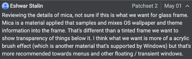
But it looks like things aren’t exactly going smoothly, as first spotted by @Leopeva64 on X. Eshwar Stalin reviewed the proposal and noted that Mica pulls in and mixes both the desktop wallpaper and the OS theme colors into the frame. That approach does not match what the UX team wants. They are looking for a tinted translucent frame that actually reveals the content sitting behind the window. Stalin said Acrylic brush effect comes closer to that idea, though Microsoft guidance recommends it more for menus and other floating or transient windows.
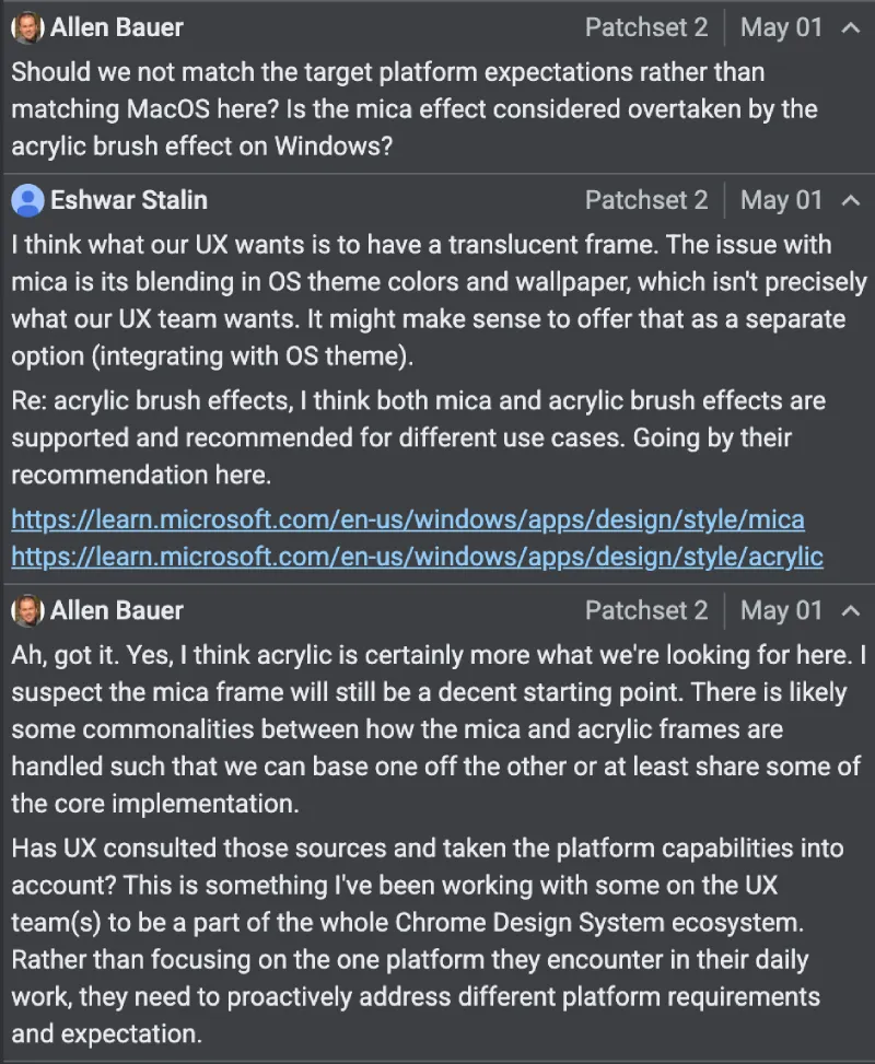
Then, another developer, Allen Bauer, asked why the team isn’t matching what Windows users expect on their own platform instead of borrowing from macOS patterns. He added that they need to handle different platform requirements directly rather than defaulting to the setup the team works with every day.
In a follow-up, Stalin clarified that the core UX goal is a straightforward translucent frame. Mica’s blending behavior is not quite right for it. He suggested it might make sense to keep Mica available as a separate option for users who want tighter OS theme integration. Both materials are supported on Windows and aimed at different use cases.
After Stalin’s reply, Bauer agreed that Acrylic fits the current goal better. He added that the two effects share enough common ground that the implementation could reuse core code, with the Mica version potentially serving as a starting point.
That said, things are still up in the air at the moment. The change list has not received any review votes yet, and two code owners have not weighed in.
At the same time, Canary builds are already running another piece of the same WebUI Refresh. Chrome’s internal pages, including Settings, now pick up a subtle color tint drawn from the new tab wallpaper or the active theme color.
I managed to test this a couple of days ago on Chrome Canary by enabling the WebUI Refresh 2026 flag.
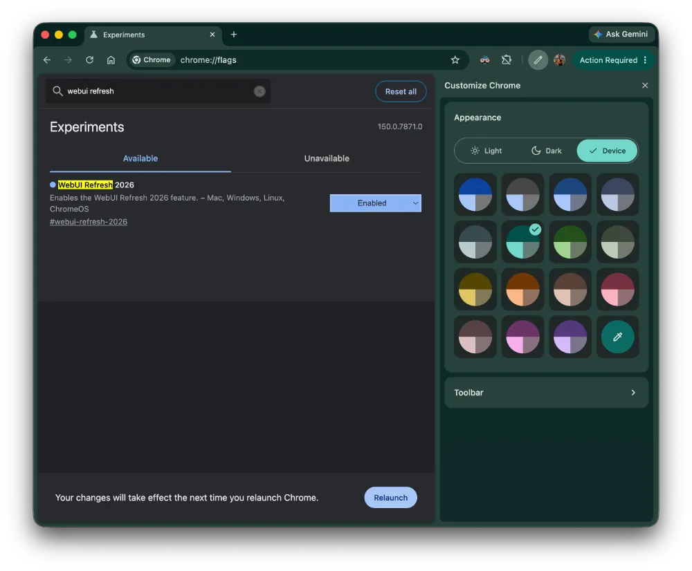
Check out these two screenshots for reference:
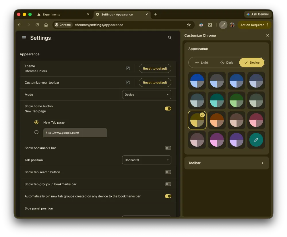
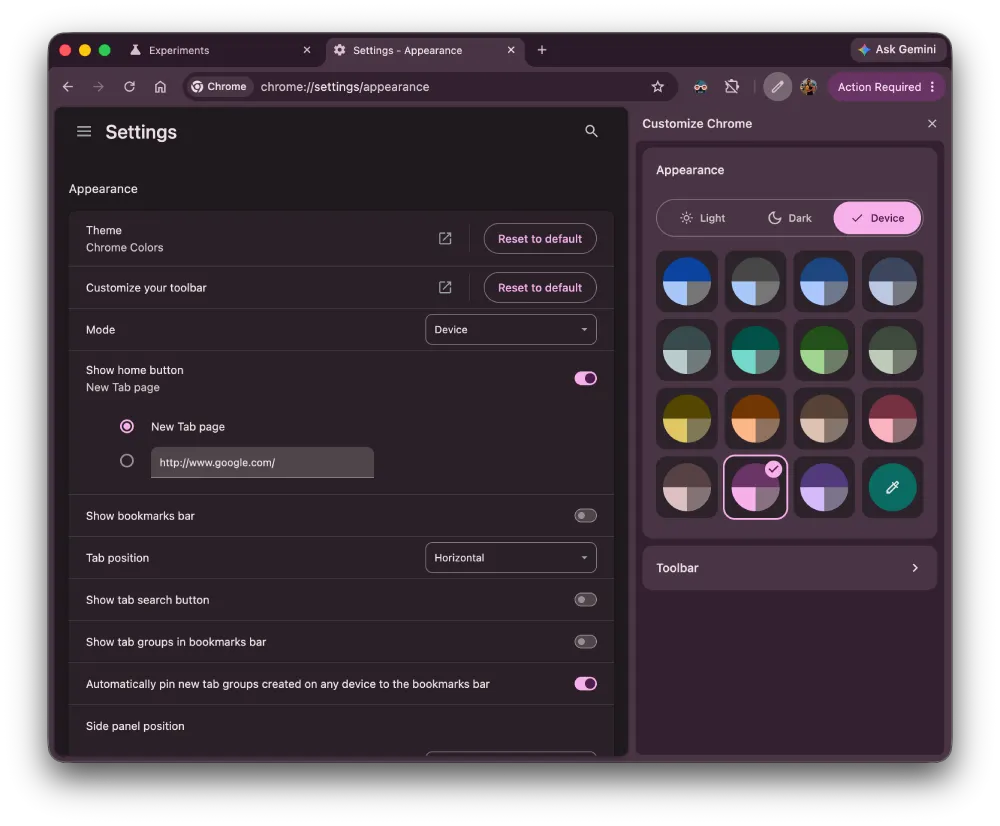
The Settings page background takes on a faint wash of whatever color your theme is using. It’s understated, but after years of flat gray. Dynamic colors also apply to toggles, buttons, and other UI elements within those pages, not just the background.
So it’s clear that Google is cooking up some big changes, but it’s not yet certain what the developers will finally agree upon.
Meanwhile, Google is also experimenting with other changes, including individual side panel alignment for Gemini, AI Mode, and other panels. They’re also developing a new tool in Chrome that can replace images on articles and other pages with AI-generated media. The exact use case for this is still unclear, but you can read more about it here.
Featured image generated with AI


Dwayne Cubbins
2826 Posts
I cover fast-moving stories across apps, online platforms, and everyday tech — phones, wearables, consoles, and whatever else people are fighting with this week. Bugs, rollouts, scams, policy enforcement, and the occasional internet-culture rabbit hole are all fair game. My goal is simple — make confusing tech news readable. When I'm not working, I'm working out or chilling with my dog. Got a tip? You can find me on X @dcubbins.
Next article View Article