


![Google Chrome for Android is prepping a massive Vertical Tabs redesign [U: Video]](https://piunikaweb.com/wp-content/uploads/2026/06/chrome-vertical-tabs-android.webp "Google Chrome for Android is prepping a massive Vertical Tabs redesign [U: Video]")
Update 04/06/26 – 08:22 pm (IST): Following the publication of our report, browser tester @Leopeva64 managed to enable vertical tabs on an Android tablet. Keep in mind that the feature is still under development, so expect further refinements before it ships publicly.
Here’s the video shared on X:
Here is the first look at vertical tabs in Chrome for Android on tablets. It is basically the same UI as on desktop. You can expand and collapse tab groups just like on desktop:https://t.co/TMy6ekowjD pic.twitter.com/ohwLYREj7F
— Leopeva64 (@Leopeva64) June 4, 2026
Original article published on June 4, 2026, follows:
I just spent the morning digging through Google’s public code tracker. What I found is going to be a huge relief for anyone who constantly keeps forty web pages open on their foldable phones or tablets. Google Chrome for Android is prepping a massive Vertical Tabs redesign. The developers are aggressively pushing code to make it happen right now.
We actually caught wind of this idea a few weeks ago. Browser development tracker, @Leopeva64, spotted an experimental flag for vertical tabs in an early version of Chrome last month. That flag was completely useless at the time. It was basically an empty placeholder that did nothing when you tapped it.
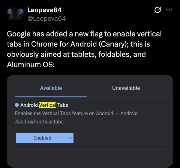
Even now, it’s the same. The flag is just an on/off switch that does nothing.
But the development is still very much active behind the scenes. The engineering team is actively wiring up the buttons to bring this feature to life.
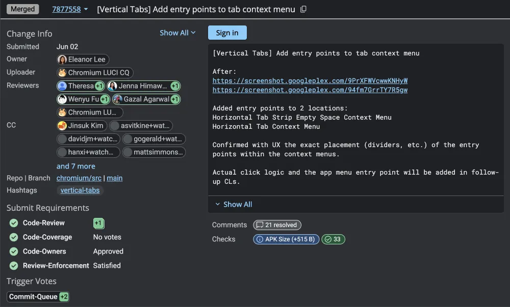
The biggest change puts a new toggle directly in your tab menu. Users will get a simple option to switch between the classic horizontal view and the new vertical layout. They just finalized the specific icon for the button that switches you back to horizontal.
From what I managed to gather, when you switch to the vertical layout, Chrome will completely suppress the old top bar. It will hide the old design, so you don’t end up with two menus eating up your screen real estate.
This Google Chrome for Android vertical tabs redesign is clearly meant to organize the chaos. The new vertical list isn’t just a simple stack of links. Google is adding dedicated buttons for tab search and tab groups right at the top of the screen. You can expect it to be similar to how it works on the desktop right now.
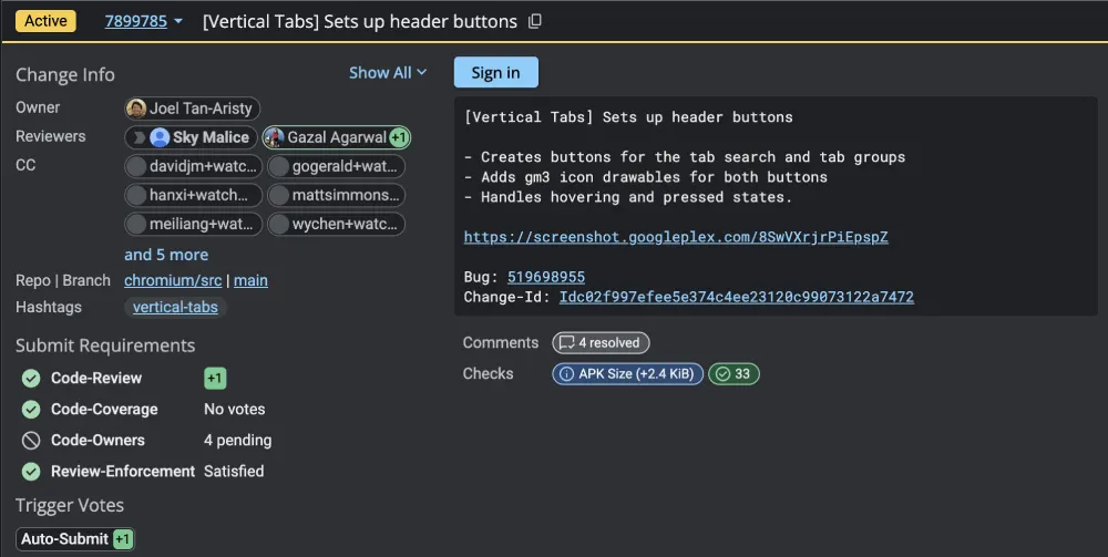
I also noticed a big shift in how the browser will handle grouped pages. Up until now, tab groups on Android have been a slightly clunky grid of squares. The new vertical setup tosses that old grid entirely out the window.
Instead, your open pages will live in a clean, straight list. Your pinned tabs get priority and will be locked securely at the very top. Any tabs you group together nest neatly in rows right below them. The developers are writing strict rules into the code so the browser never confuses a main group header with the individual pages hidden inside it.
The code also indicates that the browser stores your layout choice deep within its preferences. If you set your phone to use the vertical tabs redesign and then completely shut the app down, it remembers. The next time you launch Chrome, it boots up exactly how you left it.
But if you’re wondering what the purpose of vertical tabs on a slab phone is, then you’re missing the bigger picture. Google is likely gearing this change towards foldables, tablets, and the upcoming Aluminum OS. Basically, Google is building a full desktop operating system based on Android.
They want this new software to replace ChromeOS on upcoming consumer laptops. A vertical tab layout makes perfect sense for a true desktop environment like that. It uses the extra screen width on a laptop or an unfolded tablet way better than a cramped top bar.
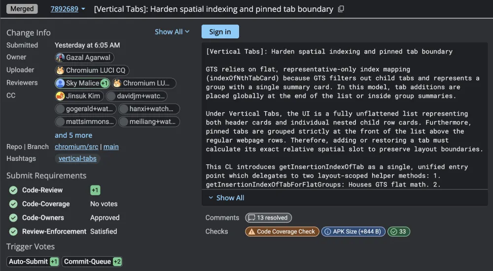
The team is still squashing a few bugs before this goes live to the public. I can see a few automated tests failing that are holding up the final approvals. A recent glitch even caused problems in the new layout when moving tabs out of a group.
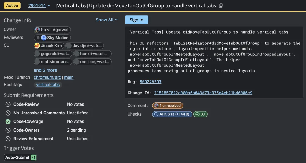
The developers are actively fixing those math errors to make sure the pages drop exactly where you drag them. They are building a whole new system just to keep the vertical list in perfect order. So this clearly isn’t a small tweak. A lot of work is going into getting it right.
Of course, we’ll only be able to get a better idea of how it’ll all work once we get to check and test it out ourselves. In the meantime, we’ll keep a close eye on any further developments and will highlight the details accordingly. So stay tuned for more of our coverage on the coming vertical tabs for Chrome on Android.


Dwayne Cubbins
2853 Posts
I cover fast-moving stories across apps, online platforms, and everyday tech — phones, wearables, consoles, and whatever else people are fighting with this week. Bugs, rollouts, scams, policy enforcement, and the occasional internet-culture rabbit hole are all fair game. My goal is simple — make confusing tech news readable. When I'm not working, I'm working out or chilling with my dog. Got a tip? You can find me on X @dcubbins.