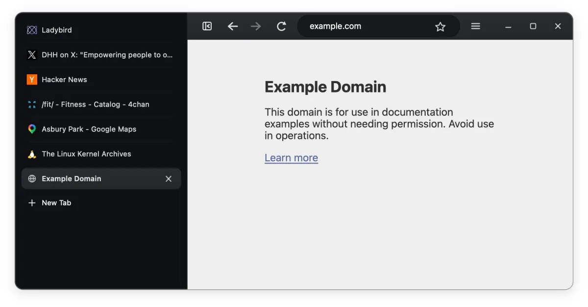
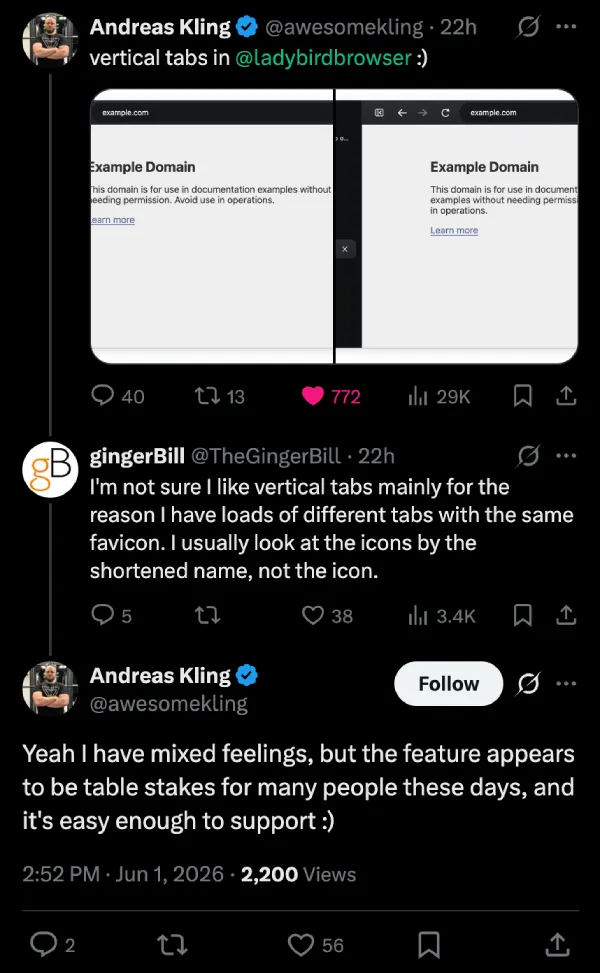
Andreas Kling added vertical tabs to Ladybird and posted screenshots on X showing it off yesterday.
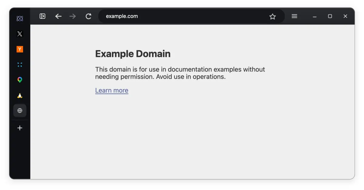
The sidebar sits on the left side of the window, and tabs stack vertically with both the favicon and the page title showing. The active one gets highlighted as you might expect, with the ‘New tab’ button at the bottom. It looks functional in the shots, nothing flashy yet.
Replies showed the usual split you get with vertical tabs. Some people were immediately into it. Others said the same thing they always say. Once you have a lot of tabs with similar favicons, you end up reading the text labels more than the icons, and vertical layouts can feel cramped for that.
Kling also replied and said he has mixed feelings about vertical tabs, but they’ve become table stakes for a lot of users these days, and it was straightforward to add.
Then the requests started rolling in. People want the address bar and controls moved into the same sidebar like Arc and Zen do. And they want ‘tree-style tabs’ on top of it. Plus, better spacing so it doesn’t feel empty. The usual stuff when someone ships a basic vertical tabs implementation.
Ladybird is still alpha, and we covered their ad blocker work last month when they brought in Brave’s engine. The team is targeting a proper alpha release later this year on Linux and macOS. Code’s on GitHub if you want to build it.
I switched to Arc when it first arrived with vertical tabs and I know a lot of folks like me will be pleased this option exists now. Ladybird adding it this early feels like they’re actually listening to what people want instead of just checking boxes. Still plenty left to build out, though.


Dwayne Cubbins
2846 Posts
I cover fast-moving stories across apps, online platforms, and everyday tech — phones, wearables, consoles, and whatever else people are fighting with this week. Bugs, rollouts, scams, policy enforcement, and the occasional internet-culture rabbit hole are all fair game. My goal is simple — make confusing tech news readable. When I'm not working, I'm working out or chilling with my dog. Got a tip? You can find me on X @dcubbins.
Next article View Article