Instagram is actively testing an update to Your Feed, and it changes how the Home tab works. The redesign continues to prioritize Reels over photos, and it introduces a new way to switch between multiple feed views. If you’re part of the beta program for this test, you’ll get a waitlist banner that grants access to the feature.
The UI was highlighted by @howfxr on X, who shared a video along with screenshots showing it off.
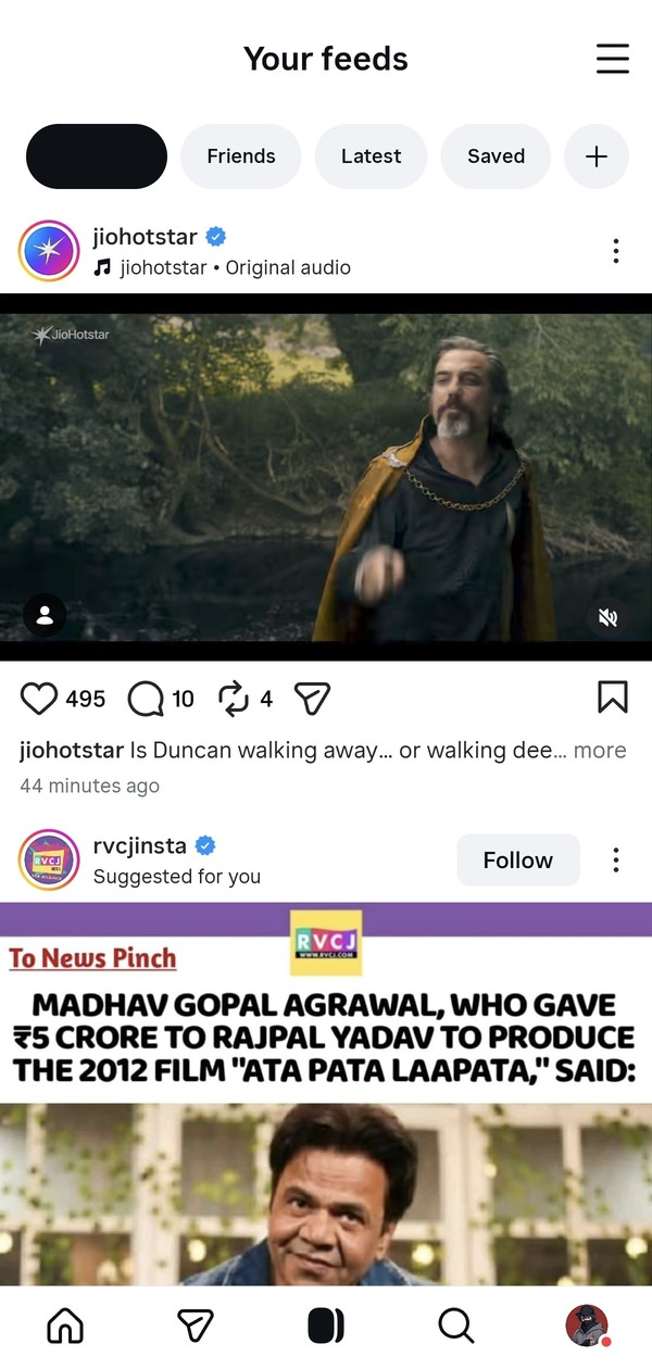
The Home experience still occasionally shows you single-image posts and carousels. However, Reels will appear more frequently than before. To open the Reels interface, you have to swipe upward from Home. This will keep videos at the center of navigation. Instagram has also removed the dedicated Reels icon at the bottom bar, and they’ve replaced it with a shortcut to the new feed.
𝗜𝗻𝘀𝘁𝗮𝗴𝗿𝗮𝗺’𝘀 𝗻𝗲𝘅𝘁 𝗯𝗶𝗴 𝘂𝗽𝗱𝗮𝘁𝗲 𝗶𝘀 𝗵𝗲𝗿𝗲 🚨👀
The platform is continuing last year’s Reels-first interface tests, now with a major new feature called “Your Feed.”
(via @ParthChandel50) pic.twitter.com/zgSDnQ8GqM
— ㆅ (@howfxr) February 19, 2026
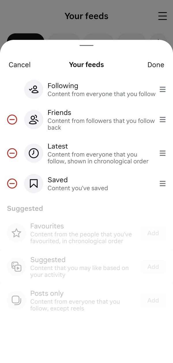
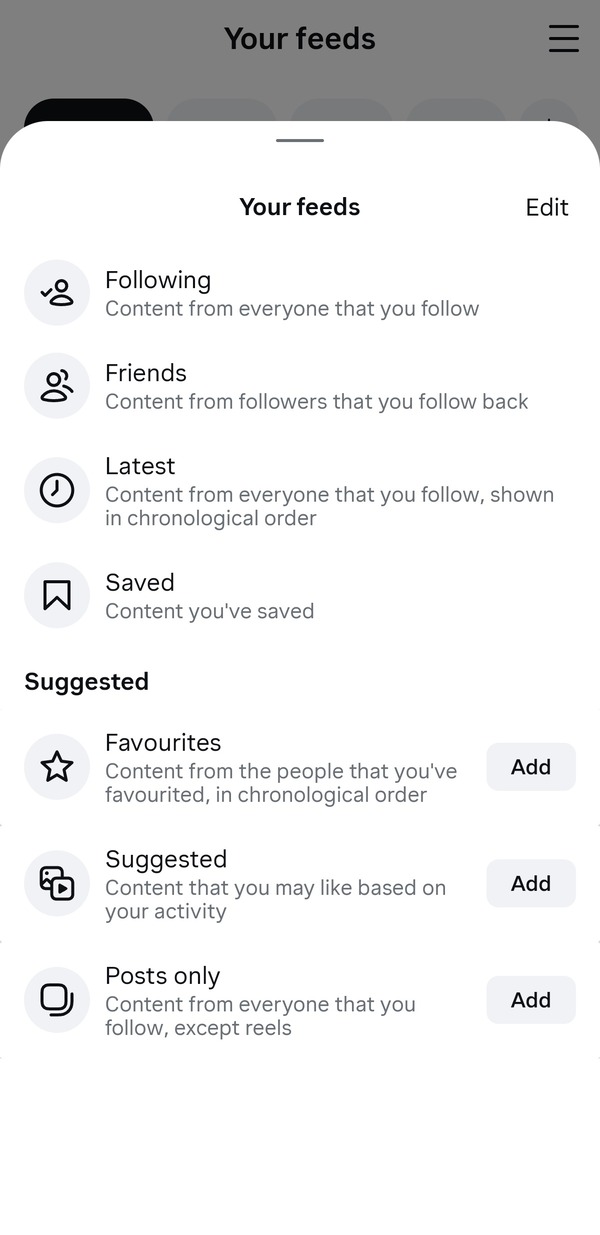
The biggest changes have happened to the ‘Your Feed’ section. It allows users to pin several types of feeds and move between them with horizontal swipes. The available options include posts from followed accounts, posts from mutuals, a chronological ‘Latest’ feed, Saved posts, Favorites, and also a posts-only feed without Reels. You can rearrange all of these tabs to decide which appears first.
The structure gives direct control to users over what shows up on their screen. If you want a cleaner timeline, you can set that. If you want to see only your friend’s posts, you can set that up as well. You also have the option to put the reels-heavy view as the main view.
For now, this test is limited to a few users in some countries. Instagram didn’t share a specific global date for the rollout of this feature, and it’ll likely not be tied to a specific version number. Recently, they’ve rolled out the Liquid Glass UI after several months of testing.
We can assume the update will drop via the server side. Some reports suggest that Instagram was testing a similar interface last year in South Korea, suggesting that the company has been refining the layout over the past few months.
All in all, this does help reduce algorithmic clutter when used properly. Instagram did confirm that the UI will roll out globally, despite it currently being tested with a limited number of people. I’m hoping bugs such as links not opening properly get ironed out eventually.
This could actually be a positively received feature, unlike the messy Reels-first UI, which changed the position of the Direct Message icon.


Dwayne Cubbins
2841 Posts
I cover fast-moving stories across apps, online platforms, and everyday tech — phones, wearables, consoles, and whatever else people are fighting with this week. Bugs, rollouts, scams, policy enforcement, and the occasional internet-culture rabbit hole are all fair game. My goal is simple — make confusing tech news readable. When I'm not working, I'm working out or chilling with my dog. Got a tip? You can find me on X @dcubbins.
Next article View Article