Instagram is rolling out a redesigned interface that puts Reels front and center, and users are furious about one particular change: DMs are no longer where they used to be.
The messaging icon has been moved from its longtime home in the top-right corner to the bottom navigation bar. That might sound like a minor tweak, but it’s fundamentally changing how people use the app.

For years, you could swipe right from anywhere in Instagram to instantly access your DMs. Now? That same swipe gesture takes you straight into Reels instead.
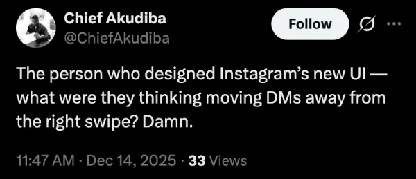
According to frustrated users across Reddit and X, the new placement is breaking years of muscle memory. “The person who designed Instagram’s new UI, what were they thinking moving DMs away from the right swipe?” one user posted on X.
Another was more direct: “Instagram move dms back where they belong or I’m gonna get crazy up in here.”
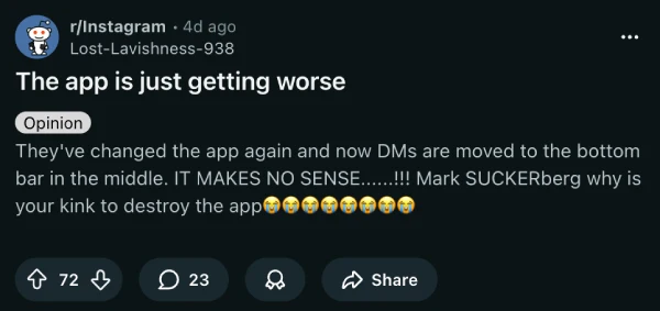
The complaints keep piling up. “Hate this instagram update keep swiping on these dumb a*s reels just to see my dms,” wrote another user. It’s clear the change isn’t landing well. Even folks on Reddit are bashing the layout revamp.
This isn’t Instagram’s first controversial UI shuffle this year. The platform has been systematically reorganizing its interface this year. We’ve seen Instagram move Highlights to the main grid, relocate the search bar to the bottom (as part of the same UI experiment), and even replace the “Following” tab with a “Friends” list.
The pattern is obvious. Instagram wants you watching Reels, not chatting with friends.
From Meta’s perspective, this makes business sense. Reels compete directly with TikTok for attention and ad revenue. Making them more accessible through that swipe gesture means more engagement with video content, which translates to more ad impressions.
But there’s a cost. Instagram built its reputation as a social network where people connect and communicate. Moving DMs to a less prominent position feels like the company is deprioritizing the very interactions that made the platform sticky in the first place.
That said, it seems Instagram is pushing full steam ahead with the new Reels-first UI. Many users have been sharing screenshots of the updated UI in the past few days. I opted in for the new UI back in October when the platform began offering some users early access.
While I occasionally still swipe right expecting to enter DMs only to get blasted with Reels, I’m mostly fine with the change. But feel free to share your thoughts about Instagram’s decision to move the DMs button to the bottom in the comments below.


Dwayne Cubbins
2811 Posts
I cover fast-moving stories across apps, online platforms, and everyday tech — phones, wearables, consoles, and whatever else people are fighting with this week. Bugs, rollouts, scams, policy enforcement, and the occasional internet-culture rabbit hole are all fair game. My goal is simple — make confusing tech news readable. When I'm not working, I'm working out or chilling with my dog. Got a tip? You can find me on X @dcubbins.
Next article View Article