![YouTube now testing huge recommended video thumbnails on the sidebar [Updated]](https://piunikaweb.com/wp-content/uploads/2026/02/youtube-sidebar-featured.webp "YouTube now testing huge recommended video thumbnails on the sidebar [Updated]")
Update 13/04/26 – 12:05 pm (IST): Reports popping up on Reddit (1,2,3,4,5,6,7,8) suggest that YouTube is expanding the giant sidebar UI experiment to a wider audience. Multiple posts on Reddit over the past day or so have people talking about the sidebar update, with many obviously frustrated about it taking over so much real estate on the screen.
This still seems to be part of the same A/B test that has been going on for a couple of months now. It’s unclear if YouTube will eventually release this as part of a UI update for everyone or if it’ll shelve it. Most users are likely hoping for the latter.
Original article published on February 4, 2026, follows:
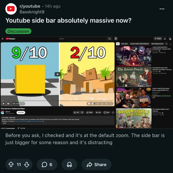
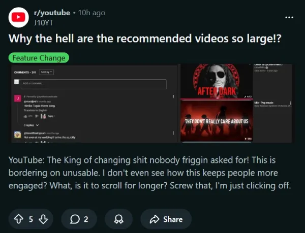
YouTube is at it again with another UI experiment that has desktop users frustrated. Multiple reports across Reddit and X show that the platform is testing massively enlarged recommended video thumbnails in the right sidebar, making them significantly bigger than before.
The change appears to be rolling out through A/B testing, meaning not everyone sees it yet. Users who got hit with the new design say the oversized thumbnails are distracting and make it harder to browse through recommendations. One Reddit user on r/youtube called it “bordering on unusable” and questioned how this keeps people more engaged.
Over on a Reddit thread, one person complained they can’t watch videos without fullscreening anymore because “the recommended videos are so big and distracting”. Another pointed out that the thumbnails now take up so much space that full video titles get cut off, showing only the first 2 or 3 words.
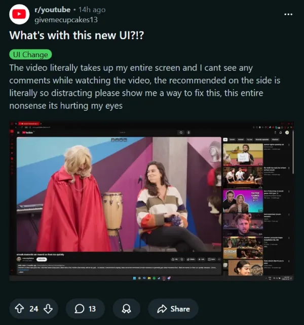
The complaints don’t stop there. Several users note that the enlarged sidebar pushes the video player itself to take up more screen real estate, leaving less room for comments and making the whole layout feel cramped. The video title space has also been reduced, forcing viewers to hover or click just to read what they’re about to watch.
This is far from YouTube’s first sidebar experiment. Just yesterday, we covered how YouTube removed the list view from subscriptions. And last month, the platform was testing a two-column recommended videos feed in the sidebar that also drew criticism. So one thing’s clear: YouTube is actively working to redesign the sidebar experience and is A/B testing different layouts to see what sticks.
For now, some users have found workarounds using browser extensions like “Control Panel for YouTube” or “Tweaks for YouTube” to manually shrink the thumbnails back down. Chrome users with uBlock Origin can also apply custom filters to restore the old size.
You can check out more reports on Reddit here, here, here, and here, as well as on X, here, here, here, and here.
If you’re seeing the chunky sidebar and hate it, you’re definitely not alone. Whether YouTube makes this permanent or scraps it based on feedback remains to be seen.
Featured image credit: u/-slakkie- / Reddit


Dwayne Cubbins
2775 Posts
I cover fast-moving stories across apps, online platforms, and everyday tech — phones, wearables, consoles, and whatever else people are fighting with this week. Bugs, rollouts, scams, policy enforcement, and the occasional internet-culture rabbit hole are all fair game. My goal is simple — make confusing tech news readable. When I'm not working, I'm working out or chilling with my dog. Got a tip? You can find me on X @dcubbins.
Next article View Article