





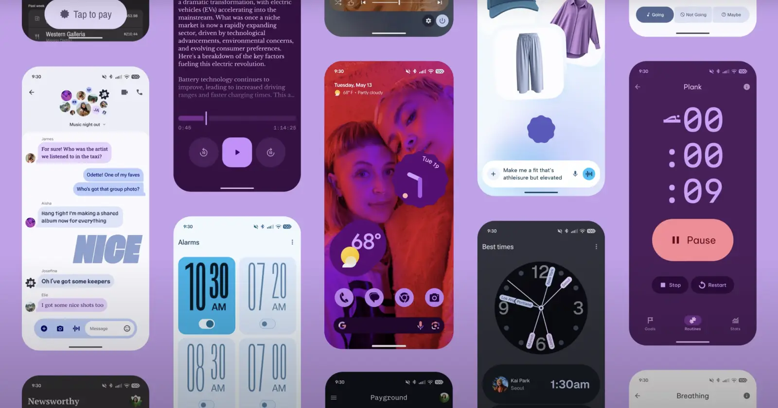
#Pixel10 has you covered on and off the grid 📍 Pixel devices will be the first to offer voice and video calls on @WhatsApp over a satellite network starting 8/28¹ 🌍 pic.twitter.com/6yDSDMskkK
— Made by Google (@madebygoogle) August 22, 2025
The past couple of weeks have been a wild ride for Pixel fans. From last-minute Pixel 10 leaks to the launch and everything in between, there are still no signs of any slowdowns. Google is still in the kitchen cooking up its revamped apps that bring the new Material 3 Expressive design language. But it seems not everyone’s a fan of this change.
Just a day ago, we highlighted how people were made at Google for redesigning the Phone (Dialer) app on our sister site, where we even shared a workaround to get back the old UI. However, that’s not the only app redesign that some Pixel users are complaining about. We’ve spotted multiple threads on Reddit also bashing the new Clock app.
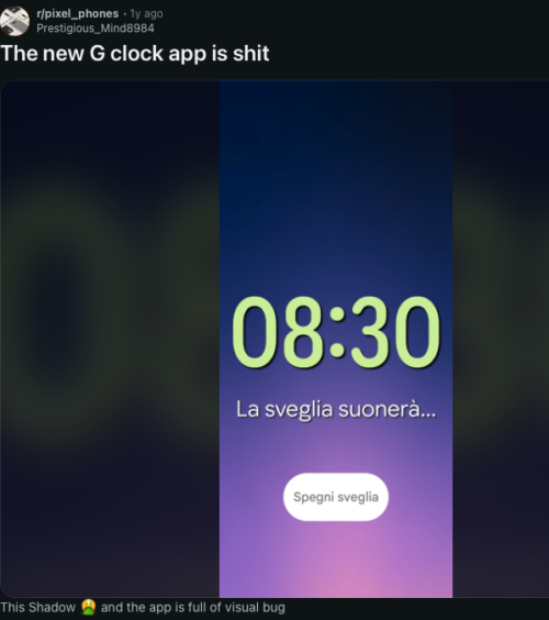
Users say the M3 Expressive pass has messed with muscle memory. The swipe gesture to hop between Alarms, Clock, Timer and Stopwatch is gone for some, replaced by a tab strip that needs taps. Fonts have ballooned in places, labels wrap in odd ways, and the space between cards feels exaggerated, making the alarms list show fewer items at once.
Several Reddit threads call out the Alarms page blasting a bright background even with dark theme on, which is a rude surprise when you open it at night.
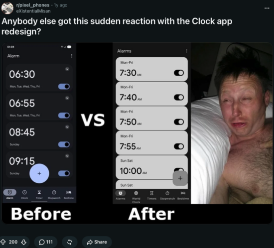
A few posts also flag truncation and scaling bugs, where text no longer fits neatly inside buttons or tiles.
The Calculator refresh is getting similar pushback. Early adopters say the new type choices and padding make it feel “toy-like,” with lower information density and less contrast than before, which slows quick entries.
But this design lines up with the broader M3 Expressive goals, which dial up size, shape and motion to be more playful. The flip side is that power users, who prize speed and scan-ability, feel like they’re tapping through more white space to get the same work done.
There’s also a curious new “Create” button under Wallpaper and Style, inside the Icons section, showing up on the Android 16 QPR2 Beta 1. It currently just displays an “App isn’t installed” pop-up when tapped, which has led to a pile of “is this a bug or a teaser?” posts across r/android_beta. Given Google’s recent AI art experiments for wallpapers, icon packs and decorative elements, it looks like a switch got flipped before the backend was ready.

If you see it, don’t waste time clearing cache, most reports say it’s server-side and non-functional for now.
Amid the UI churn, Pixel 10 is lining up a headline feature that might actually save your bacon off the grid. Google announced that the Pixel 10 will “offer voice and video calls on WhatsApp over a satellite network starting 8/28” on X, making it the first handset to offer that through Meta’s app if it ships as described.
Android already added hooks for satellite SOS, but real-time video is a bigger lift. Expect latency and bandwidth limits, a clear view of the sky, and possibly carrier or region caveats. Still, for hikers, rural users, or anyone caught in an outage, being able to place a WhatsApp call without cellular coverage would be a meaningful upgrade over SOS-only texting.
With the recent Pixel 10 launch, the whole Material 3 Expressive revamp, and Google dropping both stable and beta updates, it seems the company has a lot on its plate. So it’s likely that Google will continue refining its apps down the line. The best thing you can do is leave feedback about any app UI redesign that you don’t like through official channels like Google’s help forums.

We stand out from the tech-media crowd because we break news stories; we mainly bring you stuff that you won’t find anywhere in the mainstream tech media. Our stories have been picked up by some of the world’s most popular websites and media outlets—more info is available here.

Dwayne Cubbins
3036 Posts
I cover fast-moving stories across apps, online platforms, and everyday tech — phones, wearables, consoles, and whatever else people are fighting with this week. Bugs, rollouts, scams, policy enforcement, and the occasional internet-culture rabbit hole are all fair game. My goal is simple — make confusing tech news readable. When I'm not working, I'm working out or chilling with my dog. Got a tip? You can find me on X @dcubbins.
Next article View Article
Google Pixel roundup: Gboard writing tools, ‘Take a Message’ lands on older devices, bricking issues plague users, and ‘My Pixel’ app icon surprise
Here's what's swirling in the Google Pixel universe lately, and if you own one, chances are you’ve noticed some nifty changes and maybe even hit a snag...
Aug 27, 2025 3 Min Read