For weeks now, Google has been working on redesigning the YouTube Music app UI, first adding a key controls carousel, then a gradient background for improved aesthetics. Some weeks later, the Now Playing UI new gradient design is rolling out widely.
YouTube Music’s Now Playing UI design with gradient background reaching more users
It seems that the latest YouTube Music’s v6.29.57 app update already includes the changes made in recent weeks for all users, such as the Now Playing gradient background design. The color chosen by the system is the dominant one in the album of the song you are listening to.
Regarding the design, the tweaks made by the dev team result in a ‘more lively’ overall look for a friendlier experience in the ‘Now Playing’ section. Although the bottom three-tab area is no longer as highlighted as before, you can still swipe up to quickly access the playlist queue, but simply tapping on one of the options seems more practical now.
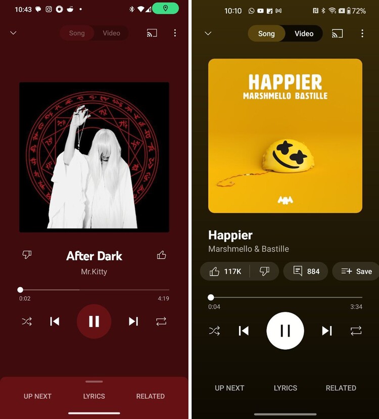
In the previous UI, YouTube Music app chose a solid color from the currently playing album to set the background. Also, the three-tab bottom area stood out noticeably (as if inviting you to swipe up).
Although the UI changes are not extreme, they seem like small refinements intended to make YouTube Music a more comfortable experience, which is always appreciated. Furthermore, sometimes extreme changes do not go well and generate backlash from users, as has happened before.
Finally, if you have already updated YouTube Music to the latest version but you still don’t have the new UI, you can try to ‘force close’ the app to try to get it faster, but it seems like a matter of a few days for it to reach all users.

Jean Leon
1613 Posts
A tech enthusiast since ever. I like to always be up to date on the latest news in the industry and write about it. Twitter: @jean_ERdC

Next article View Article