Windows 11 is the latest version of Microsoft’s OS. The update brings a set of exciting new features, plus a complete redesign with a more modern and clean UI.
Just like other operating systems, Windows 11 integrates dark and light modes for its interface. These adjust the UI color palette with different shades, seeking to mitigate the visual impact.
However, there seem to be interface issues related to switching between dark and light modes, due to certain UI inconsistencies.
Windows 11 UI inconsistencies between dark and light modes
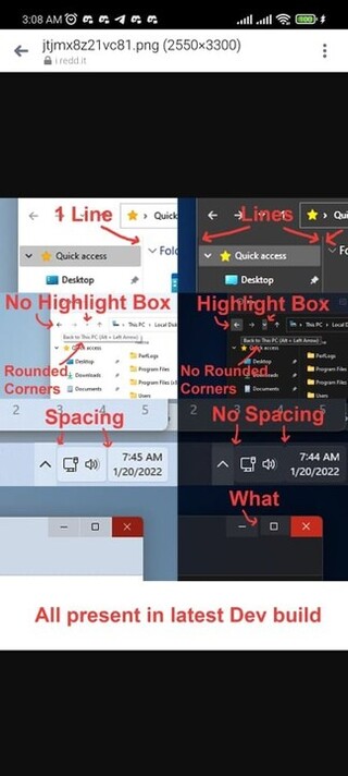
A Redditor posted the aforementioned UI inconsistencies. In the image below, you can see noticeable differences between some interface elements, depending on whether the UI is in light or dark mode.

As you can see in the image, there are multiple UI differences in elements such as separator lines, spacing, highlight boxes, and even the size of some buttons.
Why is this happening?
At the moment, there is no official or confirmed explanation as to why there are these notable UI inconsistencies in Windows 11.
But, some users are suspicious about the matter. For example, consistency issues are said to be present across multiple Microsoft teams, which is reflected in the bottom line.
More specifically, it is suggested that different Microsoft design teams use the same stylesheet and Fluent Design system libraries. But, each team makes its own modifications, and QA fails in between.
They have a stylesheet but I suspect that each team seems to have issues with visual QA and regression testing. There’s also a likelihood that the devs are creating overrides to accommodate for inconsistency between designs from different designers.
Source
To the above, certain problems of ‘archaic interface structure’ inherited from previous versions of Windows would also be added. The same Redditor who suggested the above also adds the following:
Designers are probably using the same Fluent design system libraries but some designers will override or change some system elements despite the intent of a design system to keep things consistent. This adds additional unnecessary variability.
Add to this an archaic UI interface logic structure and technical debt that likely makes development difficult to keep visually consistent.
Source
Users complain about Microsoft support
Windows 11 users upset about inconsistencies also complain about Microsoft support. Apparently, the company is not good at responding to user requests.
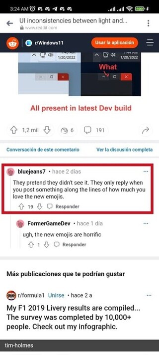
Watch as nobody from Microsoft will comment on this to acknowledge the issues. They never do. Comment how you like the new emojis though and you’ll get an answer soon.
2 trillion apparently isn’t enough for UI consistency. I don’t like Apple much for their demeaning PR tactics, but at least they get UI consistency right, consistently.
Source

In line with the above, there is no official acknowledgment from Microsoft on the matter. So, users don’t know if the company is working on solving the UI inconsistency issues in Widows 11.
If there are any changes related to the matter in the next few days, we will update this article. So, stay tuned.
Featured Image: Microsoft
PiunikaWeb started as purely an investigative tech journalism website with main focus on ‘breaking’ or ‘exclusive’ news. In no time, our stories got picked up by the likes of Forbes, Foxnews, Gizmodo, TechCrunch, Engadget, The Verge, Macrumors, and many others. Want to know more about us? Head here.


