


The new search tab in the Google Play Store is just an extra step to search, very annoying.@Google pic.twitter.com/3fJQI5P7bC
— Shai Margolis (@ShaiMargolis) March 21, 2024
Google loves to tinker with its Play Store, and the latest experiment involves shoving the search bar from its top-of-screen throne down to the lowly depths of the bottom navigation bar. Yes, the all-important search function now resides in its own dedicated “Search” tab. Here a couple of screenshots of the new UI shared by a user on X.
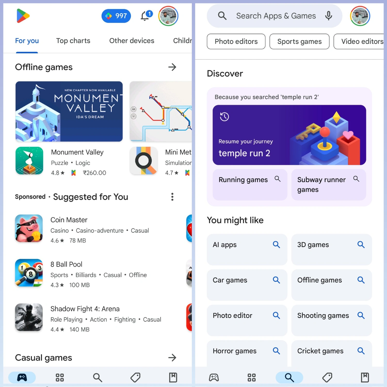
Instead of the familiar search bar at the top of your Games and Apps feeds, prepare for a two-step hunt. First, tap the “Search” tab, and then the traditional search bar will grace you with its presence. It’s a minor change, but many feel it’s a change for the worse. Some have even expressed their dissatisfaction with it.
The new Search tab itself is a smorgasbord of “You might like” suggestions and genre categories. While functional, it’s not exactly a feast for the eyes. Some are calling it text-heavy and bland.
On the bright side, the search bar’s relocation does free up some valuable space at the top of the screen. That space, unfortunately, sits rather awkwardly empty at the moment. Perhaps Google has some surprise UI magic in store to make use of it.
Strangely, this search-centric shakeup ignores the Books tab entirely. Perhaps the Books section feels forgotten amidst the changes, as if it was hastily stuck onto the Play Store as an afterthought.
The update is currently rolling out via a server-side flip to those on v40.1.19-31 of the Play Store. So if you don’t have the new search tab just yet, don’t worry (or maybe do, depending on how you feel about change), it’s coming your way soon. In other related news, Google is also testing AI-generated FAQs for apps and games on the Play Store.
What do you think of the Play Store’s search relocation? A helpful tweak or an unnecessary hassle?

Dwayne Cubbins
1074 Posts
My fascination with Android phones began the moment I got my hands on one. Since then, I've been on a journey to decode the ever-evolving tech landscape, fueled by a passion for both the "how" and the "why." Since 2018, I've been crafting content that empowers users and demystifies the tech world. From in-depth how-to guides that unlock your phone's potential to breaking news based on original research, I strive to make tech accessible and engaging.
Next article View Article
Google should add option to hide Quick Settings panel on Pixel lock screen
Your Google Pixel phone's Quick Settings are often a mere pocket-press away from turning off Wi-Fi, mobile data, or worse, activating Airplane mode. This is frustratingly common...
Mar 25, 2024 1 Min Read