Google Maps last month rolled out a new update that introduced a myriad of changes, but prominent among them are the new colors. The new color scheme might not be the most useful addition to the latest version of Google Maps, but it caught many people’s attention, including an ex-Google Maps designer who thinks the new changes make the app “colder” and “less human.”
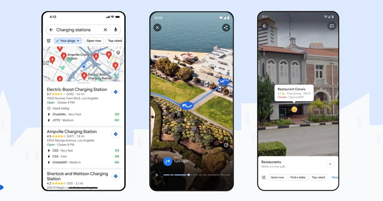
The update is available on both desktop and mobile versions of the app, tagging along new information for EV charging stations, enhanced search, as well as “Immersive View for Routes” on Android and iOS in Amsterdam, Barcelona, Dublin, Florence, Las Vegas, London, Los Angeles, Miami, New York, Paris, San Francisco, San Jose, Seattle, Tokyo and Venice. However, the biggest change that many have noticed right off the bat is that roadways no longer appear in white and yellow. Instead, they’ve been replaced by various shades of gray. As if that’s not enough, water changed from blue to teal while parks and other forest areas appear in a new shade of green. But buildings keep their gray and yellow colors.
Interestingly, Google doesn’t delve much into the color scheme changes in the official blog post announcing the new Maps update. But it turns out it’s the most visible visual change that is dividing opinion among Google Maps users. While reacting to the changes, Elizabeth Laraki, who says she worked on Google Maps in 2007, posted her reactions to the new visual design on X, acknowledging that “it’s normal for products to accumulate features over time.” However, it’s “also super important to stay vigilant and continually clean them up,” she added.
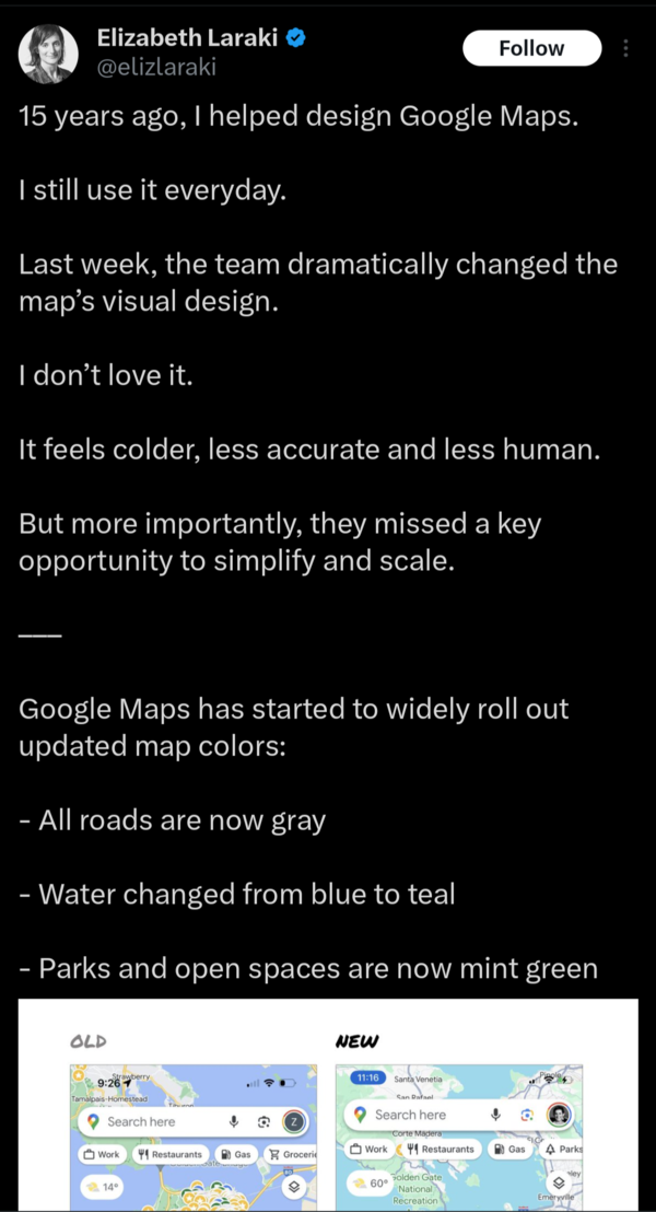
Ms Laraki thinks the Google Maps team missed an opportunity to simplify and scale the app to users liking, instead focusing on bloating the interface with new features that not necessarily add value to the end user experience. While she thinks major roads, traffic, and trails stand out more, she also argues that things like water, parks and open spaces now blend out together. “It seems the goal was to improve usability and make the maps more readable. Admittedly, I do think major roads, traffic, and trails stand out more now. But the colors of water and parks/open spaces blend together. And to me, the palette feels colder and more computer generated. But color choices aside…If the goal was better usability, the team missed a big opportunity: Google Maps should have cleaned up the crud overlaying the map,” she added.
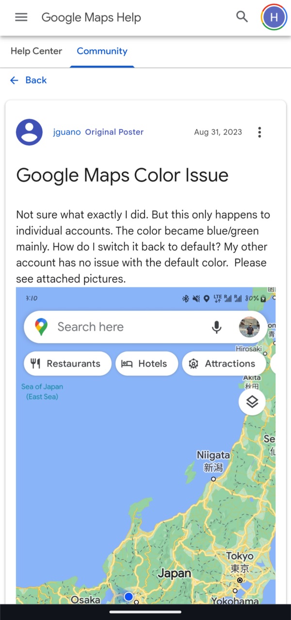
Unsurprisingly, many Google Maps users say they can relate to Ms Laraki’s criticism around the new Google Maps colors. Besides the many replies to her post on X, Reddit has multiple threads and comments from people echoing her sentiments. The Google Maps community forum is also awash with similar calls for Google to at least consider reverting the color scheme, which goes a long way to show how we dislike change.
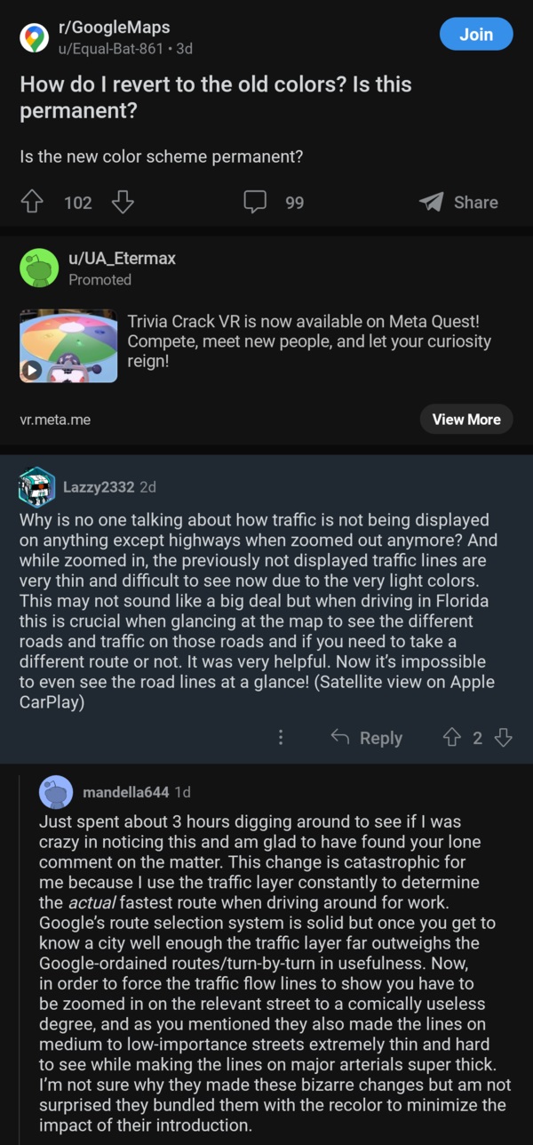
Although Ms Laraki claims roads stand out more in this new design, some Google Maps users are finding it difficult to read road names. “My biggest gripe is trying to read road names. So many times I’ll see a road name, and I start to zoom in – only to have it now disappear – to then zoom out again and it doesn’t show at all – to zoom in again and then 50/50 I can see it. Drives me nuts,” one frustrated user commented on Ms Laraki’s post shared on YCombinator. The same sentiments have also been echoed by a Redditor, who wonders who is sponsoring the silence on why traffic isn’t displayed on anything except highways when zoomed out.
Some Google Maps users like the new colors
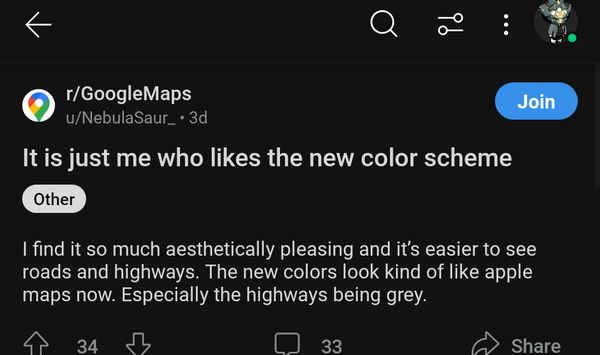
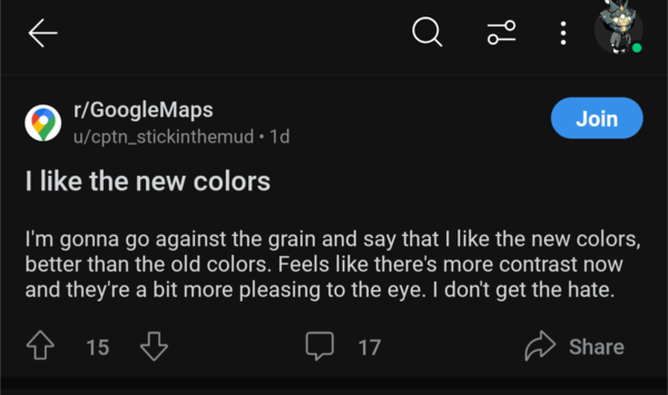
Designing a product that makes everyone happy isn’t a walk in the park. In fact, there’s no perfect product out there, and this becomes even more obvious with this Google Maps update. There are other people who like the new Google Maps colors, adding even more weight to the old adage that one man’s meat is another’s poison.
For someone whose Google Maps usage is quite dotted, I’ve struggled to pick out the changes that would make me dislike this new design. It still looks okay to me, perhaps because I’m only seeing it in screenshots since the update is still limited to select cities across the globe. But I still don’t see myself “hating” it when it eventually arrives, something that has also been echoed by several others in various forums.
It’ll be interesting to see how Google responds to the feedback shared by Ms Laraki and others who feel the same. But given the delicate balance between people who like and dislike the new color scheme, I doubt the Google Maps team will revert all the things she pointed out. Perhaps only a few, but not everything. Only time will tell.

