As a frequent user of Google Chrome on my Android device, I recently noticed a significant visual overhaul in the bookmarks section, courtesy of the latest Chrome 120 update. The changed look places a greater emphasis on big image previews for saved links. Let’s delve into the details of this fresh look that has been introduced to the bookmarks page.
New look of “bookmarks” on Google Chrome
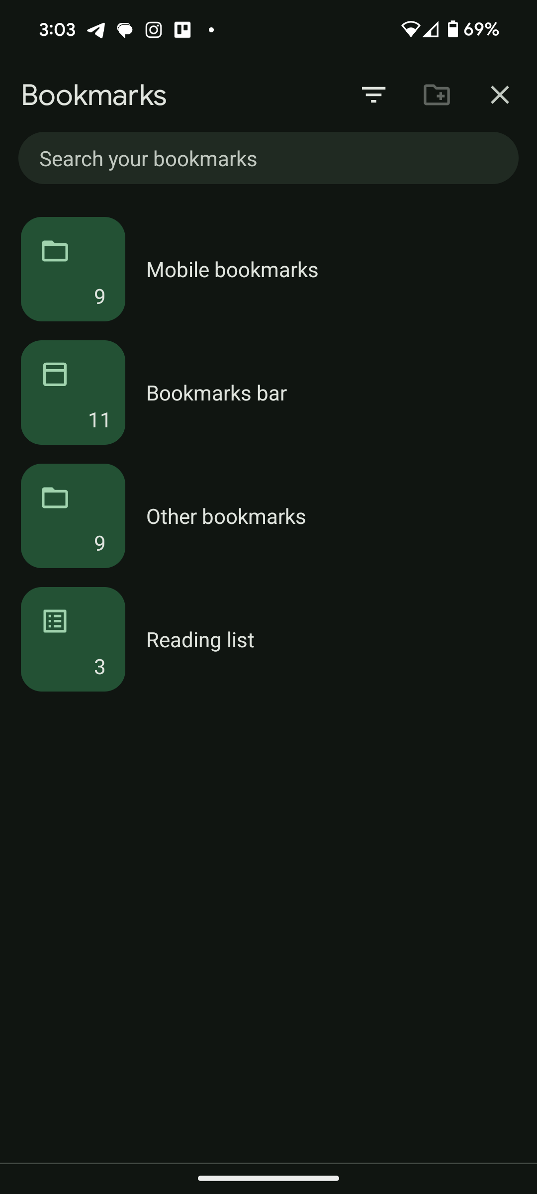
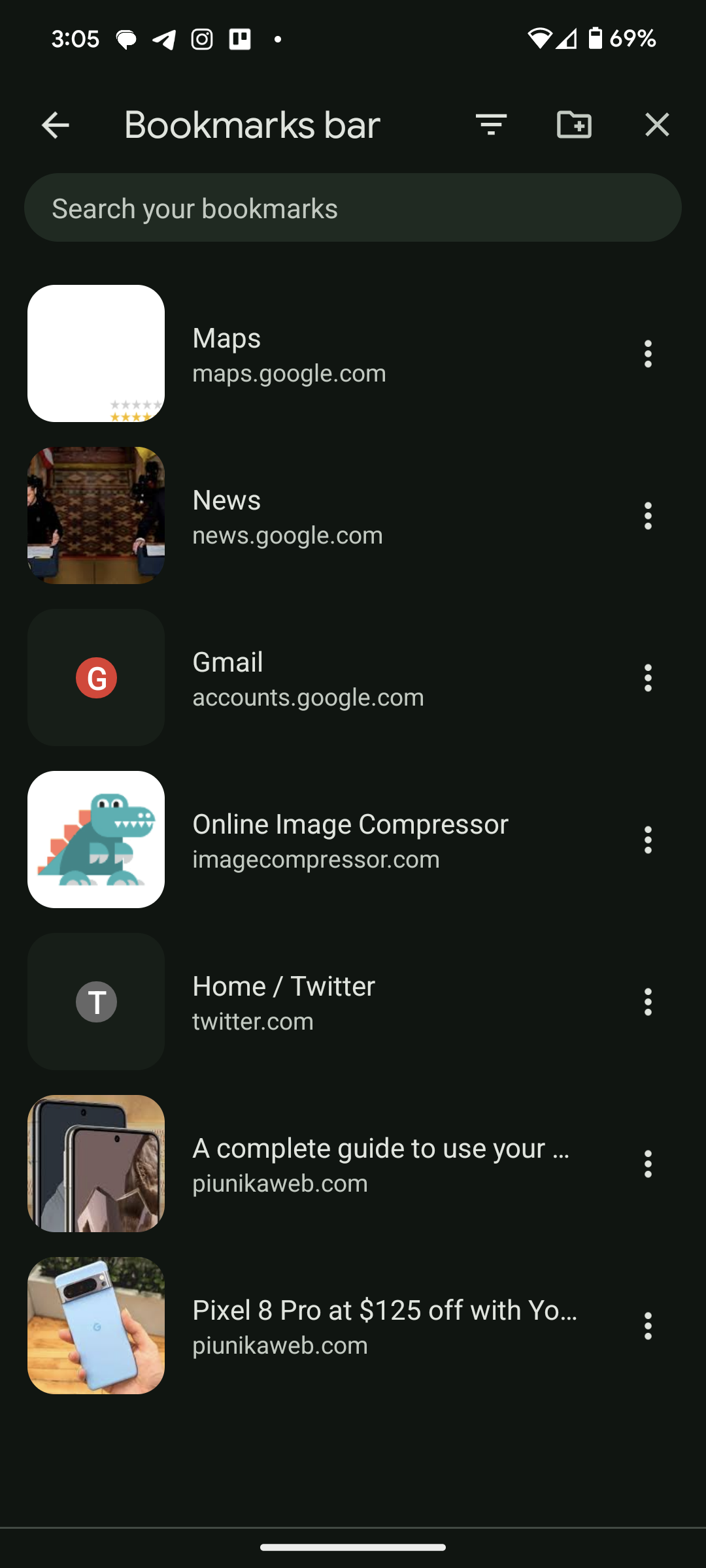
The most noticeable change is the introduction of larger previews for both folders and individual links. In the previous design, Chrome displayed only the favicons of bookmarks, which, while functional, lacked the visual richness that users often find helpful. Now, the new UI showcases blue folders for essential bookmark categories such as mobile bookmarks and bookmarks bar.
Trade-offs and benefits
While the introduction of larger previews may result in fewer bookmarks being visible on the screen simultaneously, the improved visual clarity and ease of navigation more than compensate for this minor drawback. The redesign has proven particularly beneficial for users who, like me, save numerous things in their bookmarks. The new UI has made it significantly easier to locate and access specific links within the bookmarks page.
Platform-specific implementation
An interesting aspect of this update, as spotted by 9to5Google, is its platform-specific rollout. As of now, the redesigned bookmarks UI is exclusive to Android devices. Chrome for iOS, in the current version, does not display image previews on bookmarks. This targeted approach suggests that Google may be testing it on Android before considering a wider implementation across all devices.
Here’s how to experience the change
For users yet to experience the revamped bookmarks page, the update appears to be rolling out widely. However, it’s advisable to check the Play Store for the latest Chrome updates to ensure access to the new UI. Users who appreciate a more visually oriented browsing experience are likely to find this update a welcome change.
Visuals of the new layout
To provide a clearer picture of the new layout, the screenshots below highlight how the revamped ‘bookmark’ section appears. You can have a look below.
In conclusion, the latest update to Google Chrome bookmarks introduces a fresh and visually engaging look on Android. As we await further developments and potential expansion to other platforms, it’s evident that Google is actively refining the Chrome browsing experience to better cater to user preferences and needs.


