


Google is experimenting with tweaks to the Chrome mobile app UI in what appears to be in search of a more minimalist design, and one of those changes includes a carousel of favicons on the ‘New Tab’ page instead of the classic 8 favicons that we were used to on smartphones. In addition, the UI for tablets is getting a small aesthetic change with more touches of color.
Favicon carousel under testing in Google Chrome for smartphones
The Google Chrome app ‘New Tab’ page has been receiving some changes lately, such as the implementation of Material You design language with thicker and bolder UI elements.
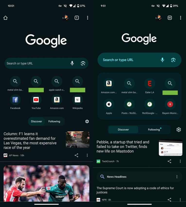
Now, the company is testing another change where they would say goodbye to the 8 favicons that appeared in two lines of four when opening a new tab, in favor of a carousel that would show only the first 4-5 favicons and require swiping left to reveal the rest.

This change has its advantages and disadvantages. For instance, as a positive point, it achieves a more minimalist UI with less visual cluttering. On the downside, it forces you to swipe to reveal icons that were previously directly visible, and there seems to be a huge waste of usable space (especially if you have the Discover feed disabled).
The redesigned Google Chrome ‘New Tab’ page has not yet been widely deployed, so it could be in testing among a small number of users first. The feedback will probably determine whether Google will give the green light to the massive rollout, although sometimes the company implements changes even with user opinions against them, so anything can happen.
More ‘Dynamic Color’ for tablets
Regarding the Google Chrome app for tablets, the top status bar (above the tabs) receives a ‘Dynamic Color’ treatment, which apparently at the moment only takes effect if you use dark mode, since according to the 9to5Google report, there are no changes if you use light mode.
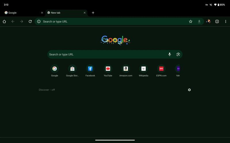
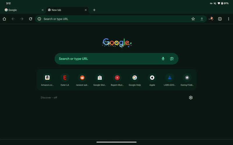
As you can see in the screenshots above, previously the status bar was black, but now it will output the color captured by the Android ‘Dynamic Color’ system. As with the previous change, this has not yet been deployed en masse.

Jean Leon
1613 Posts
A tech enthusiast since ever. I like to always be up to date on the latest news in the industry and write about it. Twitter: @jean_ERdC
