


Roblox just made its big Studio interface overhaul mandatory for every developer, killing off any way to switch back to the old setup. And yeah, a lot of creators are absolutely livid about it.
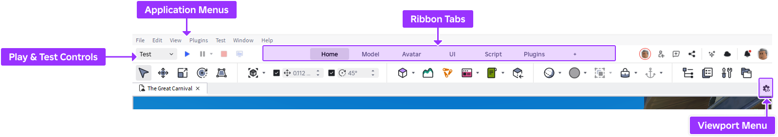
The change hit over the last day or so, right as the company wrapped up a long beta period and pushed the “Flexible Studio UI” live for good. No more toggle in the beta features menu, just the new ribbon-style toolbar, brighter blue accents, and a bunch of rearranged buttons that folks have to hunt for now.
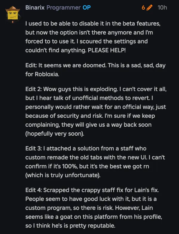
Complaints seem to be piling up on the Roblox Developer Forums (1,2,3,4,5) as well as platforms like Reddit (1,2,3,4,5) and X (1,2,3,4,5). From what I was able to deduce after reading dozens of complaints, the primary issue isn’t just that the UI is new; it’s that it’s mandatory. In previous versions, you could toggle the “Next Gen Studio” feature off in the Beta menu. As of this latest update, that toggle is gone. You are now locked into the new design, whether you like it or not.
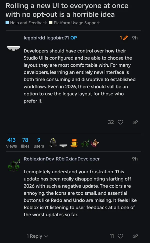
“Rolling a new UI to everyone at once with no opt-out is a horrible idea,” wrote one user, legobird71, on the DevForum. They aren’t alone. Threads with titles like “New Studio UI being mandatory makes me want to end it” and “How do I get rid of the new forced UI?” are dominating the discussion boards.
Many creators argue the new layout wastes screen real estate with excessive padding, while others find the color scheme, described by one user as “violently BLUE” against a dark background, hard on the eyes.
Functional complaints are piling up too. Developers are reporting that essential buttons like Undo and Redo have moved or vanished from their usual spots, and the new “modular” tabs have split previously simple dropdown menus into clunky, space-hogging lists.
The anger spilled over to X big time. One developer called the new look “dogsh*t” and said they’re close to quitting Studio if it stays this way. Another straight-up tagged Roblox, asking if the company hates devs because they “CANNOT find anything” and “CANNOT WORK LIKE THIS.”
Roblox says the goal is a more flexible, customizable Studio that can better support different workflows. The company’s post highlights things like expanded menus, consolidated play and test controls, and deeper toolbar customization, plus tips like adding tools back to ribbons and binding shortcuts for frequently used actions.
It also argues that keeping both the legacy UI and the new UI is not a simple theme option, describing the old UI as “an entirely different collection of systems” that would be difficult to support alongside the new one.
For now, it looks like the Next Gen UI is here to stay. Whether the community adapts or continues to revolt remains to be seen, but it’s certainly a rocky start to 2026 for the platform.


Dwayne Cubbins
2687 Posts
I cover fast-moving stories across apps, online platforms, and everyday tech — phones, wearables, consoles, and whatever else people are fighting with this week. Bugs, rollouts, scams, policy enforcement, and the occasional internet-culture rabbit hole are all fair game. My goal is simple — make confusing tech news readable. When I'm not working, I'm working out or chilling with my dog. Got a tip? You can find me on X @dcubbins.
Next article View Article
