





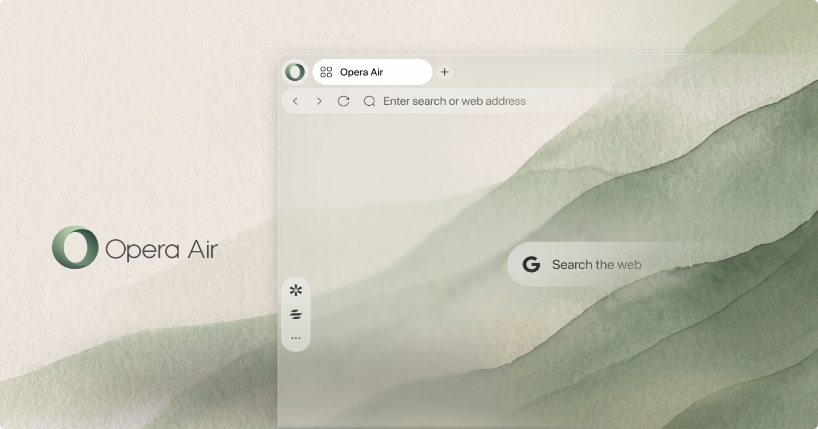
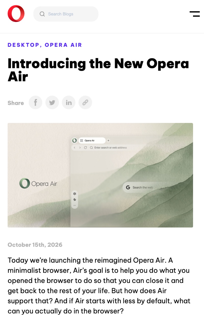
Opera Air has always been a minimalist browser focused on a distraction-free experience and mindfulness. There’s less clutter and a simple yet elegant UI design. The latest update takes this a step further.
An official blog post from Opera goes as far as calling it a “New Opera Air.” While I wouldn’t personally classify the changes as being this radical, it’s a good improvement over the 2025 version of the browser regardless.
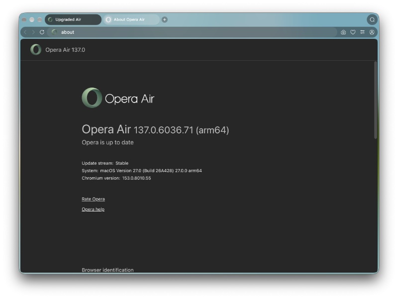
As soon as I opened Opera Air, I was greeted with two back-to-back updates; basically, I had to update twice to reach the latest version for some reason. Either way, the latest version at the time of writing is v137.0.6036.71 (on macOS).
It also shows you a card-style summary of what has changed.
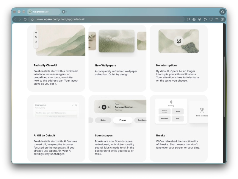
I have elaborated further in the points below.
- Higher emphasis on cleanliness: As soon as you open the browser, there are no preset shortcuts/ads. There’s zero clutter next to the address bar, and even the New Tab page is the cleanest one I’ve ever seen.
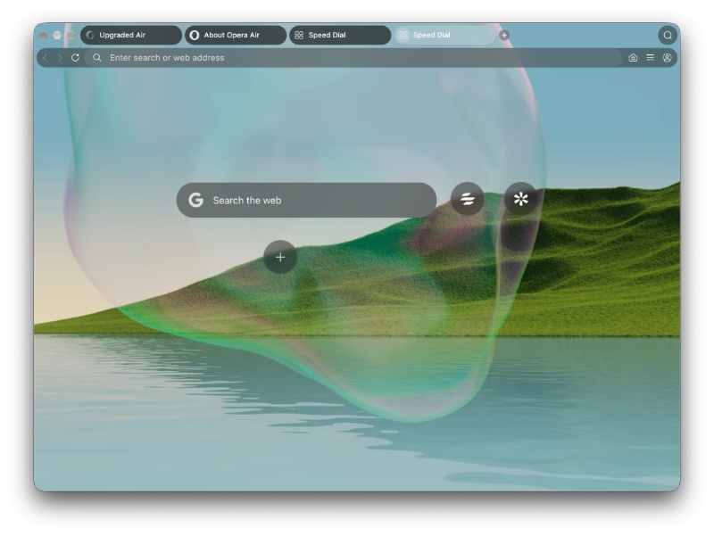
- A new set of wallpapers that are “Quiet by design.” Just right-click on the New Tab page, and you’ll find the option to set the wallpaper.
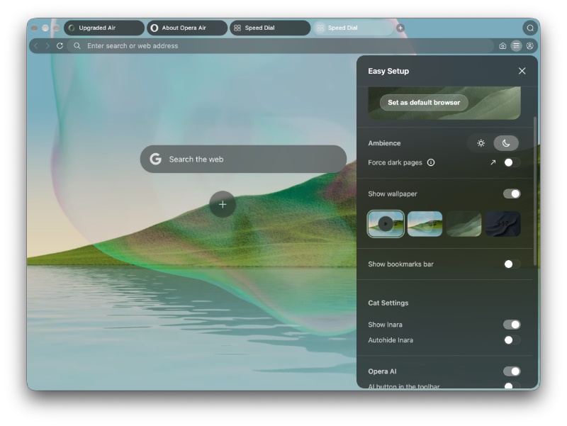
- Opera Air does not send you any notifications by default to prevent interruptions.
- AI is completely disabled by default. None of the AI features are enabled on fresh installs.
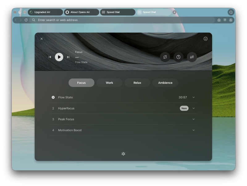
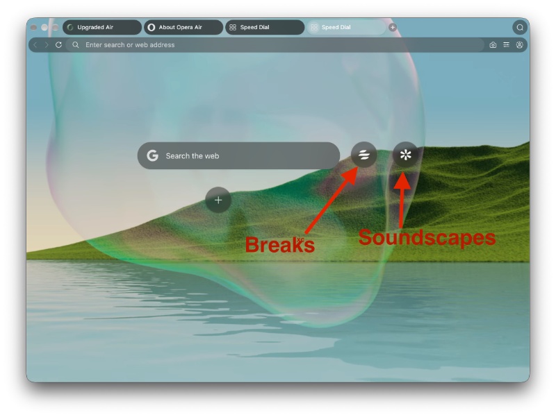
- The “Boosts” feature, which plays music, has been renamed to “Soundscapes.” This music helps you relax or focus, and the quality of the music has allegedly improved. The available music options are separated into 4 different categories.
- The “Breaks” functionality has improved, with a better UI design and much better functionality overall. You can set custom timers now.
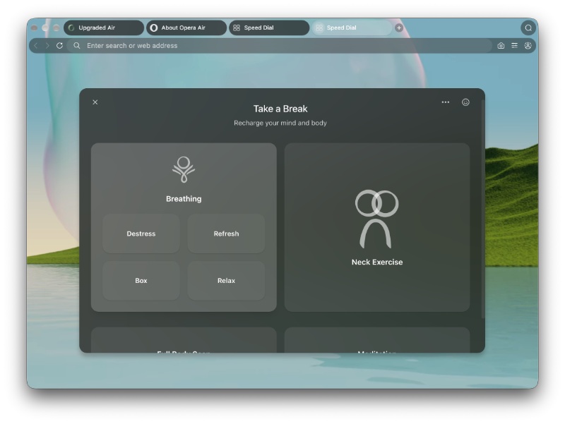
You can view the official blog post about these changes here.
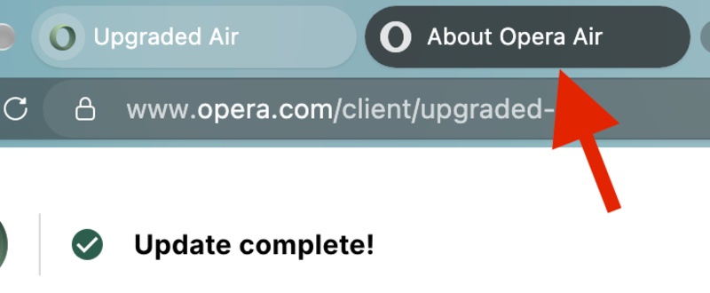
In this update, I also noticed that the UI design issues have not been completely addressed. One major issue I observed: The highlighted tab (the tab that you’re currently on) is highlighted in a light color, and others are in a darker color, which can get really confusing while browsing.
All in all, this update brings some much-needed improvements to the minimalism-focused browser.


Sudhanshu K
329 Posts
I have been a consumer technology enthusiast for over 5 years. Thanks to my experience in software beta testing and product reviews, I've understood and learnt a lot about what bugs and issues bother people, and I spend time trying to simplify their solutions. I cover smartphones, software, social media, apps, AI, and most consumer tech gadgets. Actively pursuing a Computer Science bachelor’s degree. I'm mostly active on Twitter/X (@TechWhirlUlt), drop a DM or tag me if you want to share info or connect!