Google Chrome’s bottom address bar on Android is finally getting the tab button it always needed on the new tab page, and the fix is already live in the latest Canary build.
After I installed Chrome Canary 150.0.7869.0 and messed around with the ‘Android Bottom Bar flag’, it did move the tab icon to the bottom.
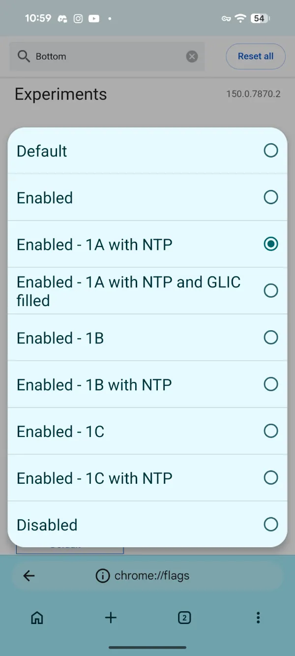
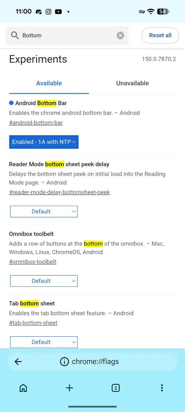
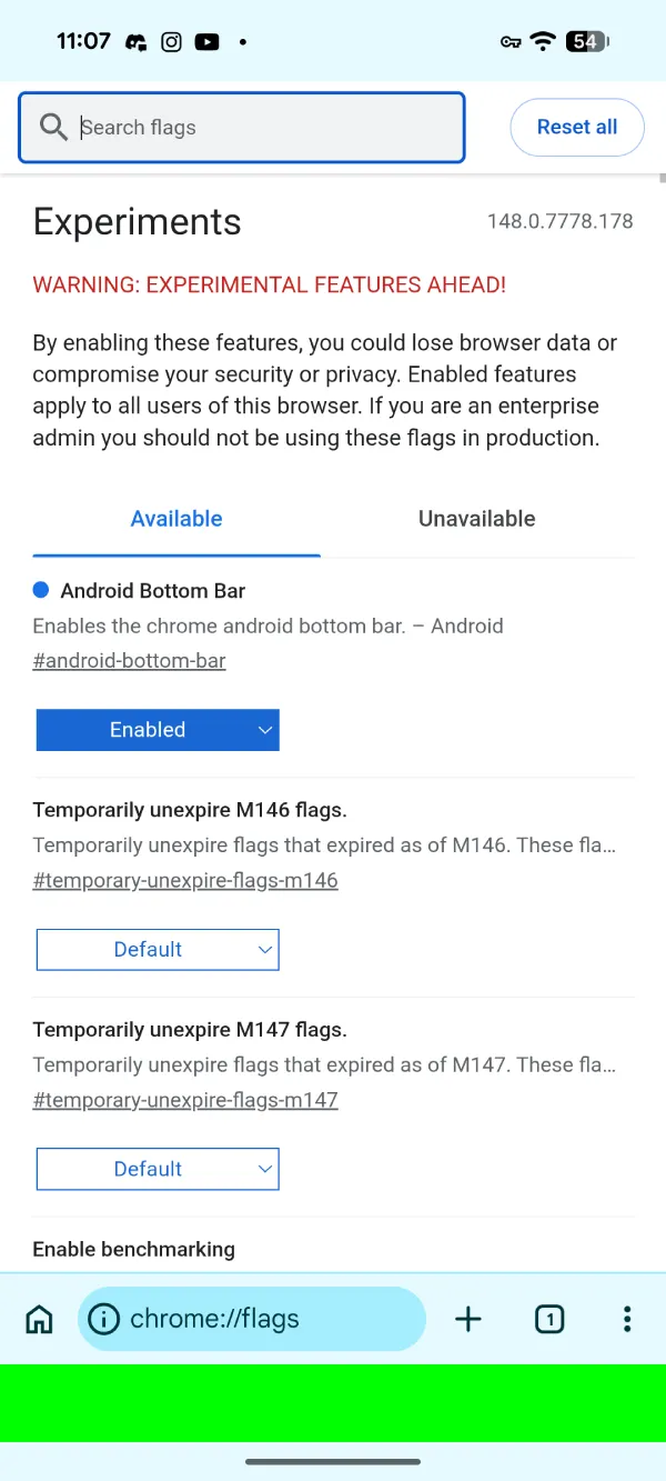
To enable it yourself, you have to go into chrome://flags and then enable #android-bottom-bar. In my testing, choosing ‘Enable – 1A with NTP’ worked.
The tab button slid straight down next to the address bar on the new tab page. No more reaching up while the rest of the interface is at the bottom. It finally feels like one coherent bottom bar instead of a half-finished experiment.
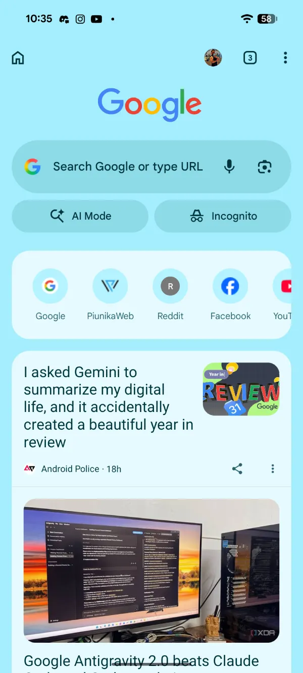
The same flag has existed in stable Chrome for months, but it never delivered the full experience. On regular web pages, the tab button already moves to the bottom. But the new tab page never got the treatment. You only got a thin green strip at the bottom. The tab switcher and other controls stayed in their old positions, which made the whole feature feel pointless for anyone who actually uses the bottom address bar every day.
This Canary build fixes that problem. There are a few layout choices under the flag, so you can adjust spacing and behavior a little. It is not a dramatic redesign, just the missing piece that makes the option worth using.
I checked the stable channel right after and the old behavior is still there. The green bar appears, but nothing else moves. So the real improvement is still a few weeks or one major update away, assuming Google keeps the current momentum.
People who keep the address bar at the bottom have been asking for this exact fix for a long time. The previous implementation felt like Google stopped halfway. This one suggests they came back and finished the job properly.
We’ll just have to wait and see how long it takes for Google to push this to the stable release as well.


Dwayne Cubbins
2772 Posts
I cover fast-moving stories across apps, online platforms, and everyday tech — phones, wearables, consoles, and whatever else people are fighting with this week. Bugs, rollouts, scams, policy enforcement, and the occasional internet-culture rabbit hole are all fair game. My goal is simple — make confusing tech news readable. When I'm not working, I'm working out or chilling with my dog. Got a tip? You can find me on X @dcubbins.
Next article View Article