


Google has made a small but noticeable change to the logo on its search homepage. The company replaced the Product Sans typeface it had used for years with its current Google Sans font. This silent tweak landed without any official word from Google and spread to users over the past week.
I checked my own search page and the new logo is already there. Most visitors will probably not spot the difference right away unless they look closely or compare it with a screenshot from last month. Once you do notice it though the page feels a bit different. The top of the screen no longer has that same visual weight it carried before.
The change first got attention after an X user named MondySpartan asked followers if the homepage looked off to them. Several people replied that they had seen the same thing.
![]()
Designer Drexel then posted a layered comparison that makes the switch impossible to miss.
The new letters have a thinner overall appearance. The lowercase o characters that used to form perfect circles now look slightly flatter. Google has relied on the older geometric style since 2015, so this marks a clear break from that era.
According to the font design breakdown, Google Sans came about because Product Sans had clear limits outside of big lockups. Marketing teams liked the look for ads but found it less effective at smaller sizes or in quick glances. Product teams also needed something better for interfaces, so designers refined the shapes and proportions to produce a more flexible typeface that performs across sizes and contexts.
As expected, people have plently of thoughts about the change. Some say the lighter weight gives the logo a cheap or unfinished look. Others simply prefer the bolder version they grew used to over the years. User Xenoteca called the new design deformed and unbalanced and noted that the uppercase G now seems too small next to the other letters.
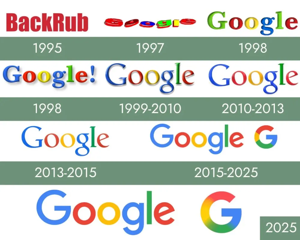
Someone even shared a roundup of Google’s logo evolution over the years. You can check it out below:
That said, this change fits a pattern of visual updates across Google products.
Last week, we covered the rollout of new gradient icons for Workspace apps. Those icons dropped the solid backgrounds that had defined them for years in favor of gradient coloring and more unique designs.
Another user named spicykat360 said the logo change started showing up for some accounts about six days ago. It no longer feels like a limited test and instead looks like a permanent update that will reach everyone.
Google often introduces these minor design tweaks without much notice. The company tends to let people get used to the new appearance rather than explaining every adjustment. The search page now has a lighter logo sitting above the search box, and that is likely how it will stay.


Dwayne Cubbins
2771 Posts
I cover fast-moving stories across apps, online platforms, and everyday tech — phones, wearables, consoles, and whatever else people are fighting with this week. Bugs, rollouts, scams, policy enforcement, and the occasional internet-culture rabbit hole are all fair game. My goal is simple — make confusing tech news readable. When I'm not working, I'm working out or chilling with my dog. Got a tip? You can find me on X @dcubbins.