When Sonos pushed its controversial app redesign, the backlash did not stay confined to Reddit threads and support forums. It spilled into the wider tech conversation, forced public apologies, and eventually became part of the story that ended with CEO Patrick Spence’s firing in January 2025, after the redesign reportedly wiped nearly $500 million from the company’s market value. That is the kind of fallout that should make any company sit up and rethink how it handles a major app transition. And right now, Fitbit users are watching Google roll out its redesigned Google Health app and feeling an uncomfortable sense of déjà vu.
The frustration is not abstract. It is visible in the screenshots, the forum posts, and the complaints piling up since the new app started replacing the Fitbit app on May 19. We already covered one of the early pain points in our report on the Google Health app calorie deficit feature, but that issue appears to be just one part of a much broader problem: users do not simply dislike the redesign; many feel the transition itself is broken.
What stands out most is how quickly the conversation has shifted from “this is different” to “this is worse.”
One of the clearest complaints is the new home screen layout. In the screenshots shared by users, the app now leans heavily on oversized tiles, with the most important data crowded into a few large cards while the rest of the screen is left with awkward empty space. One user summed up the problem bluntly: “Why so much white wasted space?” Another wrote that the app feels “inoperable” because it is hard to navigate and the layout seems to get in the way of actually seeing the numbers people care about.
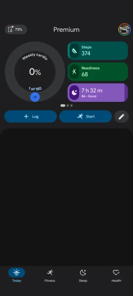
That complaint is not hard to understand when you look at the images. The Today tab does highlight steps, readiness, and sleep at the top, but then a huge block of empty space sits underneath, making the interface feel unfinished rather than intentional. Google’s own guidance makes the design philosophy even clearer: users can customize the Today tab, but they cannot simply swap the large primary tile to sleep. Instead, they are told to enable Sleep, then drag tiles around so the sleep card appears higher in the feed. In other words, the app is technically customizable, but not in a way that feels simple or obvious.
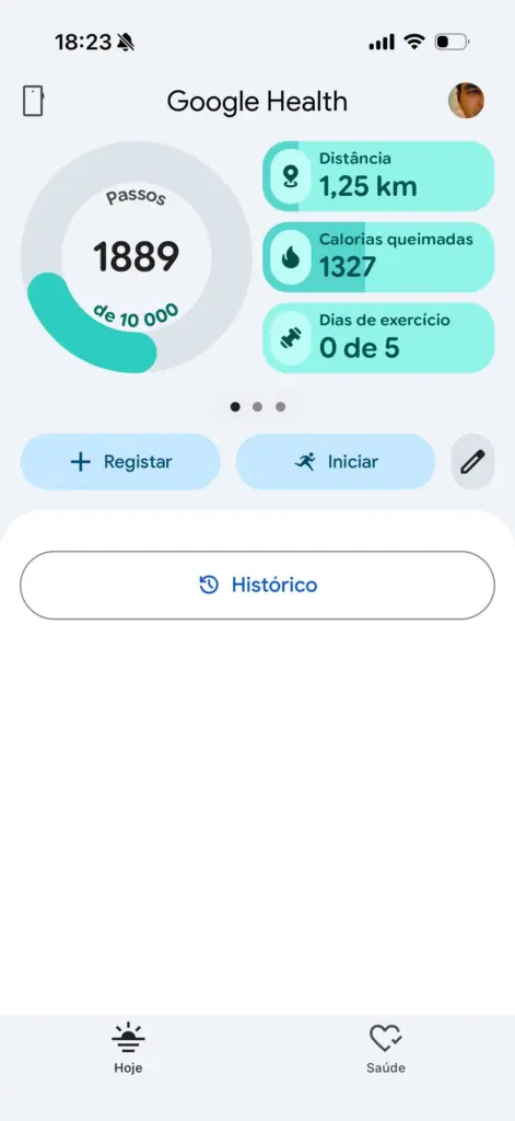
A large part of the backlash also centers on missing or downgraded Fitbit features. Several users say the hourly step tracking graphics are gone, including the familiar day-by-day visual that showed progress in chunks. Others say the 250-step reminders that helped them monitor movement throughout the day have disappeared. For some users, that is not a cosmetic loss. It is a practical one, especially for those who rely on those reminders as part of their health routine.
Then there is the issue of sleep. Fitbit’s old setup let users surface sleep data more prominently, but the new app appears to make that harder for some people. One user explicitly said they were trying to keep sleep as a large tile, as they had on Fitbit, but could not. The result, as they put it, was a design change to something that wasn’t broken. That line captures the heart of the backlash. Users are not just mad that Google changed the app. They are mad that Google changed the app in ways that seem to make core information harder to access.
There is also growing frustration with the AI-driven coaching layer. Multiple users say the Coach prompts, AI text, and conversational suggestions get in the way of the app they actually opened to check their health data. Some users complain about AI slop taking up space before the real stats appear. Another says the AI coach feature feels unnecessary and even intrusive, with some users tapping it by accident. That is especially awkward for a health app, where people often want fast, quiet access to numbers, not a chatty interface that keeps trying to interpret their day for them.
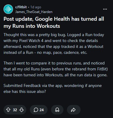
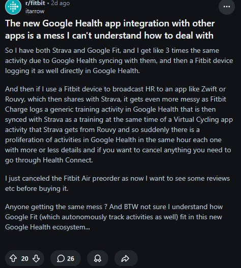
In some cases, the complaints move beyond layout into outright functionality problems. Some users say the app turned all of their runs into workouts, stripping away maps, pace, and cadence from old activities. Others say the new Google Health ecosystem creates duplicate activity entries when Fitbit, Google Fit, Strava, and other services all try to sync together. Apparently, the new app’s integration with other services is a mess, and cleaning it up requires jumping through Health Connect. That kind of confusion is exactly what makes a transition feel like a downgrade instead of an upgrade.
There are even complaints about data categories disappearing, including oxygen variation and the hourly steps view. Those are not trivial grievances. Health and fitness users are often the kind of audience that notices small changes immediately because they rely on those details daily.
This is where the Sonos comparison becomes especially hard to ignore.
Sonos did not lose goodwill because it changed things. It lost goodwill because it seemed to replace a working experience with something less stable, less intuitive, and less respectful of long-time users. The company later apologized publicly for the app failures, and the whole episode became a case study in how badly a rollout can go when the transition is too abrupt. Google risks walking into the same trap here.
The biggest strategic mistake in cases like this is not the redesign itself. It is the assumption that the old app can be removed before the new one earns trust.
That is why I keep coming back to the same conclusion: Google should have kept the Fitbit app alive for longer while it ironed out the rough edges in Google Health. They have the financial muscles for this. A parallel rollout would have let cautious users stay on the version they knew, while Google steadily improved the new one without forcing everyone through the same pain at once. Instead, the company appears to have chosen a hard replacement model, and that almost always creates resentment when the new experience is not ready for everyone.
We have seen this pattern before. An app gets a shiny new identity, users lose features or discover familiar workflows have been buried, and the company insists the change is an improvement while the community tries to make the old experience work inside the new one.
Google did warn that some Fitbit features would be dropped or reworked. This shows the company knew the migration would not be seamless. But warning users is not the same as making them comfortable. Once people start seeing dead space, missing views, duplicated entries, awkward AI prompts, and hidden customization options, the warning starts to feel more like a disclaimer than a plan.
And that is the larger lesson here.
A good redesign does not just look modern. It helps people do the same things more easily, or better, than before. Right now, many Fitbit users feel that Google Health is doing the opposite. They are not celebrating a cleaner future. They are asking for the old app back. Or at the very least, for a slower, more thoughtful transition that does not force everyone onto a half-finished replacement at once.
Google may still fix these issues. It may restore some missing views, improve the layout, and calm the backlash with updates. But the company has already lost one thing that is hard to get back once it is gone: user confidence.
And after the Sonos debacle, that should have been the first thing every app team protected.


Hillary Keverenge
2688 Posts
Tech has been my playground for over a decade. While the Android journey began early, it truly took flight with the revolutionary Lollipop update. Since then, it's been a parade of Android devices (with a sprinkle of iOS), culminating in a mostly happy marriage with Google's smart home ecosystem. Expect insightful articles and explorations of the ever-evolving world of Android and Google products coupled with occasional rants on the Nest smart home ecosystem.
Next article View Article