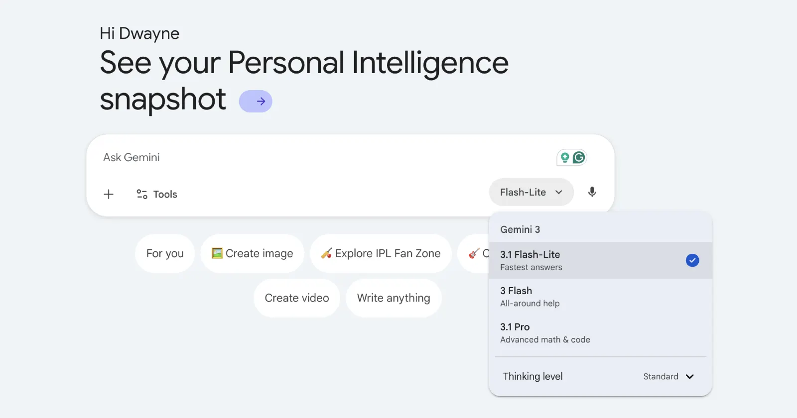
Google is pushing a major update to its Gemini web interface, introducing the previously API-only Gemini 3.1 Flash-Lite model alongside a colorful light blue redesign. The unexpected rollout of the Gemini 3.1 Flash-Lite model seems to be live for everyone, though the redesigned website is yet to go live on a wider scale.
This web deployment expands on a highly staggered mobile test from earlier this month, where the 3.1 Lite model first surfaced inside the iOS app’s model selector. At the time, the model appeared to be quietly replacing the platform’s dedicated Thinking option for a handful of accounts alongside hints of a 3.2 Flash tier. Now it is looking like Google is ready to make the Lite model a permanent, global fixture.
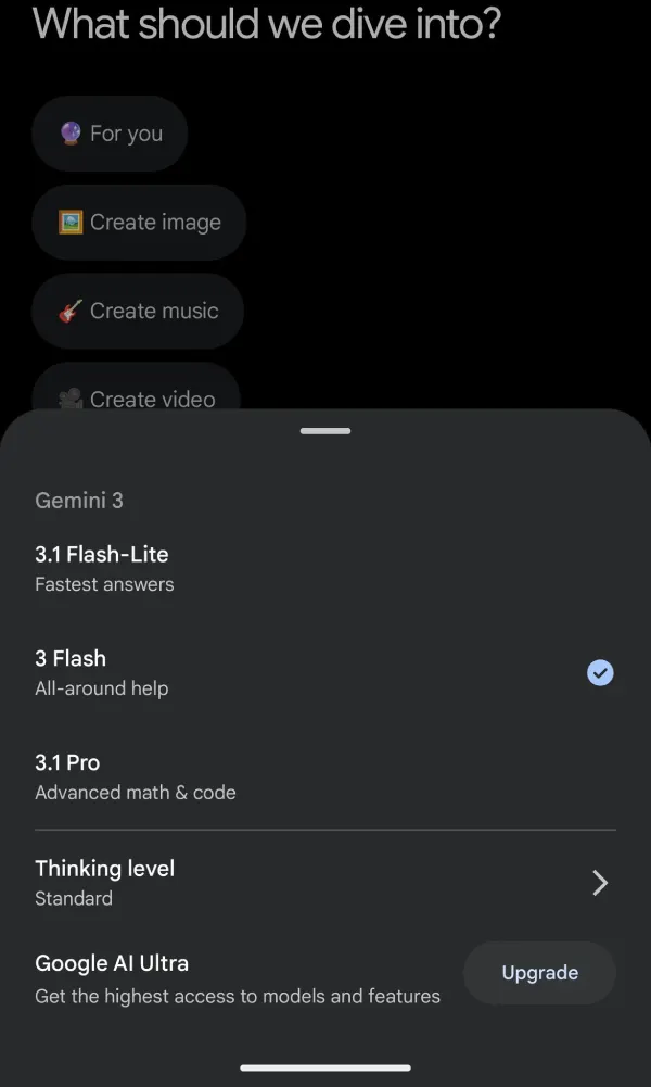
Here’s a screenshot of the model selector right now:
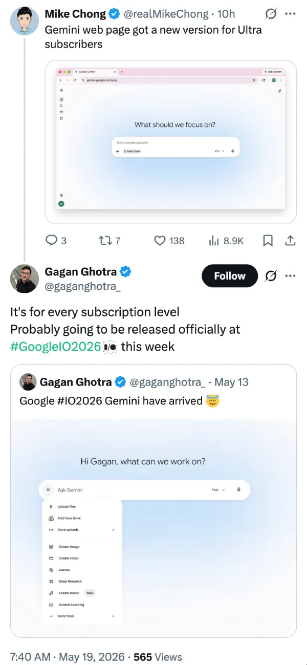
Users are already spotting the changes live on desktop. Tech consultant Gagan Ghotra shared a screenshot showing that the colorful new interface isn’t locked behind a premium paywall. Free-tier accounts are also getting the exact same light-blue glow-like effect as top-tier Ultra subscribers. There are a few other rearrangements too, apart from the splash of color.
Reports from earlier today have also highlighted that this interface refresh is not exclusive to the desktop experience. The Gemini app for Android is simultaneously rolling out a parallel redesign, mirroring the minimalist, blue-and-white gradient aesthetic seen on iOS.
While this update cleans up the mobile layout by consolidating the attachment and tool menus into a unified ‘+’ icon, it notably excludes the ‘Liquid Glass’ transparency effect from the iOS counterpart.
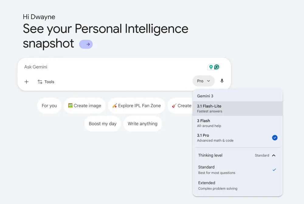
That said, structural changes to the models remain the core story. Google is tweaking the lineup so that “Thinking” is no longer a standalone model selection. Instead, the reasoning capability has transitioned into a global toggle with standard and extended levels.
This replaces the old setup where users had separate Thinking and non-Thinking Flash options.
In our tests, we spotted the new 3.1 Flash-Lite model only on the web. The Android and iOS apps still do not have the newer model. That said, at least one user who shared a screenshot on X seems to have it on the mobile app (as evident with the gesture bar in the screenshot they posted).
While it’s still too early to judge the performance, some users are venting online after noticing they are getting aggressively rate-limited on the standard Flash model and automatically kicked down to Flash-Lite mid-chat.
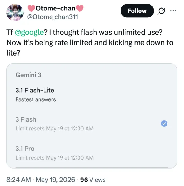
So could this be a tactic from Google to get people to use the even cheaper model? I guess we’ll have to wait and see how things play out over the coming days.
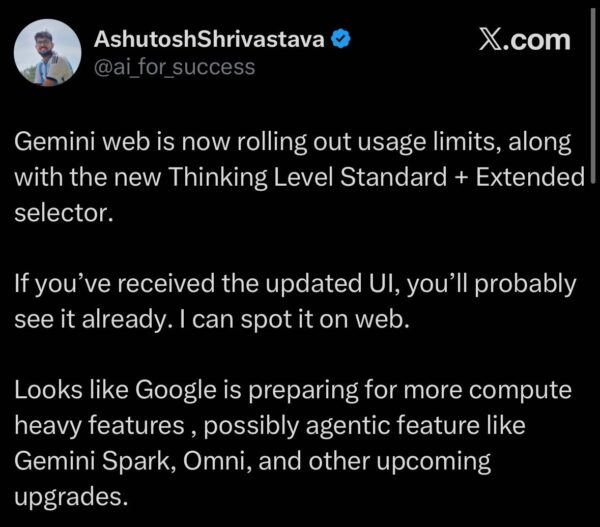
Google has already begun rolling out weekly usage tracking. Instead of the familiar daily or hourly refresh, this shift toward a fixed weekly allowance means heavy users who burn through their quota during a busy weekend could find themselves locked out for the remainder of the week.
Up until now, this specific Lite tier lived behind the scenes as an API-only option for developers running low-latency workloads. Bringing it to the mainstream web interface points to an aggressive cost-cutting strategy. Moving free accounts to a lighter, cheaper default tier saves Google serious money on compute.
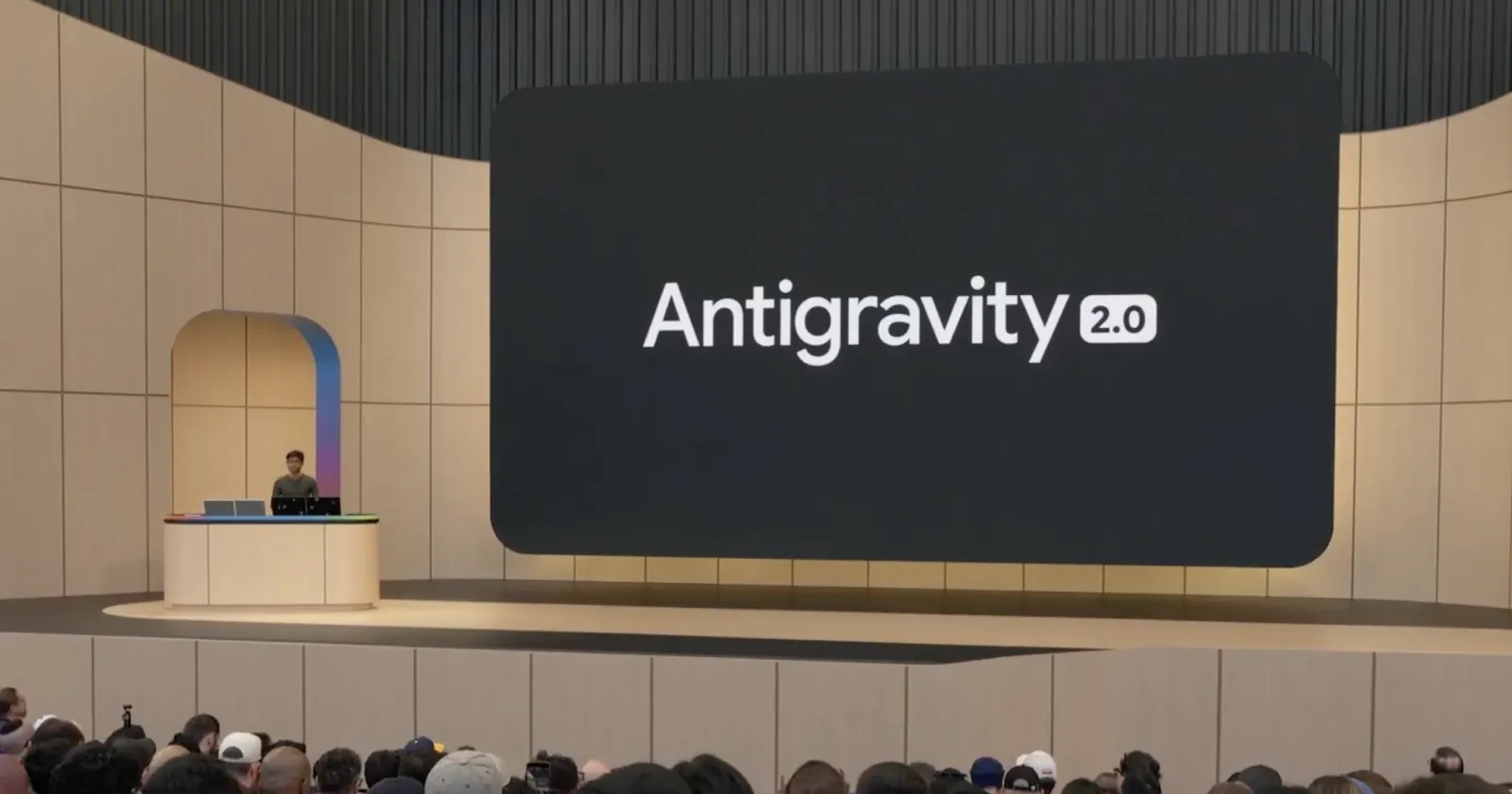
Google has not issued an official changelog regarding the UI tweaks or the model swaps. Expect the company to address the new alignment during the I/O keynotes this week, likely pitching the Lite tier as a win for real-time responsiveness.
For those interested, you can watch the keynote below when it begins later today:
Update 03:29 pm (IST): The article was updated with details about the usage limit tracker showing up for users.


Dwayne Cubbins
2776 Posts
I cover fast-moving stories across apps, online platforms, and everyday tech — phones, wearables, consoles, and whatever else people are fighting with this week. Bugs, rollouts, scams, policy enforcement, and the occasional internet-culture rabbit hole are all fair game. My goal is simple — make confusing tech news readable. When I'm not working, I'm working out or chilling with my dog. Got a tip? You can find me on X @dcubbins.
Next article View Article