


Spotify swapped its familiar green circle app icon for a glittering disco ball recently. The mirrored green sphere carries the usual three black lines and marks the company’s 20th anniversary celebrations. It showed up alongside personalized listening stats and throwback features under the “Spotify 20: Your Party of the Year(s)” push.
Much like any other change, the internet was divided over it. Some folks liked it, while others called the new icon tacky, pixelated, or just ugly. Screenshots spread on X and Reddit with plenty of complaints about how it looked next to everything else on their home screens.
![]()
That said, Spotify didn’t drag it out. On Sunday, the company replied under a post from a user asking to fire the person responsible for the redesigned icon. In the response, Spotify said, “Alright, we know glitter is not for everyone. Our temp glow up ends soon. Your regularly scheduled Spotify icon returns next week.”
![]()
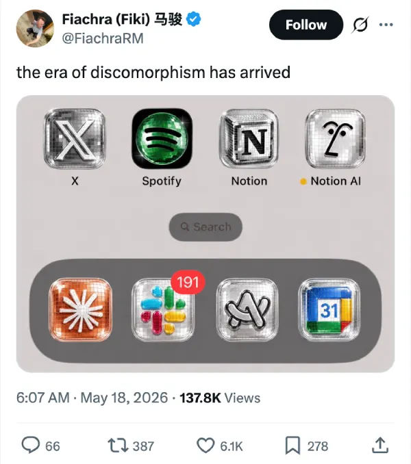
So while Spotify’s shiny disco ball icon is retiring, this brief change seems to have kick-started a trend already.
People began turning other app icons into shiny, reflective disco versions. The word “discomorphism” started circulating as shorthand for the style. An X post from @RaceJohnson that simply labeled an image with the term picked up serious reach. It now has nearly 2 million views.
![]()
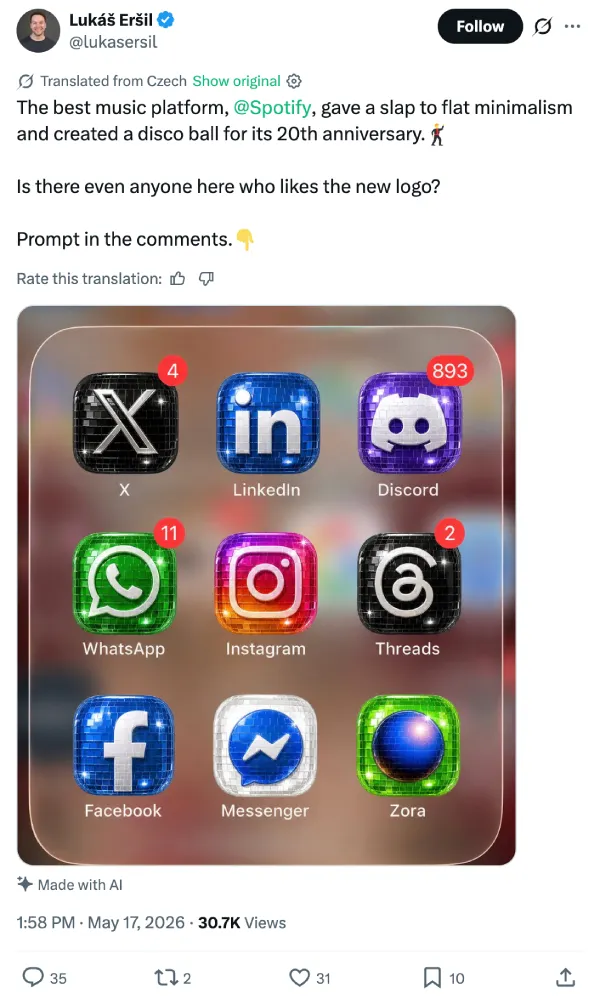
Notion leaned in too, posting its own disco-flavored image that was created by @RaceJohnson.
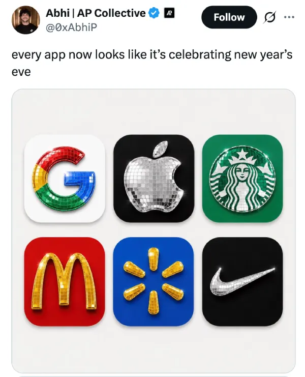
But this is just the tip of the iceberg; we’ve rounded up a few other examples shared by users on X. You can check them out below:
Okay, now that you’ve seen a bunch of logos inspired by Spotify’s disco ball logo, it’s likely that you want to experiment with the effect. If so, then designer Szymon (@aecyydesign) posted one of the clearer how-tos. He broke it into two steps with a ready prompt for ChatGPT.
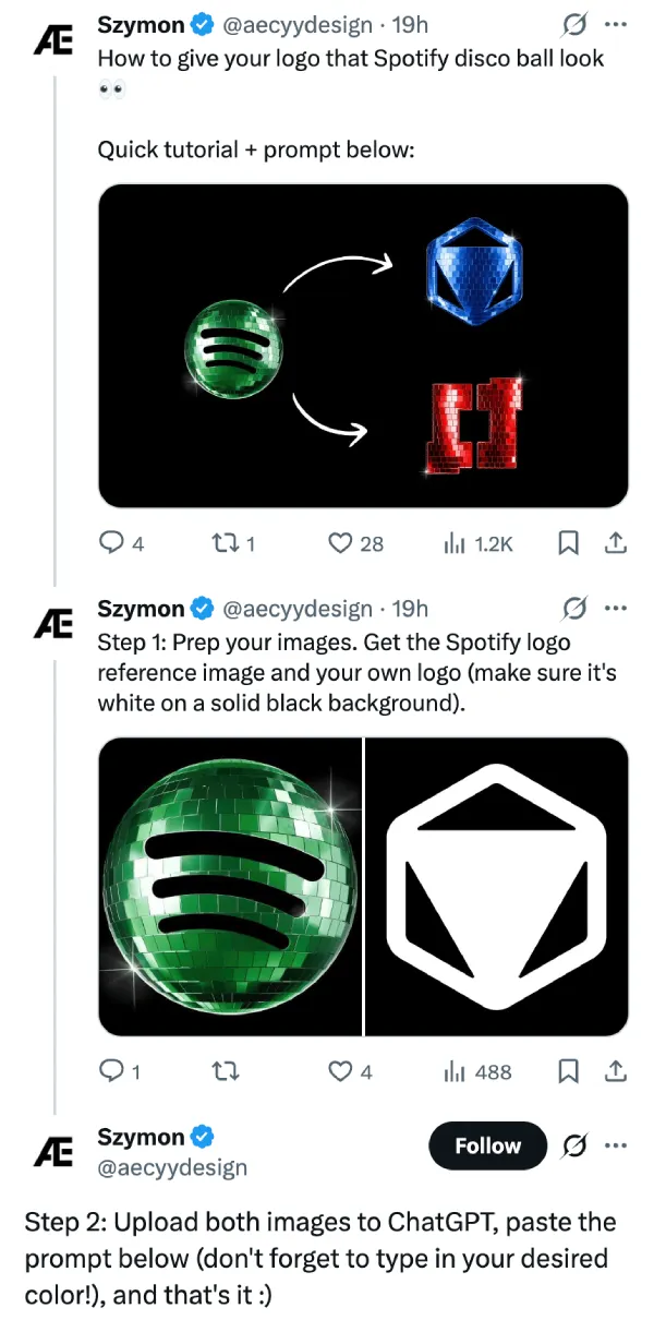
First, prep the images: grab a reference shot of the Spotify disco icon and your own logo in white on a solid black background. Upload both. Then paste the prompt and fill in the color you want for the tiles.
ChatGPT Prompt
Apply the surface material and reflective disco-ball treatment from the uploaded Spotify reference image to the second attached logo. Preserve the original logo geometry exactly, including shape, proportions, extrusion depth, bevels, camera angle, composition, and lighting setup. Replace only the material.
Recreate the mirrored tile structure exactly as shown in the reference, including the reflective square panels, tile spacing, glossy reflections, specular highlights, and sparkle behavior. Ensure the material wraps seamlessly across all visible surfaces, including the front face and side walls, with physically accurate reflections and light interaction.
Do not redesign, simplify, or reinterpret the logo in any way. Maintain the exact visual style, material fidelity, and rendering characteristics of the reference image. The only permitted modification is the overall tile color, which should be changed to [ENTER COLOR HERE] while preserving all other material properties and lighting behavior.
Output as a high-resolution, photorealistic 3D studio render with ultra-detailed 8K surface quality, crisp reflections, and clean edge definition.
Again, you can thank @aecyydesign for the prompt and steps.
With this, you can start creating your own Spotify disco ball-themed icons. Feel free to tag @piunikaweb on your creations. We’ll check them all out.
Featured image credit: @sushilwtf / X


Dwayne Cubbins
2838 Posts
I cover fast-moving stories across apps, online platforms, and everyday tech — phones, wearables, consoles, and whatever else people are fighting with this week. Bugs, rollouts, scams, policy enforcement, and the occasional internet-culture rabbit hole are all fair game. My goal is simple — make confusing tech news readable. When I'm not working, I'm working out or chilling with my dog. Got a tip? You can find me on X @dcubbins.