Mozilla has a big visual overhaul in the works for Firefox. The project goes by the name Nova, and it focuses on very rounded elements throughout the interface. Curious users who like to experiment have already worked out how to activate it early on. But they are finding out the hard way that it breaks quite a bit of the browser in its current state.
Back in March, some leaked mockups gave the first look at pastel gradients and floating style menus. Just in the last few days, people discovered the way to force this early code live. It works on both the Nightly builds and the standard stable release.
Getting it running involves a quick visit to the browser’s advanced configuration page. Changing the flag browser.design-tokens.nova over to true brings up the new look even for those on the regular version.
Doing that at this point is not a great idea though.
The instructions made their way to the main Firefox subreddit recently. The discussion filled up fast with reports of broken layouts and strange appearances.
One user described pinned tabs that stretched all the way across the top and hid every other open tab. Another mentioned the address bar becoming scrambled with buttons that looked completely off.
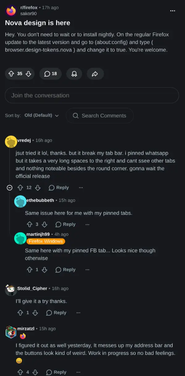
What is happening is that the redesign remains incomplete. A commenter who seemed to understand the code pointed out that the current flag only brings in a portion of the new stylesheet. The bigger layout adjustments needed to support Nova have not arrived yet. Without them, the browser tries to apply rounded styling to the existing structure meant for sharper corners. The result is a mismatched and broken experience.
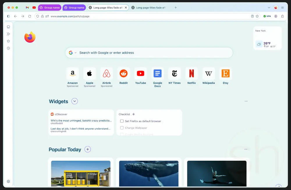
In its finished form, Nova aims for a softer overall aesthetic in the open-source browser. Earlier reports described plans to place web content inside a rounded container while turning the tabs into floating island-like elements.
That said, some Firefox users aren’t big fans of this potential design. One comment in a separate thread called the pill-shaped tabs weird and dated-looking.
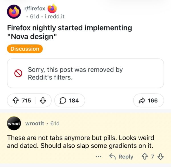
Others complained that the aggressively rounded corners end up resembling older Chrome designs or recent changes from Apple. A number of people simply want the browser to make efficient use of space rather than introducing large gaps and empty areas.
The toggle stays out of sight for now, and that is intentional. If someone wants an early preview, they can flip the switch, but they need to be okay with their browser falling apart during everyday use.


Dwayne Cubbins
2772 Posts
I cover fast-moving stories across apps, online platforms, and everyday tech — phones, wearables, consoles, and whatever else people are fighting with this week. Bugs, rollouts, scams, policy enforcement, and the occasional internet-culture rabbit hole are all fair game. My goal is simple — make confusing tech news readable. When I'm not working, I'm working out or chilling with my dog. Got a tip? You can find me on X @dcubbins.
Next article View Article