


Dropping today: our new logo in dynamic backgrounds, profile backgrounds, and gamer pics! pic.twitter.com/VSUDSTBhQx
— Asha (@asha_shar) May 1, 2026
Xbox and Spotify have each rolled out updates to their long-standing logos, suggesting an evolution of brand visuals. These changes occurred amid the Xbox division getting a new CEO.
A post on Reddit shows the new Spotify logo, and Asha Sharma, the CEO of Xbox, directly announced the Xbox design refresh through a post on X.
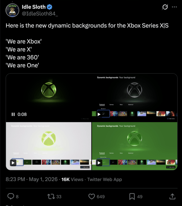
Xbox has introduced a refreshed logo that features a glossy, glass-like finish. It maintains the signature vibrant green color. While the design features the iconic Xbox orb, it also adds more depth with subtle light reflections and effects.
We can spot similarities with Apple’s Liquid Glass aesthetic; the design is now three-dimensional in appearance, and it’s no longer a 2D flat logo.
The design is part of a rebranding that restores Xbox as the central identity, replacing Microsoft Gaming. There are new dynamic backgrounds for the Xbox Series X and S as well, and they showcase the new logo with some themed visuals. You can view the clips showing the new dynamic backgrounds from here.
The Xbox redesign was received very well, with users noting that it’s good to see brands actually listening to users and dropping the older design language.
It’s not just Xbox that’s shifting its design identity, but the biggest music streaming service, Spotify, is also testing a new iOS app icon in its Testflight beta. The previous minimalist green circle-and-wave motif has been replaced with a new disco ball.
![]()
The spherical icon uses mirrored green tiles, forming a reflective texture. It also has sparkle effects and a playful curvature.
The reception to the new Spotify logo is mixed. A lot of people feel it’s not a very good attempt. Personally, I think the design is rather unfinished. The three black stripes on the logo look a bit out of place with the overall colors.
![]()
However, since this is a logo in the Testflight beta, it may be refined further before a public release. A lot of people feel it may just be an experiment.
It appears that both companies are moving away from sterile, corporate logos. It begins with how the app icon looks on the home screen, and may eventually lead to a design shift in the entire app.
These updates to both of the logos signal a shift in the industry. For several years, users have complained about the trend of corporate minimalism and 2D logos. Earlier designs had a lot of depth, and the new minimalist logos were called “aesthetic terrorism.”
Thankfully, that trend seems to be slowly fading away, starting with Apple’s redesign of iOS to a 3D aesthetic. In the future, many companies may follow suit; I believe Xbox and Spotify are first in the list.

We stand out from the tech-media crowd because we break news stories; we mainly bring you stuff that you won’t find anywhere in the mainstream tech media. Our stories have been picked up by some of the world’s most popular websites and media outlets—more info is available here.

Dwayne Cubbins
2728 Posts
I cover fast-moving stories across apps, online platforms, and everyday tech — phones, wearables, consoles, and whatever else people are fighting with this week. Bugs, rollouts, scams, policy enforcement, and the occasional internet-culture rabbit hole are all fair game. My goal is simple — make confusing tech news readable. When I'm not working, I'm working out or chilling with my dog. Got a tip? You can find me on X @dcubbins.
Next article View Article
Some ChatGPT users report 'Unknown error occured' when uploading files
Update 20/05/26 - 21:20 pm (IST): Today, we are again seeing reports of the same issue. Here's a screenshot showing some fresh reports:
However, OpenAI hasn't...
May 11, 2026 2 Min Read