





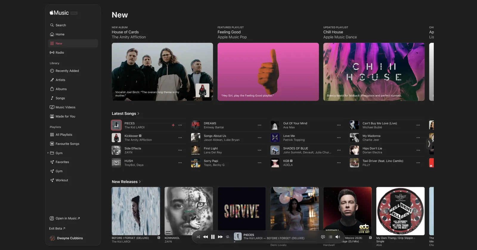
Apple Music on Web updated design out now on beta
byu/antcpz inAppleMusic
Apple Music is testing a subtle visual refresh for its web player in beta, with early users spotting changes to the sidebar and playback controls rather than a full redesign.
The update is live on beta.music.apple.com and was first highlighted in a post on Reddit’s r/AppleMusic subreddit. You can try out the new UI yourself, but the beta version is slightly glitchy, at least in my brief testing.
At a glance, it might look like a bigger overhaul. It isn’t. The core layout across pages like Home, albums, and search remains largely the same. Cards, grids, and content structure are basically untouched.
What has changed is the framing around it.
The left sidebar now uses a translucent, frosted panel instead of the older solid look, giving it a softer feel. The “Now Playing” bar has also been redesigned, with a more rounded, floating appearance that leans into Apple’s newer UI direction. It’s also positioned at the bottom.
It clearly takes cues from Apple’s broader “Liquid Glass” design language, but this isn’t a full implementation. That style is typically more transparent and glass-like. Here, Apple is going for something more muted, closer to a frosted blur effect.
You can check out the side-by-side comparison screenshots below for reference. The main content areas are nearly identical between versions, with most visual changes concentrated in the navigation and the Now Playing bar.
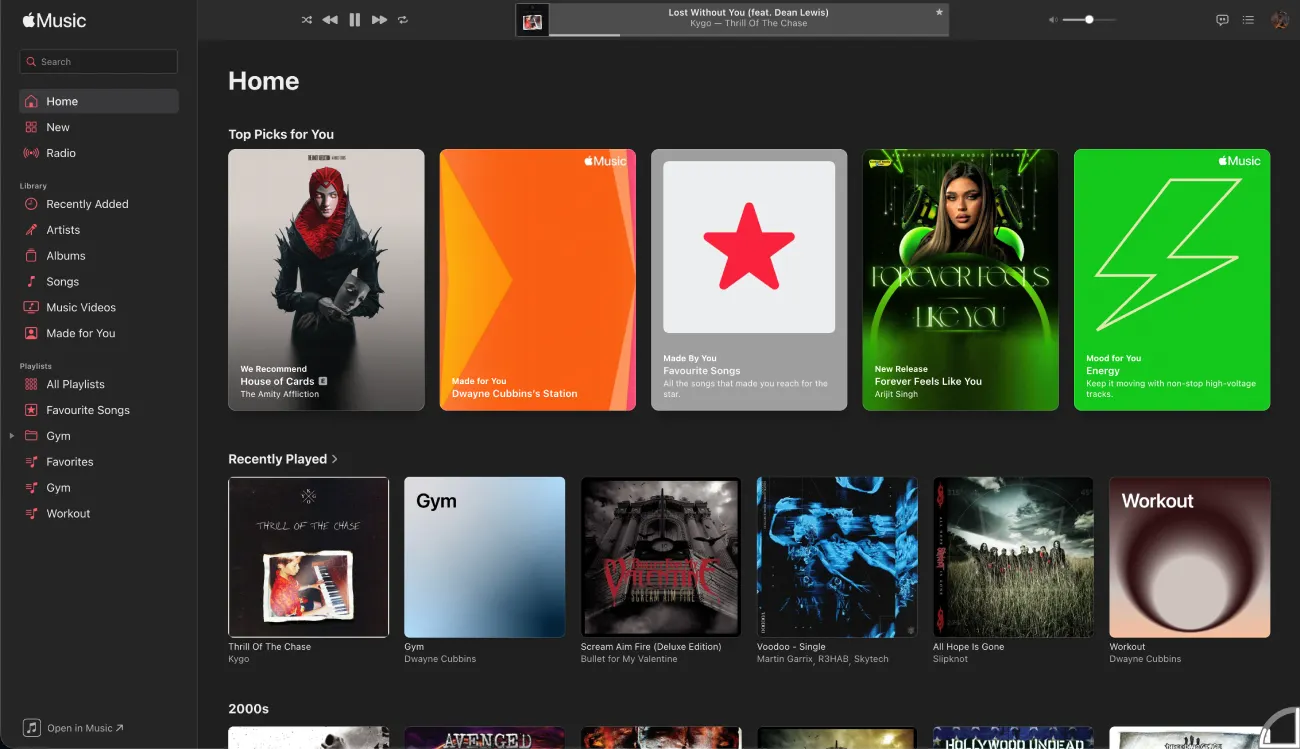
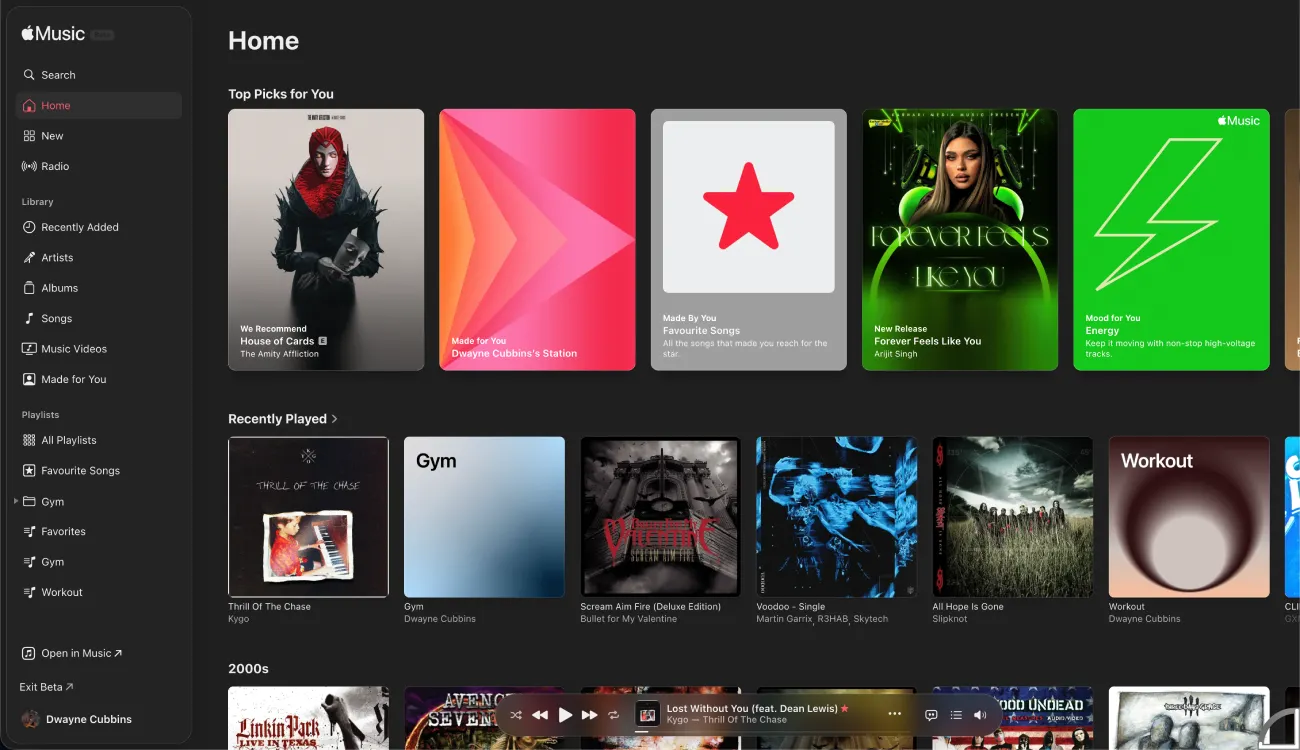
That lighter touch might actually be intentional. Apple’s web player has lagged behind its native apps for a while, and a smaller refresh like this is a safer way to modernize it without breaking familiar workflows. Plus, I doubt it would be worthwhile for Apple to even try to replicate the Liquid Glass UI on a web player, given the complexities.
User reactions so far are mixed. Some like the cleaner look, especially the updated player bar. Others say performance still feels sluggish in places, which has been a long-running complaint with the web version.
There are also ongoing frustrations that this update doesn’t address, including playback quirks and missing controls. So while it looks a bit nicer, the experience itself may not feel dramatically different yet.
Apple hasn’t said anything publicly about the redesign, and it’s still limited to beta. For now, this looks more like a visual tune-up than a major rethink.

We stand out from the tech-media crowd because we break news stories; we mainly bring you stuff that you won’t find anywhere in the mainstream tech media. Our stories have been picked up by some of the world’s most popular websites and media outlets—more info is available here.

Dwayne Cubbins
3093 Posts
I cover fast-moving stories across apps, online platforms, and everyday tech — phones, wearables, consoles, and whatever else people are fighting with this week. Bugs, rollouts, scams, policy enforcement, and the occasional internet-culture rabbit hole are all fair game. My goal is simple — make confusing tech news readable. When I'm not working, I'm working out or chilling with my dog. Got a tip? You can find me on X @dcubbins.
Next article View Article
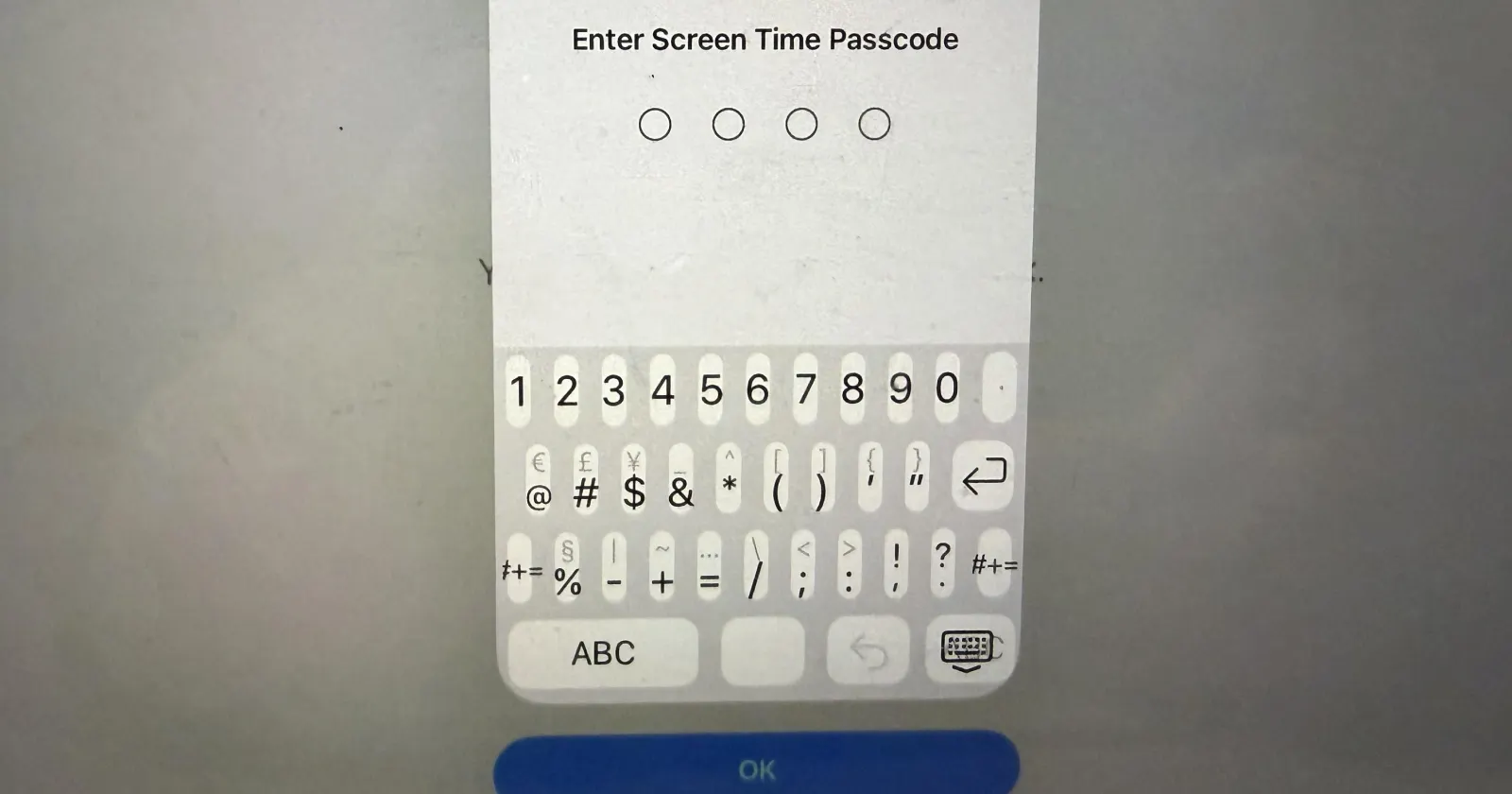
Here's a workaround for the horrible Screen Time keyboard bug on iPadOS 26.4.1
Apple device owners updating to iPadOS 26.4.1 are running into a frustrating visual glitch that makes typing a Screen Time passcode nearly impossible. Instead of the standard number...
May 04, 2026 2 Min Read