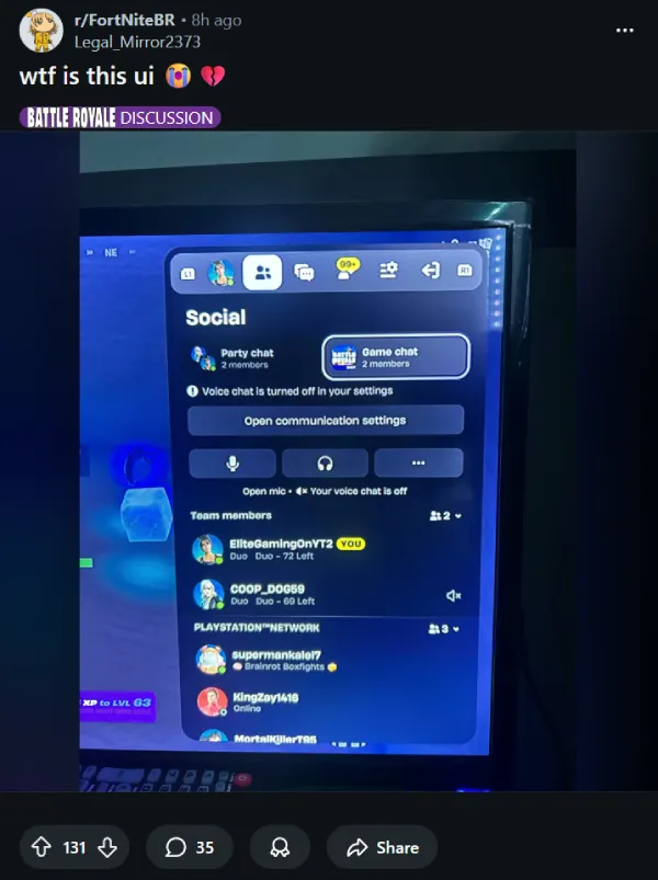
Fortnite’s latest UI overhaul is landing with a thud, as fresh complaints pile up about clutter, lost personality, and slower navigation.
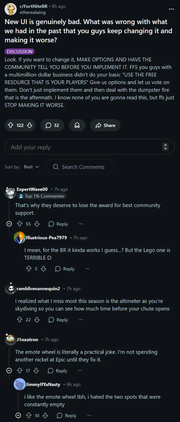
One big thread on r/FortNiteBR captures the frustration: why alter a layout players had already adapted to when the replacement feels less effective?
The new look is being described by players as “cluttered” and “overwhelming,” with visual elements that seem designed for mobile touchscreens rather than controllers or mouse-and-keyboard setups. One common complaint involves the new emote wheel, which now requires extra button presses to navigate, adding unnecessary friction to what used to be a seamless interaction.
It doesn’t help that the “Recent Modes” button — a massive quality-of-life feature for quick-switching games — has been removed entirely.
Visually, the HUD feels busier than ever. The new sprint bar and prominent storm notifications take up significant screen real estate, distracting from the actual gameplay. As one Reddit user succinctly put it, the new UI is “genuinely bad,” begging the question: “What was wrong with what we had?”.
Players in the same thread are also pointing to smaller functional regressions too, like missing skydiving info they relied on (one example mentioned is the altimeter), along with complaints that some modes, like LEGO Fortnite, feel especially rough with the new interface.
A big part of the anger is tied to the pause menu itself, not just the in-match HUD. The change is also making rounds on Facebook, where screenshots show Epic has revamped the Fortnite menu flow again, and players say it makes basic stuff like backing out and leaving a match feel needlessly different than what their muscle memory expects.
And the frustration clearly isn’t staying on Reddit. On X, one player flat-out begged Epic to stop tinkering, writing “STOP TOUCHING THE UI THE FRIENDS LIST UI WAS JUST FINE BEFORE.”
Another called it “L after L,” saying the pause menu change felt pointless, especially for longtime spenders who feel like the game keeps shifting under them.
Others say the new interface is actively getting in the way, like the complaint that the winning screen is now “covered with a new UI” that pushes Battle Pass promos, and that the match end rush barely leaves you a few seconds to emote before the new overlay takes over.
Even for players who don’t hate the look, the vibe is that it’s unstable, with one post saying the new Fortnite UI is “hella buggy” on their setup.
But the UI isn’t the only thing frustrating players this week.
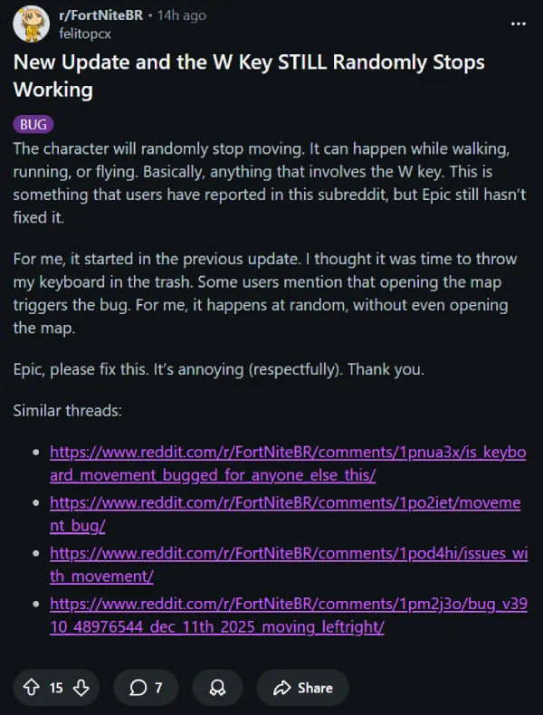
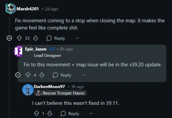
A nasty bug has surfaced where your character’s forward movement completely halts after you close the map. Whether you’re auto-running or holding the W key, closing the map forces you to stop dead in your tracks. In a competitive Battle Royale setting, that can be a death sentence.
According to Reddit user Marsh4201, this glitch makes the game feel unresponsive and sluggish. Fortunately, there is light at the end of the tunnel for the movement issue. Epic_Jason, a Lead Designer at Epic, confirmed in a response to the same user that a fix for the map movement bug is locked in for the upcoming v39.20 update.
I’m hoping that update arrives sooner rather than later, because losing a crown victory to a UI bug is a special kind of pain.
As for the interface itself, we likely won’t see a reversion. Epic rarely backtracks fully on design overhauls, but we can hope for tweaks that reduce the clutter in future patches.

