


Over the past week, several users have noticed that Google Search has suddenly reverted to what appears to be an older design, complete with the classic logo, an old-style search bar, and a simplified results layout. Users on both Chrome and Safari have spotted the throwback interface across desktop and mobile devices.
While at first glance it may look like a glitch, this is most likely part of an A/B test or temporary “holdback” experiment being run by Google. Such tests are common for the Search team, which frequently experiments with interface variations to gauge user engagement or performance.
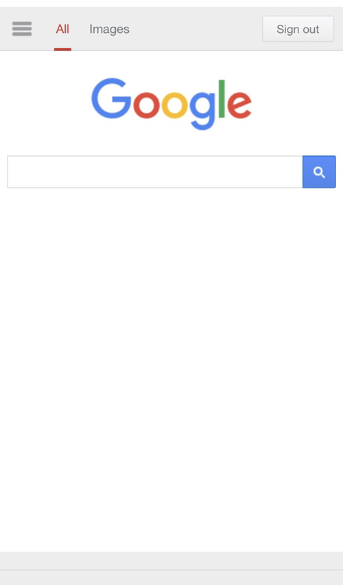
Interestingly, the reports are inconsistent: the issue doesn’t appear on all devices or browsers. Tests I’ve done on iPhones running iOS 18 and iOS 26, Android devices, and even macOS 26 systems show the normal interface, further suggesting that only a small group of users have been targeted for this round of testing.
Google’s Search Central blog posted an update on November 5 outlining its ongoing effort to “simplify the search results page” by removing lesser-used features and improving page speed. That announcement may be connected to this UI test, which could be evaluating whether a more stripped-down interface helps people find information faster.
Some users are embracing the nostalgic look, saying it feels simpler and less cluttered. Others, however, are frustrated by missing features like the inability to save images directly from search results or access newer AI-driven elements.
If you’re among those seeing the old UI, there’s no cause for concern. It’s almost certainly a temporary rollout and should revert automatically once Google concludes its testing. The company routinely collects feedback and behavioral data from these experiments to determine whether to keep, adjust, or abandon such layouts.
In short: this isn’t a bug, and your Google Search isn’t broken. It’s just Google quietly experimenting, and giving a few users a brief trip down memory lane in the process.

Hillary Keverenge
2473 Posts
Tech has been my playground for over a decade. While the Android journey began early, it truly took flight with the revolutionary Lollipop update. Since then, it's been a parade of Android devices (with a sprinkle of iOS), culminating in a mostly happy marriage with Google's smart home ecosystem. Expect insightful articles and explorations of the ever-evolving world of Android and Google products coupled with occasional rants on the Nest smart home ecosystem.