The Minecraft Bedrock community is fed up with Microsoft’s latest UI change, and this time the backlash isn’t going away quietly. Update 1.21.120 brought a redesigned pause menu that’s got players questioning whether anyone at Mojang actually plays their own game.
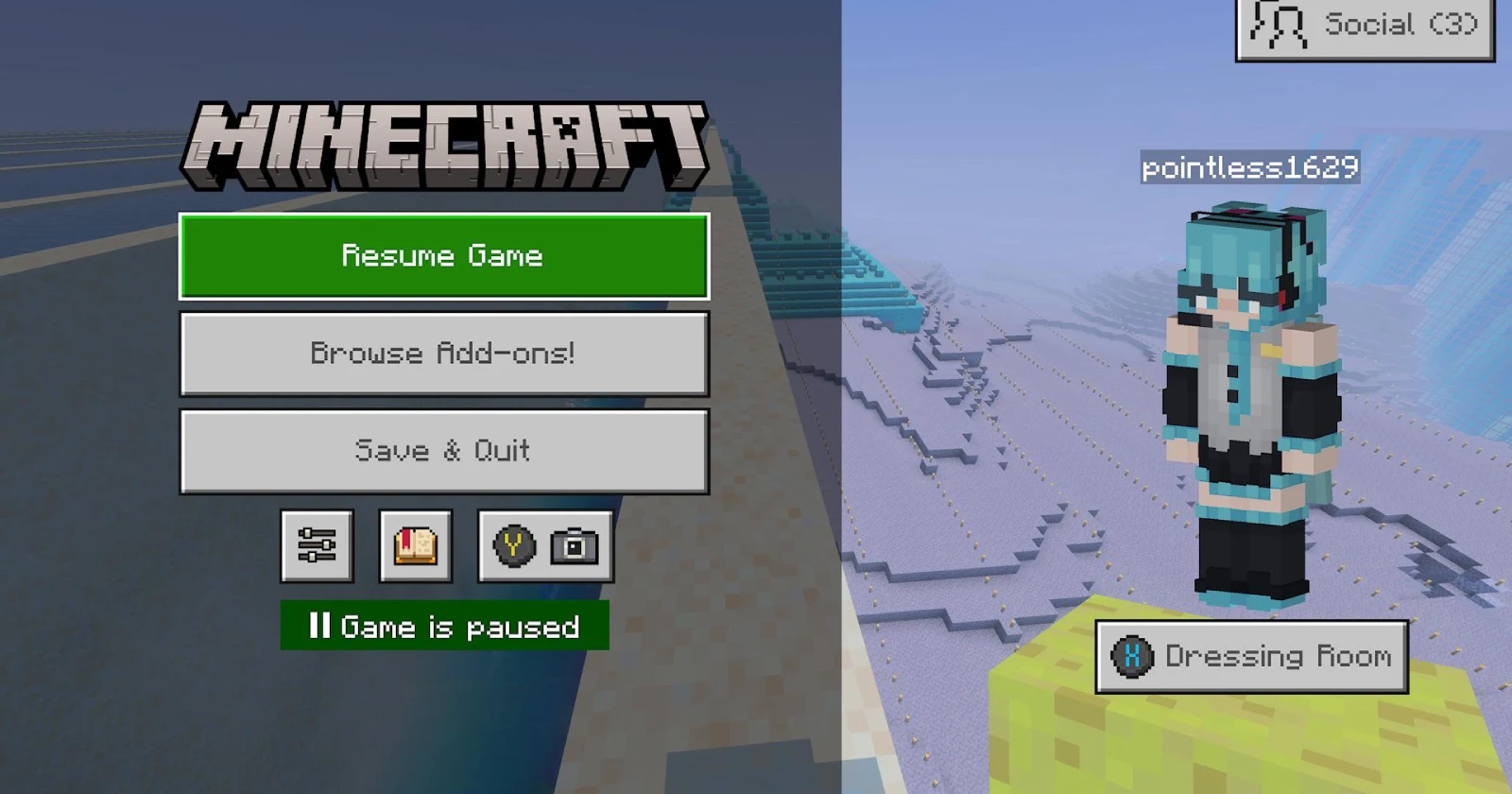
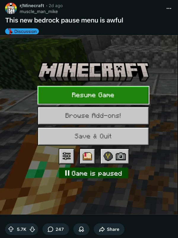
The complaints center on one glaring issue: the “Browse Add-ons!” button now takes up prime real estate where the Settings button used to be. That’s right. The settings option, which players use constantly to adjust controls, audio, and video options, has been demoted to a tiny gear icon. Meanwhile, the marketplace gets the VIP treatment with a massive, exclamation-point-adorned button that screams “please spend money here.”
One Reddit thread racked up over 5,700 upvotes in just two days, with players calling the decision “almost offensive” and “sheer stupidity.” The top comment nails the frustration: why is an add-on storefront more accessible than basic game settings? Another user pointed out the obvious, noting that this isn’t stupidity at all — it’s greed, plain and simple.
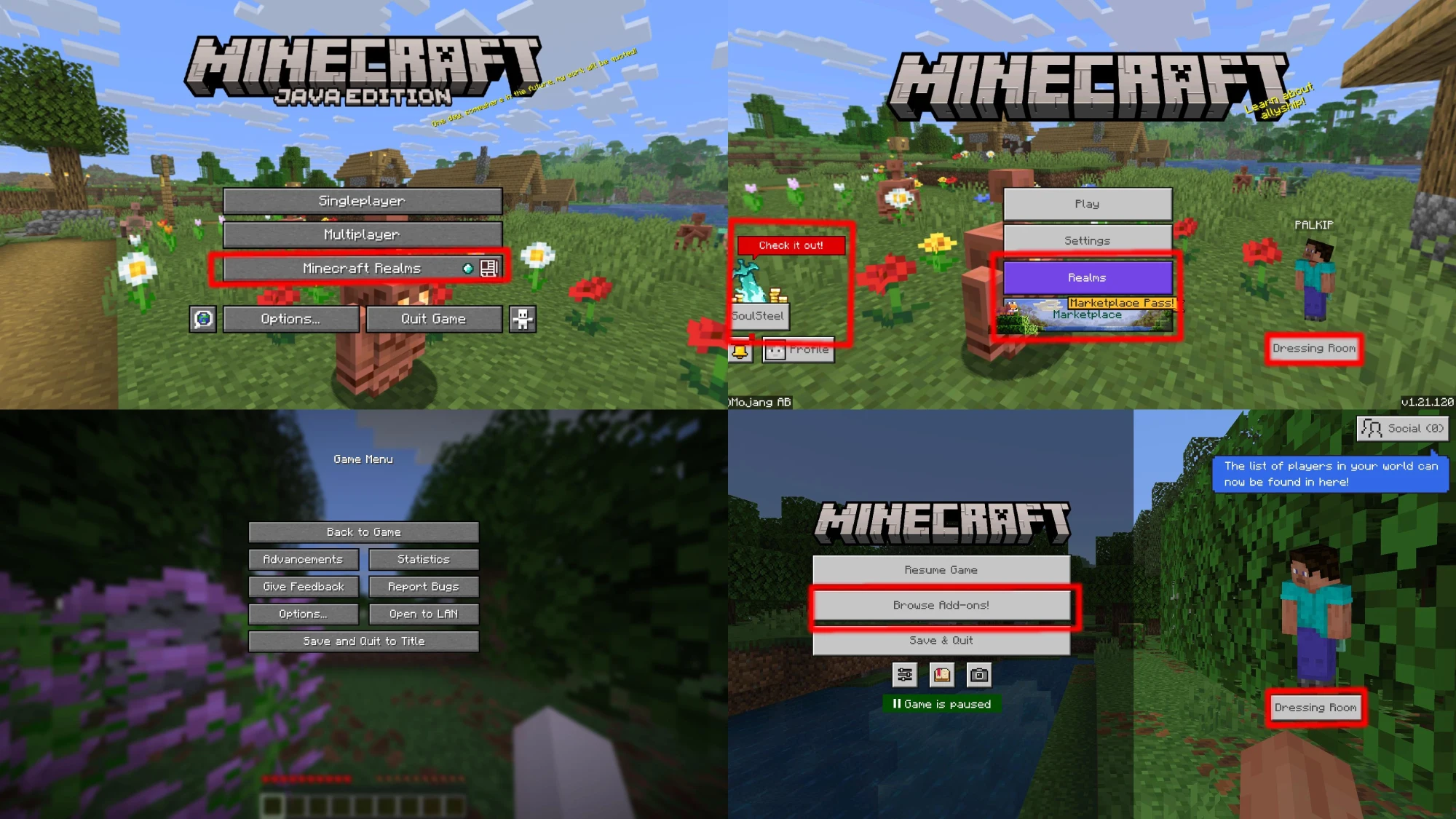
The marketplace button is particularly annoying because it doesn’t even take you to your active Realms. Players who pay for Realm subscriptions have to click through the Play menu instead, making the big purple button nothing more than an advertisement for a service many already use. It’s bad UX wrapped in aggressive monetization.
A second major thread raised an important question: how did we get here? The post shows the gradual evolution of Bedrock’s pause screen, which has become increasingly cluttered with monetization buttons over the years. The real problem is that players only started pushing back now that their Settings access got compromised. Before that, the creeping marketplace buttons were tolerated, maybe even ignored.
Java Edition players are watching from the sidelines with a mix of sympathy and relief. “If they tried this on Java there would be a mod that reverts it uploaded within the hour,” one commenter noted. That’s the difference between the two versions in a nutshell. Bedrock players don’t have that escape hatch. They’re stuck with whatever Microsoft decides to push, and right now, what Microsoft wants is for you to browse their store.
Several players have already found workarounds. Texture packs that swap the buttons are circulating, though they can’t completely fix the menu since much of it is hardcoded. Some users report they’ve stopped playing Bedrock entirely, citing this UI change as the final straw after dealing with poor performance and other issues.
The community has made its position clear across multiple platforms. You can check out more complaints and discussions here, here, here, and here.
Whether Mojang will actually listen to player feedback remains to be seen. For now, Bedrock players are left wondering if their game will ever stop feeling like a monetization experiment.
Featured image credit: u/jahviz2 / Reddit


