


![[Poll] What's your opinion on YouTube's new UI update?](https://piunikaweb.com/wp-content/uploads/2025/10/youtube-new-ui-featured.webp "[Poll] What's your opinion on YouTube's new UI update?")
RANT: Why did YouTube make this TERRIBLE UPDATE on the "Save to playlist" feature?!
byu/CrestfallenSilence inyoutube
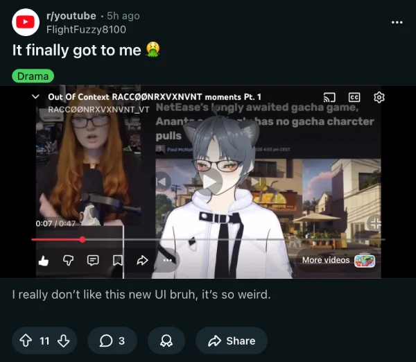
Remember when we covered YouTube’s new desktop UI rollout last week? Well, the backlash has only intensified since then, with Reddit’s r/youtube community practically exploding with reactions over the past few hours alone. But here’s the thing: not everyone is grabbing their pitchforks, and honestly, I’m not either.
Scrolling through the dozens of threads popping up, you’ll find titles ranging from “This new UI sucks” to “I actually don’t hate the new UI” and even “call me crazy but i think the new ui is kinda good”. The divide is real, and the conversation has reached fever pitch. One user wrote “It finally got to me” with a nauseated emoji.
One Redditor compared the interface to “those phones for the elderly”, while over on X, users are calling it “disgusting dogsh*t” and saying it makes them feel “like a toddler on a tablet.” Someone even questioned who designed this thing, asking if decades of development and billions in research were really necessary to achieve this result. The frustration is quite real, with threads like “I’ve been dreading this” and “Youtube changed and now its broken!” popping up constantly.
But let me offer a slightly different take. The redesign feels somewhat refreshing to me, bringing a cleaner look to the video player. That said, those cartoonish-like, dislike, and comment buttons? They could definitely use some refinement. They feel a bit too out of place, almost like they’re targeting a younger demographic at the expense of everyone else who’s been using the platform for years.
What’s genuinely frustrating, though, is a less-discussed change that deserves way more attention: the “Save to playlist” feature disaster.
Previously, you could multi-select playlists through checkboxes in one go. Now? The selection window closes after each choice, forcing you to reopen it multiple times if you want to add a video to several playlists. For power users who organize thousands of videos, this turns a simple three-step process into six or more repetitive clicks. As one frustrated Redditor put it, this ruins a perfectly decent feature for absolutely no good reason.
The backlash has gotten so intense that meta-threads are appearing, like “Can people stop posting about the new ui?” and “Time for another meme of people here talking about the UI”, showing just how saturated the conversation has become. Some users are even calling for boycotting Google entirely, though that seems a bit extreme.
Whether you love it, hate it, or fall somewhere in between like me, this redesign has certainly sparked one of the most divided reactions to a YouTube update in recent memory.

Dwayne Cubbins
1827 Posts
My fascination with Android phones began the moment I got my hands on one. Since then, I've been on a journey to decode the ever-evolving tech landscape, fueled by a passion for both the "how" and the "why." Since 2018, I've been crafting content that empowers users and demystifies the tech world. From in-depth how-to guides that unlock your phone's potential to breaking news based on original research, I strive to make tech accessible and engaging.
Next article View Article

WhatsApp's 'wa.me' links are broken, returning an error for users worldwide
WhatsApp users are reporting widespread issues with wa.me links, which are commonly used to start chats without saving contacts. The service appears to be down globally, with users encountering...
Oct 22, 2025 1 Min Read