


Which YouTube Progress Bar UI do you remember first using? pic.twitter.com/HGK2wsYHFk
— Mandi Vaughn (@ItsMandiVaughn) October 14, 2025
Update 15/10/25 – 01:28 pm (IST): It’s official. YouTube has announced that it’s now rolling out a number of new features, which include the revamped UI. They claim it’s a “cleaner, more immersive viewing experience.”
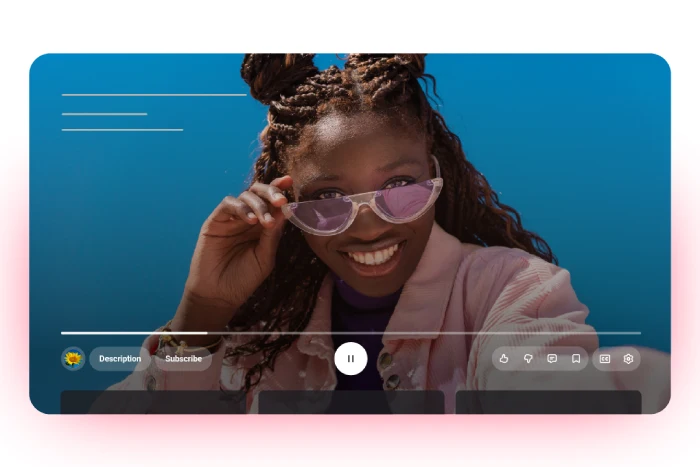
The update brings several notable changes beyond the controversial rounded buttons and translucent design. YouTube is introducing custom like animations that vary by content type — liking a music video now triggers an animated musical note, while sports videos display game-related visuals.
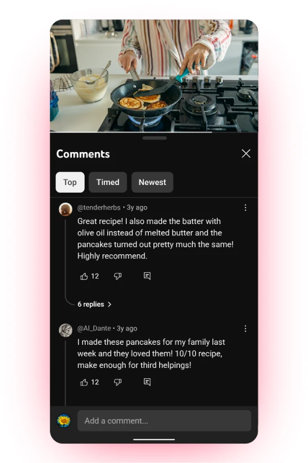
The platform is also rolling out threaded comments similar to Reddit, allowing users to follow conversations more easily with up to three levels of threading in the replies panel.
Additionally, YouTube has refined the double-tap seek feature to be “more modern and less intrusive,” and mobile users will experience smoother transitions when switching between tabs. The global rollout began the week of October 13 across mobile, web, and TV devices.
They’ve also asked users to share their feedback, but I wouldn’t hold my breath for any big changes to the new UI anytime soon, even if there’s a lot of backlash.
Original article published on October 14, 2025, follows:
YouTube’s rollout of its new media player UI is now in full swing, and let me just say — people are not holding back on their feelings about it. After months of scattered testing, the redesign now seems to be popping up for users all over the globe, and like clockwork, the complaints are pouring in.
I actually covered the initial experiments with this floating, rounded-button UI back in April on our sister Tech Issues Today, noting how it tinkered with core interactions that most of us have grown accustomed to. Well, the experiment phase seems to be coming to an end because the new UI is here for a lot of users.
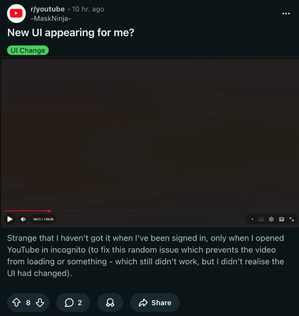
The backlash centers on a few specific gripes. Multiple Reddit threads are calling the redesign everything from “the most disgusting layout” to just plain ugly. One user pointed out what might be the most annoying functional change: you can’t casually scroll with your mouse wheel during videos anymore.

Try it now and you’ll get smacked with a giant grid of video thumbnails instead. That’s going to mess with a lot of people’s muscle memory, especially those who used to scroll down to read comments while watching in fullscreen.
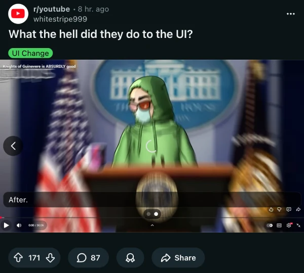
The visual changes are getting picked apart too. Everything’s gone round — buttons, corners, you name it. Another thread captures the confusion perfectly: “What the hell did they do to the UI?” The controls now take up noticeably more screen space, with some users estimating it’s eating up about one-seventh of their display. That’s a lot of real estate for buttons that used to be compact and out of the way.
The criticism isn’t exclusive to Reddit either. Some users are even tagging YouTube on X, like @Sir_Cleric, who says the change is “needless”. TeamYouTube’s official response? The standard “we’re all ears” line, directing frustrated users to the feedback tool.
The interesting thing is that not everyone hates it. Buried in the comment sections, a few users admit they’re fine with the changes, or at least indifferent. But those voices are drowned out by the majority who see this as another case of fixing something that wasn’t broken.
For those desperate to undo the damage, there’s already a workaround making the rounds for the web version. Users are sharing a Stylus extension script that reverts the player to its previous look. So essentially, power users are installing browser extensions just to get back the YouTube they had yesterday.
Here are the steps shared by one commenter:
Ok to apply this get the extension called stylus
Firefox: https://addons.mozilla.org/en-US/firefox/addon/styl-us/
Chrome: https://chromewebstore.google.com/detail/stylus/clngdbkpkpeebahjckkjfobafhncgmne?hl=en
Then go to youtube and click the extension then press the pen
A menu that says “edit style” should open copy the paste bin and paste it in the code block
And finally press Save.
Despite all the negative feedback since the initial testing, YouTube seems to be going full steam ahead with the new UI. So it’s unlikely we’ll see the UI being reverted to the previous one anytime soon, if at all.
That said, I did stumble upon a post on X comparing all the recent media player bar designs YouTube has used. Feel free to share your favorite one in the comments below:

Dwayne Cubbins
1815 Posts
My fascination with Android phones began the moment I got my hands on one. Since then, I've been on a journey to decode the ever-evolving tech landscape, fueled by a passion for both the "how" and the "why." Since 2018, I've been crafting content that empowers users and demystifies the tech world. From in-depth how-to guides that unlock your phone's potential to breaking news based on original research, I strive to make tech accessible and engaging.
Next article View Article

AO3 (Archive of Our Own) down? Here's why it's not working currently
Update 31/10/25 - 11:45 pm (IST): Almost like clockwork, AO3 is down once again, a month after the previous widespread outage. There are close to 7 thousand reports...
Oct 31, 2025 1 Min Read