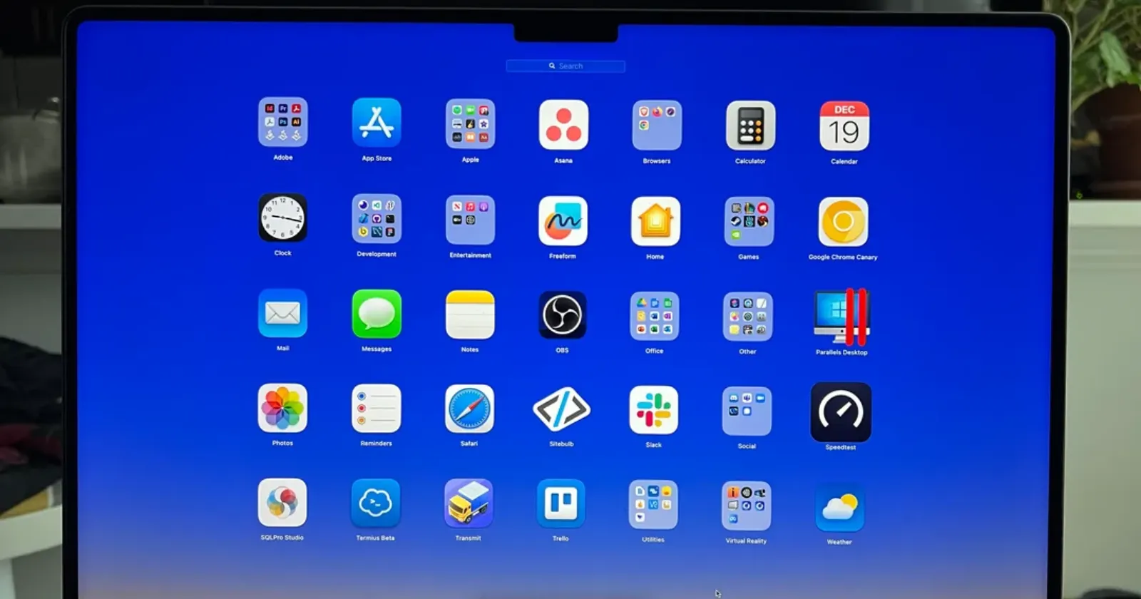
Apple released iOS 26 yesterday, and the Liquid Glass design overhaul is making waves – just not all of them good ones. The new visual language promises icons that shimmer like fluid crystal, with transparency effects rippling through notifications, widgets, and the control center.
But within hours of the update hitting devices, the complaints started flooding in. Forums, Reddit threads, and social media lit up with frustrated users pointing out everything from inconsistent implementation to eye-straining effects. The pattern feels familiar – Apple makes a bold design change, early adopters either love it or hate it, and everyone else waits to see how it settles.
The most glaring issue, according to users, is how unevenly Liquid Glass got applied across the system. Users are finding jarring gaps where the old design language still lurks. The force reboot screen looks completely outdated, and the lock screen clock editor has weird spacing problems.
“It really is wild how haphazardly they applied Liquid Glass,” one Reddit user commented. Another called the whole rollout “rushed” and begged for quick patches to fix the obvious oversights.
The reflective borders around icons and widgets are also drawing particularly harsh criticism. These shiny outlines were supposed to add depth and sophistication, but many users find them cheap-looking and distracting.
![]()
“The shimmery edge looks really cheap to me. Not sure who thought it was a good idea to highlight the edge of shapes like that,” a MacRumors forum regular complained. Users with minimalist setups are especially frustrated, saying the borders destroy their carefully crafted black-on-black aesthetics.
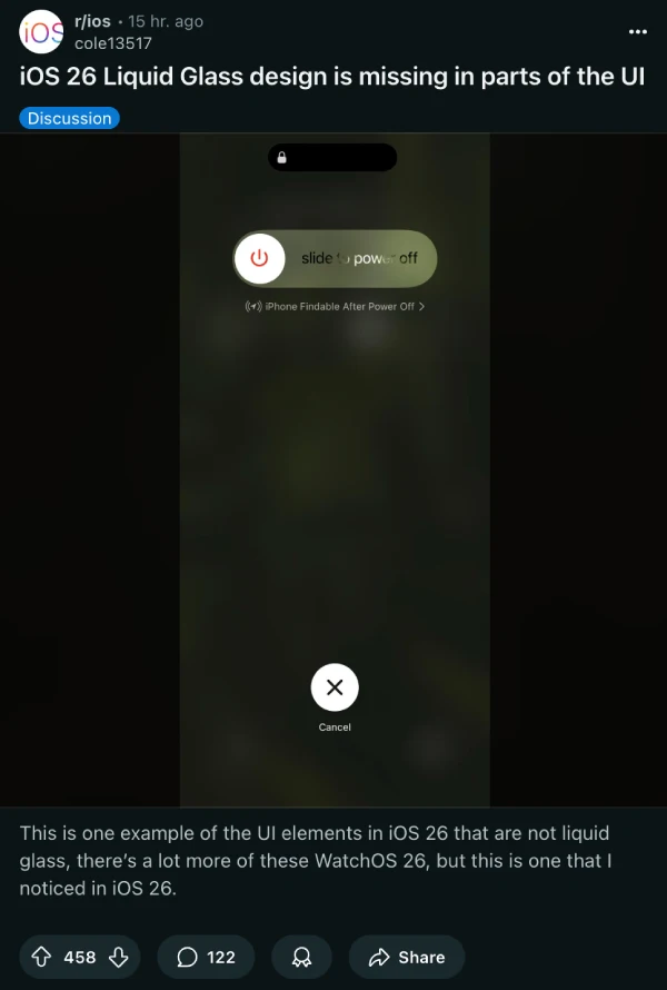
Dark mode is taking the biggest beating. What used to be a sleek, eye-saving option has turned into what several users are calling an “optical nightmare.” The glass tints and moving reflections make icons appear tilted or warped, causing eye strain and even dizziness for some people.
“The frame glow effect makes apps look tilted, and it’s really distracting for me (I even feel a bit dizziness),” one Reddit user shared.
![]()
If you see the screenshot, the icons actually look titled. I’ve personally not noticed this on my iPhone 16 in the same way. However, that could also boil down to the fact that I’ve not been using dark mode icons for the most part.
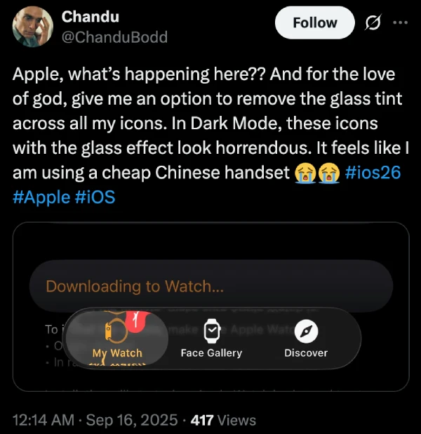
Software engineer Chandu Bodd tweeted about the dark mode experience: “In Dark Mode, these icons with the glass effect look horrendous. It feels like I am using a cheap Chinese handset.”
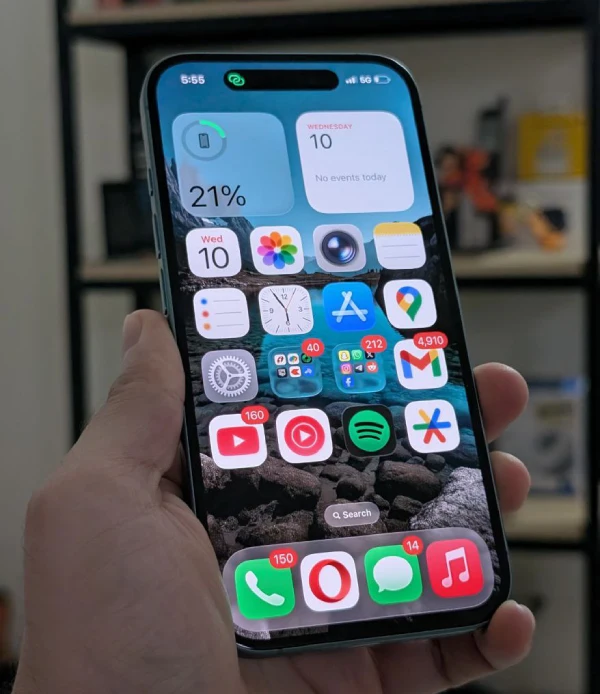
Apart from this, users say the widget implementation seems particularly half-baked. Ugly lines appear on Reminders and Calendar widgets, and the transparency effects work inconsistently across different apps. Some widgets look properly integrated, while others appear to have the glass effects slapped on as an afterthought.
That said, for those finding the effects overwhelming, there is a workaround. Going to Settings > Display & Text Size and toggling on Reduce Transparency can tone down some of the more aggressive glass effects.
I have to admit something: I actually love the Liquid Glass design language. There’s something genuinely refreshing about the whole UI. I’ve been beta testing it since day one, and I like how Apple has improved things since the initial release.
I’m also hoping app developers embrace this design direction and update their interfaces to match. Of course, I realize plenty of people disagree with me, which is why I think any app implementing Liquid Glass effects should include toggle options. Let users dial the intensity up or down based on their preferences.
The core concept behind Liquid Glass feels right to me – software that doesn’t just display information but creates an experience. Yes, the execution is uneven. Yes, it needs more customization options. But sometimes you have to push boundaries to move design forward, even if it means breaking a few eggs along the way.
Apple will likely address the worst issues in upcoming point releases. They’ll probably add more granular controls and fix the obvious inconsistencies. Until then, we’re in that familiar territory where a major Apple design change splits users into passionate camps.
If you’re holding off on updating, that’s understandable. But if you do decide to take the plunge, give Liquid Glass a real chance. The visual language might feel jarring at first, but there’s something special about interfaces that feel genuinely dynamic rather than static. Even with all the current rough edges, I can’t help but feel excited about where this direction might lead.


Dwayne Cubbins
2826 Posts
I cover fast-moving stories across apps, online platforms, and everyday tech — phones, wearables, consoles, and whatever else people are fighting with this week. Bugs, rollouts, scams, policy enforcement, and the occasional internet-culture rabbit hole are all fair game. My goal is simple — make confusing tech news readable. When I'm not working, I'm working out or chilling with my dog. Got a tip? You can find me on X @dcubbins.
Next article View Article