Google’s relentless tweaking of YouTube Music’s user interface shows no signs of stopping, with users reporting yet another wave of changes to the Now Playing screen that’s got the community talking. The latest round of adjustments has rearranged control buttons, relocated features, and sparked the usual mix of frustration and curiosity among subscribers.
Screenshots surfacing across Reddit reveal a redesigned interface where the familiar bottom-row controls have been consolidated into a more compact layout. The pause button remains prominently centered, but the surrounding elements have been shuffled around in ways that break established muscle memory. Some users are finding the new arrangement cramped and prone to accidental taps, while others appreciate the cleaner aesthetic.
Here’s a quick comparison of the current UI for most people and the new UI that a handful are seeing:
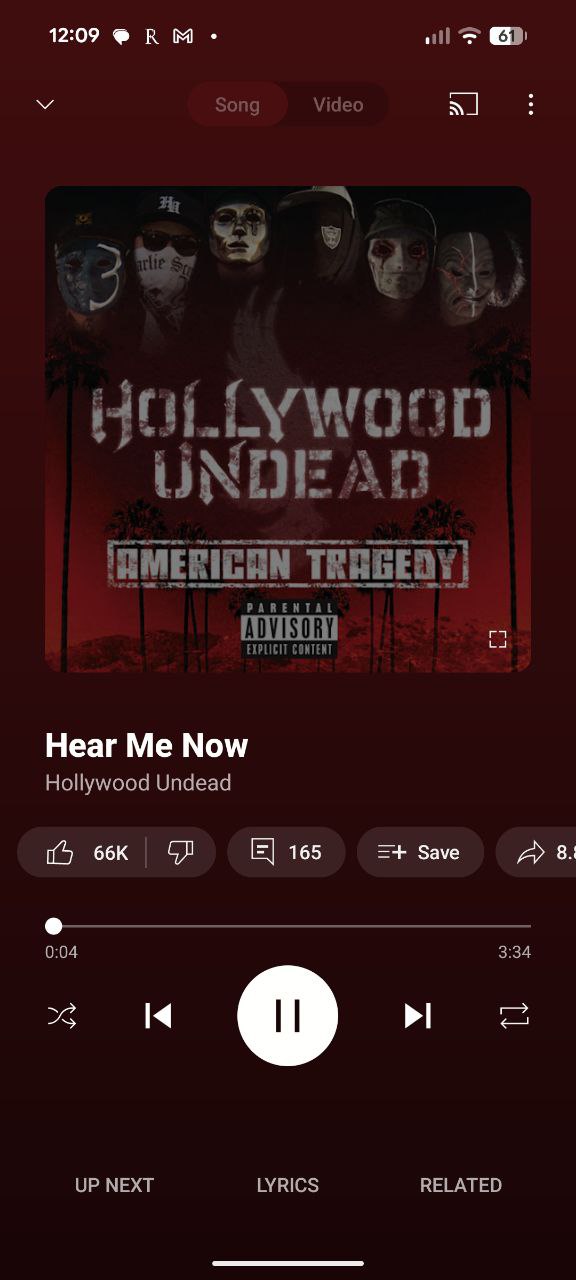

One of the more contentious changes involves the repositioning of frequently-used features. The Related section, previously accessible through a dedicated tab at the bottom, appears to have vanished from its usual spot. Users discovered that tapping the song title now brings up related tracks, but this extra step has annoyed those who relied on quick access to discover new music while listening.
The lyrics functionality has also undergone changes, now appearing as a button rather than the previous implementation. This shift comes just days after we reported that YouTube Music is testing premium-only lyrics access for some users.
The video toggle button has also moved down from its previous position, creating what some users describe as awkward empty space at the top of the screen. The album artwork area now feels less integrated with the overall layout, disrupting the visual hierarchy that users had grown accustomed to.
But this isn’t the only thing that is leaving some users frustrated. Reports of playback issues are popping up, coinciding with the interface changes. The issues include songs that won’t start, playlists that fail to advance automatically, and buffering problems that weren’t present before. So it’s possible some bugs might have slipped through while YouTube was implementing the new UI behind the scenes.
The timing of these changes proves interesting, coming less than a year after YouTube Music’s previous major Now Playing overhaul in late 2024. That redesign introduced several elements that are now being modified again.
That said, are you also seeing the new UI on your YouTube Music app? Let us know in the comments below.


Dwayne Cubbins
2772 Posts
I cover fast-moving stories across apps, online platforms, and everyday tech — phones, wearables, consoles, and whatever else people are fighting with this week. Bugs, rollouts, scams, policy enforcement, and the occasional internet-culture rabbit hole are all fair game. My goal is simple — make confusing tech news readable. When I'm not working, I'm working out or chilling with my dog. Got a tip? You can find me on X @dcubbins.
Next article View Article