


Google Wallet Material You Update
byu/issayrobles inGoogleWallet
Google is continually refining the look and feel of Android and its own suite of applications. A major part of this ongoing evolution is the “Material 3 Expressive” design language. This new design aims for a more personal, fluid, and visually engaging user experience. It brings bolder colors, more dynamic animations, and a focus on making apps feel more intuitive and delightful to use. Recently, several key Pixel apps have started to receive these exciting Material 3 Expressive updates.
Google Wallet gets a fresh look
Google Wallet, the app you use to manage your payment cards, passes, and digital IDs, is seeing a straightforward but impactful Material 3 Expressive redesign. The most noticeable change on the homepage is the replacement of the “Wallet” text in the top-left corner with the app’s logo. This provides a clean balance with your profile picture on the opposite side.
Your list of pass cards now appears a bit larger, making them easier to see and tap. The “Archived passes” button has also been updated. It now lives inside a neat pill-shaped container with an accompanying icon. Plus, a larger floating action button, or FAB, is in use for quick actions. The “Recent activity” page has also received an update. All transactions now sit neatly in containers, with the first and last cards sporting more rounded corners for a smoother look. While this update is starting to roll out, it might not be on every device just yet. Keep an eye out for it.
Pixel Camera 9.9 introduces built-in help
The Pixel Camera app is also embracing Material 3 Expressive with its latest version, 9.9. This update brings a brand-new “education hub” directly into the app. It’s designed to offer visual inspiration and clear instructions for each camera mode. You will now find a subtle question mark icon in the top-right corner. Tapping this reveals the new help section.
![]()
![]()
Within this hub, the “Explore ways to take photos” section features large previews of various modes like “Add Me”, “Panorama”, “Astro”, and “Night Sight”. Each mode comes with examples from photographers. You can even full-screen these images to get a better look. A convenient “Open Camera” floating action button lets you jump straight into the mode you’re learning about. The “How to” section provides detailed instructions, much like the Pixel Tips app. The top tabs for “Examples” and “How to” use a Material 3 Expressive connected button group. This means the rounded rectangle tab subtly transforms into a pill shape when you select it. The new help pages also cover video modes and other useful tips, making your Pixel camera even easier to master.
Google Clock 7.14 gets subtle Material 3 Expressive tweaks
Even the humble Google Clock app is getting a dose of Material 3 Expressive with version 7.14. This update focuses on subtle but effective visual changes. You’ll notice the latest Material 3 switches throughout the app. These on/off toggles are now slightly taller and narrower. When a toggle is off, it features bolder outlines and a less prominent circular handle, making it clearer at a glance. You will see these updated switches in the Alarm tab and the app’s Settings list.
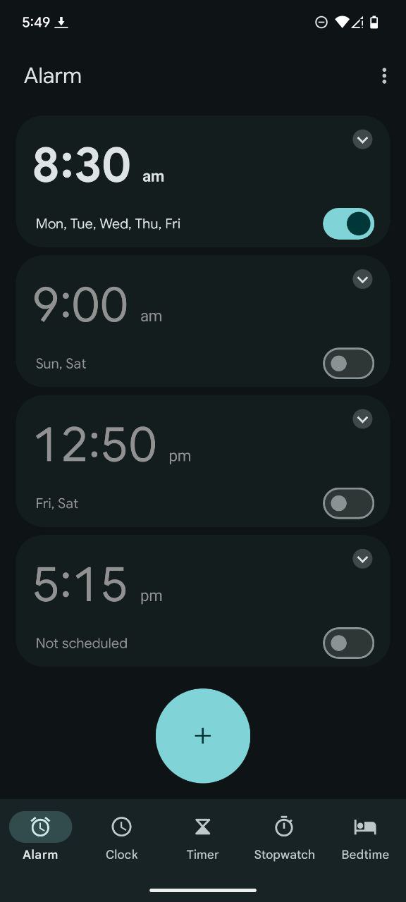
Another minor but noticeable change is in the World Clock tab. The weather condition icons, which used to be colored, are now entirely gray. This gives them a more subtle, less distracting appearance. While these updates are small, they are part of Google’s larger push to unify the design language across its apps, making the Pixel experience more cohesive and visually appealing. These rollouts are often gradual, so it might take a little time for everyone to see the changes on their devices.

We stand out from the tech-media crowd because we break news stories; we mainly bring you stuff that you won’t find anywhere in the mainstream tech media. Our stories have been picked up by some of the world’s most popular websites and media outlets—more info is available here.

Dwayne Cubbins
2796 Posts
I cover fast-moving stories across apps, online platforms, and everyday tech — phones, wearables, consoles, and whatever else people are fighting with this week. Bugs, rollouts, scams, policy enforcement, and the occasional internet-culture rabbit hole are all fair game. My goal is simple — make confusing tech news readable. When I'm not working, I'm working out or chilling with my dog. Got a tip? You can find me on X @dcubbins.
Next article View Article

[U: It's finally here] Fitbit app still missing dark mode support, but you can enable it on Android using this workaround
Update 21/08/25 - 5:55 pm (IST): After making users wait a long time, Google has finally introduced native dark mode support on the Fitbit app. This new eye...
Aug 21, 2025 4 Min Read