Android fans, especially Pixel users, you might notice a subtle — but oddly satisfying — shift in your Google Photos app. Hot on the heels of YouTube’s transparent status bar update on Android, Google is rolling out a fresh look for Google Photos with a twist: a translucent status bar that changes the app’s topmost visual layer, bringing a new sense of depth to the interface.
With the latest Google Photos update, version 7.7, the status bar is now translucent instead of fully transparent, a change that might seem small but actually makes a notable difference, especially if you’re using dark mode. The effect is most obvious when you’re scrolled to the top of the app; the status bar takes on a lighter tint compared to the rest of the app, creating a softer blend between the bar and the interface.
Previously, Google Photos sported a fully transparent status bar. This design made it easy to see what’s behind the status bar at the top of the screen. But for some users, this setup had an unintentional drawback: it highlighted a pretty stark visual contrast with Google Photos’ scrolling elements. For instance, the date indicator in the top-right corner cast a shadow effect that popped — perhaps a little too much — against the original transparent background.
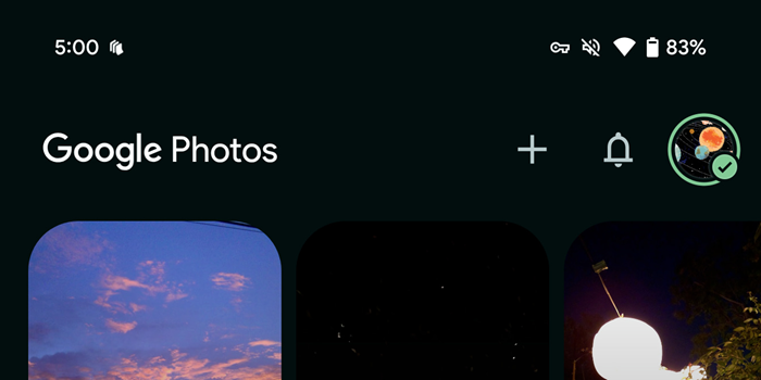
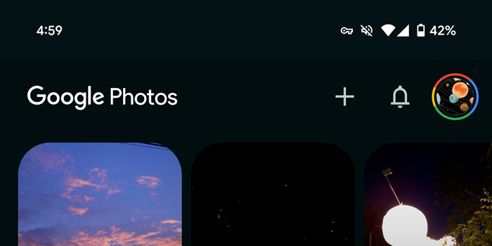
Now, with the new translucent effect, that contrast is dialed down. The date shadow remains, but it blends more smoothly into the background, creating a more cohesive feel as you scroll through your memories. Google Photos has joined the ranks of other Google apps, like Google Keep and Google Messages, which have taken different routes to integrate the status bar, making the experience feel less cluttered and more intuitive.
This tweak in Google Photos 7.7 comes as part of a wider Android aesthetic refresh, with YouTube’s recent update marking just the beginning. YouTube, in case you missed it, introduced a fully transparent status bar on Android, which users found helped integrate the app’s interface with the rest of the system for a sleeker look. It’s a welcome sign that Google is paying more attention to these micro-design details, which together create a more polished and unified experience across its app ecosystem.
If you haven’t seen this update yet, don’t worry — it’s currently rolling out widely via the Google Play Store, so Pixel users should be getting this translucent treatment soon enough.

Hillary Keverenge
2484 Posts
Tech has been my playground for over a decade. While the Android journey began early, it truly took flight with the revolutionary Lollipop update. Since then, it's been a parade of Android devices (with a sprinkle of iOS), culminating in a mostly happy marriage with Google's smart home ecosystem. Expect insightful articles and explorations of the ever-evolving world of Android and Google products coupled with occasional rants on the Nest smart home ecosystem.
Next article View Article