YouTube, one of the most popular video-sharing platforms on the planet, has always strived to stay on the cutting edge of technology and user experience. Last year, the platform unveiled a major redesign, bringing a sleek black dark theme and Ambient Mode into the mix. Now, YouTube is back with a bang, introducing ‘three dozen new features and design updates’. Among these updates is the much-debated ‘You’ tab in the YouTube’s mobile app.
YouTube’s new ‘You’ tab: A hit or a miss?
In a recent video, YouTube explained that the decision to merge the account page and Library tab was made with the intention of simplifying the user experience. The idea is to offer a one-stop shop for all your content, making it more accessible and user-friendly. This brings us to the new ‘You’ tab, which replaces the old ‘Library’ tab situated at the right corner of the bottom navigation bar.
As soon as this new change went live, the YouTube community couldn’t help but voice their opinions. The reactions have been swift and divided. For those who are less than thrilled with the update, the sentiment seems to be largely negative. They argue that the most recent change to the library on the app is not only aesthetically unpleasant but also considerably less user-friendly.
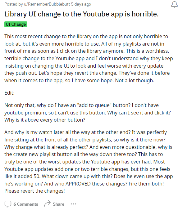
When they tap on the library icon, their beloved playlists are no longer right there in front of them. Instead, they must now navigate through a series of clicks and scrolls to access their playlists. It’s safe to say that many users find this to be a worthless and terrible change to the YouTube app, leaving them scratching their heads as to why developers keep pushing updates that seem to make the user interface look and feel worse.
Some love the change
On the flip side, there are those who are singing a different tune. They find the new user interface refreshingly clean and efficient. In their view, the ‘You’ tab enhances the overall accessibility of their channel, making it closely resemble the web version, but now on mobile. To them, it’s a welcome step towards a more unified and intuitive YouTube experience.

So, here we are, with opinions divided into two clear camps: those who want to see this change reverted and those who welcome it with open arms.
Now, we turn to you. What’s your take on the new ‘You’ tab in the YouTube mobile app? Do you love the streamlined design and accessibility it offers, or are you yearning for a return to the familiarity of the old ‘Library’ tab?
Note: There are more such stories in our dedicated YouTube Section, so be sure to follow them as well.
Featured image source: YouTube.
PiunikaWeb started as purely an investigative tech journalism website with main focus on ‘breaking’ or ‘exclusive’ news. In no time, our stories got picked up by the likes of Forbes, Foxnews, Gizmodo, TechCrunch, Engadget, The Verge, Macrumors, and many others. Want to know more about us? Head here.


Karanjot Sidhu
1024 Posts
A computer science engineer who loves tech and won't stop talking about it. Here at Piunikaweb, I mostly cover Google Pixel deals and how-tos, though you may find me covering Pixel news as well sometimes. Apart from being a nerd, i love gaming and watching movies in my free time.
Next article View Article