Companies across industries are continuously seeking ways to enhance their products and services, recognizing the paramount importance of user satisfaction. One such company at the forefront of this endeavor is Google.
Renowned for its innovative approach and commitment to user-centric design, Google consistently introduces changes to its products, aiming to improve the overall user experience.
Google Maps saved places small dots on iOS
However, a recent tweak to the Google Maps iOS user interface (UI) has sparked mixed reactions among users (1,2,3,4).
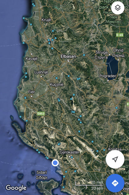
Previously, when users saved a location on Google Maps, a pin would be dropped on the map to mark the spot. This feature allowed users to easily identify and differentiate their saved places at a glance.
However, in a recent update, devs decided to replace the familiar pins to mark saved places with small dots on Google Maps iOS app.
While the change may seem trivial to some, it has generated a significant amount of backlash from users who preferred the previous design.
One of the main reasons people are upset about this change is the loss of visual clarity. With pins, it was easier to spot and distinguish between multiple saved places, especially when they were in close proximity to one another.
@googlemaps when will you be fixing the dots issue on the maps for saved places. There was nothing wrong with old version. At worst, could have made an option to turn it on or off. Ridiculous
Source
My saved locations on google maps are shown as small dots. I tried to change from saved location, but i cant find anything
Source
This topic gained traction and was escalated to the Google team for investigation. Users were eager to know if this change was a result of a bug or an intentional update.
The alleged official response from the Google Maps team shed light on the matter, stating that the transition from pins to dots was indeed an intended change, not a glitch or error.
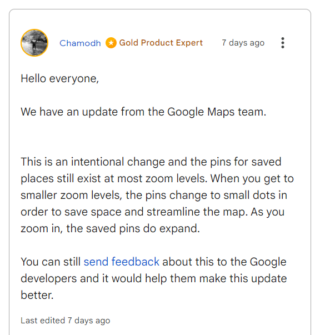
This clarification disappointed some users who were hoping for a reversal of the new UI.
One possible reason behind this modification could be Google’s ongoing efforts to streamline and simplify the Maps interface.
Despite the dissatisfaction expressed by some users, it is worth noting that there are individuals who actually appreciate the new UI.
This is a great change as my map was basically unusable with previous icons occupying the entire screen in densely-saved areas like New York.
Source
Interestingly, while the transition from pins to dots seems to be affecting iOS users, Android users have not experienced the same change.
This discrepancy has further added to the confusion and frustration for iOS users who may wonder why the update was implemented on one platform but not the other.
It remains unclear whether Google plans to extend this UI change to Android or if it will remain exclusive to iOS.
Note: We have more such stories in our dedicated Google Maps section so be sure to follow them as well.
PiunikaWeb started as purely an investigative tech journalism website with main focus on ‘breaking’ or ‘exclusive’ news. In no time, our stories got picked up by the likes of Forbes, Foxnews, Gizmodo, TechCrunch, Engadget, The Verge, Macrumors, and many others. Want to know more about us? Head here.

Tags
Google Maps Google Maps saved places Google Maps saved places pins Google Maps saved places small dots Google Maps saved places small dots on iOS
Karanjot Sidhu
1024 Posts
A computer science engineer who loves tech and won't stop talking about it. Here at Piunikaweb, I mostly cover Google Pixel deals and how-tos, though you may find me covering Pixel news as well sometimes. Apart from being a nerd, i love gaming and watching movies in my free time.
Next article View Article