leave many users disappointed")
Trello recently rolled out an update that includes 20 new label colors. It was done with a view of keeping up with the color-blind friendly patterns.
However, the addition of these new colors wasn’t very well-received by some Trello users.
Trello label colors are now lighter in shade
Users (1, 2, 3, 4) are exhibiting their disappointment at the introduction of new label colors on Trello. Apparently, the default colors now come in a lighter shade after the recent update.
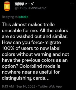
It’s funny that they use the word “vibrant” in the announcement and then give us the most washed-out set of colors imaginable
Source
I love that we’re getting new colors, but this totally messes my flow up. It’s so much harder to see what is labeled as what and there really isn’t a big difference in color when changing the shade.
Source
The issue is clearly irksome for users as they find it difficult to differentiate between various labels at a glance. In addition to that, the text in a particular label also becomes difficult to read in some cases.
Not just that, users are aghast as Trello doesn’t even provide an option for retrieving the previous colors anymore.
Even though the new pastel-colored labels are aesthetically pleasing, it becomes pointless as it hampers their visibility.
The pastels, while aesthetically lovely, are difficult to differentiate at a glance when collapsed; when expanded, the addition of the darker dot on the pastel background with white lettering is so visually cluttered I can’t filter through to what I need.
Source
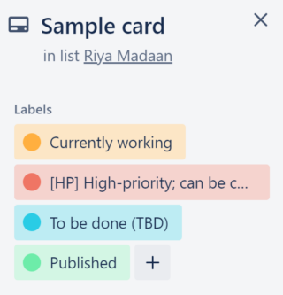
It appears that the color change is currently limited to the expanded versions of the labels. We’ve added a screenshot below for your reference:
Interestingly, some random Trello users (1, 2, 3) noticed the changed label colors during the testing phase as well.
The labels I used for my Trello cards suddenly changed from solid red or blue or purple or gold or whatever to these pastel-ish colors. Is that a Trello issue, or do I need to get under the hood of Windows 10 to see what happened and change ’em back?
Source
Although the exact old shades aren’t available, Trello still gives users plenty of darker shades to choose from in case they don’t like the light ones. Here’s how you can make your Trello workspace more vibrant:
We hope that Trello developers listen to user feedback and acknowledge the problem soon.
We’ll keep tabs on further developments and update the article accordingly.
Featured image source: Trello
PiunikaWeb started as purely an investigative tech journalism website with main focus on ‘breaking’ or ‘exclusive’ news. In no time, our stories got picked up by the likes of Forbes, Foxnews, Gizmodo, TechCrunch, Engadget, The Verge, Macrumors, and many others. Want to know more about us? Head here.
Tags
lighter shade of Trello label New Trello label colors New Trello label colors affect visibility pastel colored labels on Trello Trello label colors after update Trello new label colors
Riya Madaan
868 Posts
Weaving a little bit of life into the articles I write. No, not really! That's not really possible for a trash writer like me but I still try. Apart from it, I skate, meditate and medicate. Also keep myself away from troubles as I age.
Next article View Article