#Poll alert!
— PiunikaWeb - Everything Google Pixel (@PiunikaWeb) November 9, 2021
Should Google tweak Android 12 UI elements based on user feedback? What do you think?
Vote below and read our coverage here: https://t.co/uFrRihY7Qu#Android #Android12 #UI #update #updates #Google #smartphone #smartphones #feedback
New updates are being added at the bottom of this story…
Original story (published on November 09, 2021) follows:
It looks like Google wanted to reimagine how Android behaves and interacts with the user starting with the introduction of Material You on Android 12. The Mountain View-based company says it is the next stage for Material Design.
That being said, some UI elements looked quite outdated and out of place in versions prior to Android 12. Material You introduced several customization options that helped users make Android feel more personal.
While changes such as themes based on wallpaper color are appreciated by the majority, others think that the UI is just ugly and the elements inconsistent. And unfortunately, they are not totally wrong.
The wallpaper-based system theming is not very good, with users reporting that it crashes apps and games. Moreover, many said they are frustrated by the inability to remove the ‘At a Glance’ widget from the home screen.
Another major letdown is the lack of lock screen customization and the inclusion of the power menu options in the quick settings shade. The power menu is something users have appreciated and become accustomed to.
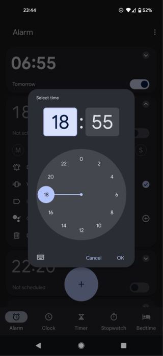
Some users who upgraded to Android 12 say that the notifications bar covers the entire screen instead of being an overlay, which is really annoying. Others are complaining about the clock app having 24 hours in one rotation and missing odd numbers.

Look how much screen space is wasted by the #Android12 pull down menu. All this info used to be packed nice and neat into half the screen. This is such a failure of interface design. Such a massive step back from version 11. Everything about this update is horrible
(Source)
The more I use Android 12, the more I think it’s just not very good. There’s a ton of inconsistencies, the theming based on the background is hideous, the sizing of various parts of the UI just feels wrong and the need to double swipe to get important controls is so annoying.
(Source)
Android 12 users have also complained that the volume control animations and the brightness slider look ugly and feel like a step back. However, some say that it is the best Android update in terms of UI in years.
That brings us to the question, do you think Google should be a bit flexible and consider tweaking some UI elements based on user feedback? Do let us know what you think by voting in the poll or sharing your thoughts in the comment section down below.
Update 1 (November 17)
IST 10:27 am: The poll results are out and it is unanimous that all of you feel like Google should tweak Android 12 UI elements based on user feedback.
Note: We have more such stories in our dedicated Android Section so be sure to follow them as well.
PiunikaWeb started as purely an investigative tech journalism website with main focus on ‘breaking’ or ‘exclusive’ news. In no time, our stories got picked up by the likes of Forbes, Foxnews, Gizmodo, TechCrunch, Engadget, The Verge, Macrumors, and many others. Want to know more about us? Head here.

![[Poll results out] Android 12 user interface: Should Google consider tweaking some UI elements following user feedback? [Poll results out] Android 12 user interface: Should Google consider tweaking some UI elements following user feedback?](https://piunikaweb.com/wp-content/uploads/2021/10/Android-12-featured-image.jpg)


