


I tweaked Big Sur’s notification design to make it a bit more usable.
byu/rovenroy inMacOS
Big Sur is perhaps one of the greatest updates to macOS ever. This is pretty clear from the plethora of new changes that it brings forward. Almost all of the system apps like Safari, Messages, and Maps have seen some pretty significant improvements.
This is in combination with a bunch of UI changes as well like an updated menu bar, redesigned Floating Dock, new icons for apps and symbols for various controls, and much more.
But perhaps the most significant changes have been made to the Control Centre and Notification Centre.
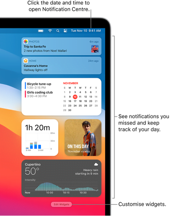
In the words of Apple, “the redesigned Notification Centre puts all your notifications and widgets into a single, dedicated column. Notifications are automatically sorted by most recent, and redesigned Today widgets deliver information at a glance.”
However, even with all these improvements, the notifications still get kind of annoying to use mostly because of the way that current notification actions are designed on macOS Big Sur.
They are hidden behind a menu that only appears when you hover over the bubble, making it a step longer to reach them. Now of course this shouldn’t really be too much of a cause of bother, should it?
After all, how difficult can a mouse hover action turn out to be? Well, let’s just say that it’s all fun and games until you got a hundred notifications in your Notification Center waiting to be attended to.
I’ll never understand why Apple put an “Options” drop down for messages. Just put the reply button back. Why have the extra step?
Source
Because Apple cares much more about the style than about usability.
Source
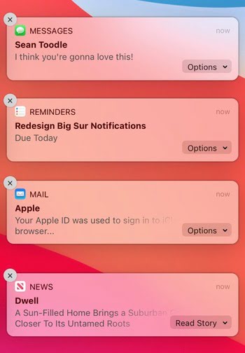
The solution to this is rather simple: pull the actions out of the little “Options” menu and instead place them on the notifications itself. Some will argue against this implementation that it may result in messy notifications.
However, a simple look at a concept designed by Redditor u/rovenroy will change your mind:
As you can clearly see in the current implementation on the left, having an “Options” menu does leave out plenty of space on its left – space that can be put to good use – as it has been on the re-design to the right.
Another thing that can be improved here is the close (X) button that is annoyingly tiny to reach. Really small design changes, we know, but could make a huge difference when it comes to convenience.
Needless to say, it is totally up to Apple to change the way the notifications work. It shouldn’t be too great a task though. After all, how hard can a tiny design tweak like this possibly be?
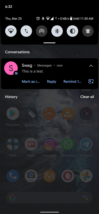
Even Android has had a notification design for years similar to the Big Sur notification actions demonstrated by the concept.
Anyway, for now, your best bet to make your voice heard would be to give out feedback through Apple’s official macOS feedback page. Perhaps if enough requests go in, Apple may consider it all with the next major macOS update.
PiunikaWeb started purely as an investigative tech journalism website with a main focus on ‘breaking’ or ‘exclusive’ news. In no time, our stories got picked up by the likes of Forbes, Fox News, Gizmodo, TechCrunch, Engadget, The Verge, MacRumors, and many others. Want to know more about us? Head here.

We stand out from the tech-media crowd because we break news stories; we mainly bring you stuff that you won’t find anywhere in the mainstream tech media. Our stories have been picked up by some of the world’s most popular websites and media outlets—more info is available here.

Zohaib Ahmed
824 Posts
Simply love being surrounded by technology as it's a constant reminder of how far humans have advanced as a race. Every new development feels exciting, which I convey to others through writing. And after a day's work, gaming just feels therapeutic.
Next article View Article
[Up: NewTumbl shut down] Is Tumblr shutting down? No. But there’s exodus and Newgrounds is gaining from it
NOTE: For all latest, breaking news related to Tumblr adult content ban as well as its alternatives, head here.
So it's been nearly a week since Tumblr started experiencing...
Jun 13, 2023 4 Min Read