There’s nothing wrong saying the search engine giant Google believes in experimenting with new features, as well as tweaking the existing ones to enhance user experience. The Mountain-View, California-based company does that quiet often irrespective of their services in question.
One such effort was made by the company in the later half of May, where they revamped the layout of Google Search on mobile devices. With the new design, the name of the website and its icon appear right above the results card, unlike earlier, where it showed underneath the title without any icon.

In addition, as can be seen in the image above, on searching for a product it also displays bolder ad labels on top of the result cards alongside the web address. The redesign was meant for mobile devices only. However, the company may roll out the same to desktop as well, sometime later.
But as is usually the case with change, sometimes it’s appreciated, sometimes it’s not. And as far a we can see, a good number of users are not liking the new search results layout for displaying too many ads and videos. They say, with the new design, it has become difficult to find relevant results.
Take a look at what some users have to say about this:
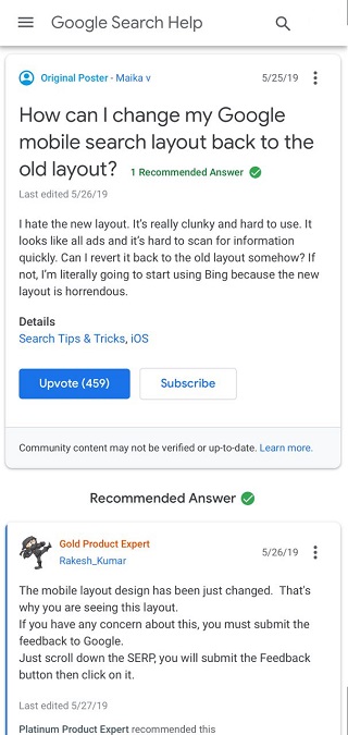
I hate the new layout. It’s really clunky and hard to use. It looks like all ads and it’s hard to scan for information quickly. Can I revert it back to the old layout somehow? If not, I’m literally going to start using Bing because the new layout is horrendous.
New update looks fucking awful! Difficult to view on a mobile device now. Each link area is larger resulting in more scrolling, the algorithm clearly is changed as I now don’t see what I’m trying to search for as top results… Insteads it’s irrelevant ads, videos, news or some other crap. Who on earth user tested this?! Revert back to the functioning layout.
And here’s how a couple of users word this on micro-blogging site Twitter:
https://twitter.com/prkrs/status/1133938137380663297
https://twitter.com/ivettecampos/status/1132756534000140288
Many users are looking for ways to switch back to the older layout and inquiring about it. But looks, there’s no way out other than using a different web browser. The proliferating user complaints even got a forums product expert involved, suggesting users to give feedback.
The mobile layout design has been just changed. That’s why you are seeing this layout.
If you have any concern about this, you must submit the feedback to Google.
So in case you are also not in for the new Google Search layout, there’s no option other than submitting a feedback, like may have already done. Sad, but that’s how it currently stands. What’s your opinion about this change? Drop a comment and share with us.
NOTE: For more bugs/issues, news and stories related to Google, interested readers may head here.
PiunikaWeb is a unique initiative that mainly focuses on investigative journalism. This means we do a lot of hard work to come up with news stories that are either ‘exclusive,’ ‘breaking,’ or ‘curated’ in nature. Perhaps that’s the reason our work has been picked by the likes of Forbes, Foxnews, Gizmodo, TechCrunch, Engadget, The Verge, Macrumors, and more. Do take a tour of our website to get a feel of our work. And if you like what we do, stay connected with us on Twitter (@PiunikaWeb) and other social media channels to receive timely updates on stories we publish.

Dr. Aparajita Sharma
1227 Posts
Currently, I am pursuing Ph.D (Psychology), and have been teaching the same for past four years. Coming to PiunikaWeb, I know it was a complete switch over, but the idea was appealing enough to put in all the effort it called for. My work primarily involves research. Oh, and yes, some of the photographs you see here are clicked by me. Overall, I am enjoying whatever I am doing, and hoping you’ll also feel the same reading all my articles. You can find me on LinkedIN.
Next article View Article