


![[Updated] Tumblr gets a facelift - new dashboard colors update where 'blue is darker, grays are lighter'](https://piunikaweb.com/wp-content/uploads/2019/01/tumblr-facelift-featured-new.png "[Updated] Tumblr gets a facelift - new dashboard colors update where 'blue is darker, grays are lighter'")
This is the kind of change that drives users nuts. They do it with zero input or warning, they only speak up after they've rolled out the change. It's also both subtle and noticeable, so like, it certainly made ME feel anxious, like am I hallucinating? What's different?
— SingsongRaptor on Bluesky(ze/zer/zers) (@SingsongRaptor) January 30, 2019
NOTE: For all latest, breaking news related to Tumblr adult content ban as well as its alternatives, head here.
There are new updates that have been added at the bottom of this story….
Nearly a couple of months after announcing a complete ban on adult content, Tumblr has made another major change. No, it’s not related to the content this time. Instead it’s about the look and feel of the platform.
In a staff post titled ‘Tumblr is getting a facelift‘, the company announced the switch to a new look is being done to stay inline with the Web Accessibility Initiative of the World Wide Web Consortium.
This is the initiative that sets standards for accessibility for people who may need assistance using the internet. It outlines steps to take and tools to use to create as seamless of an experience online as possible, whether you have auditory, visual, or neurological disabilities, are using a limited device, are on a slow connection with limited bandwidth, or…well, a whole bunch of other reasons
So what’s changed?
Well, Tumblr says the result of this weeks-long effort means inaccessible menus are now more accessible, poorly described elements have been fixed, and increased overall readability. Head here to learn more about these changes specifically.
The other major change is related to color contrast. Here’s how Tumblr explains it:
Part of making Tumblr more accessible involved upping the color contrast in our UI, most notably on the dashboard and everywhere else that familiar blue touches. The light grays and muted blues had a contrast ratio of 2.02:1. What does that mean? Bad. It was bad, and we needed to do better by people with visual impairments
The company shared an animated gif showing the new dashboard look. See that here.
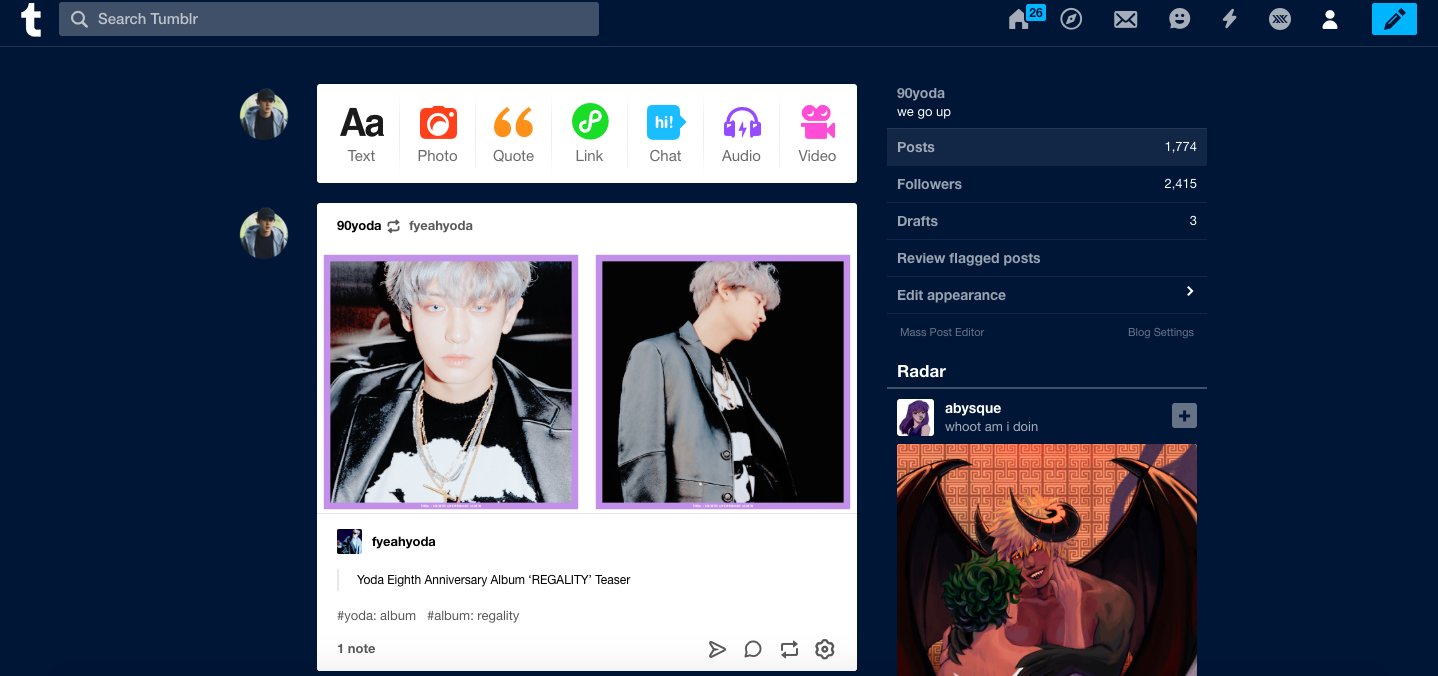
To give you a better idea, here’s a user shared look of their new dashboard (click/tap to view full size):
Commenting on the new look, Tumblr says:
The blue is darker, the grays are lighter, all the buttons and icons are brighter with our new brand colors, and it has a contrast ratio of 7.87:1 What does that mean? Good! Very good
The company, however, admits this new dashboard look negatively impacts the bluespace art that users have created for many years now. Sadly, Tumblr says there’s no workaround for that.
Seeing these older posts lose the utilization of the dashboard—something that made them so special and unique to just Tumblr—is certainly not a great feeling. There’s no way around that. We hope, however, that this change only means newer, more bluespace art will be created, and that this time around it will be easier for everyone to experience
This new update has started rolling out slowly, and should be available to all Tumblr users in days to come.
Are users happy with the facelift?
It’s too early to comment on that, as the official announcement itself is only a few hours old. Still, we tried to find some early reports from users and here’s what all we stumbled upon:
But like, they should have hired an accessibility consultant. They just need to stop half assing things for very bad attempts at being PC and hip or whatever their motivations are. This goes right with bad AI programming for the damn ban.
— SingsongRaptor on Bluesky(ze/zer/zers) (@SingsongRaptor) January 30, 2019
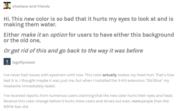
Terrible update, you can't look at your dash for more than a couple of seconds without getting a headache. Bless x-kit people for saving our eyes and sanity.
— trajektoria (@trajektoria1) January 30, 2019
It's the worst thing they have done, it makes my eyes hurt and gave me a headache when I logged on this morning.
— love__bucky (@love__bucky) January 30, 2019
https://twitter.com/__LONGLIVED/status/1090846181146677249
https://twitter.com/vratsavultures/status/1090720750800113664
https://twitter.com/fabfrnkie/status/1090683357581717505
Some like the change though:
https://twitter.com/spookysmores/status/1090762316239511552
Also, looks like Tumblr forgot this page before making the change:
Tumblr changed their background colour to dark blue for "accessibility".
— Iain P (@IPv2) January 30, 2019
Only they forgot about their GDPR consent page. Now illegible.
Yes, same Tumblr that filtered out its own "acceptable" example images.
And which put a GDPR HTML wall in front of RSS feeds.
Genius. pic.twitter.com/G6RHa1FhMH
Anyway, what do you think of this new update? Let us know in the comments section below.
How to revert to the old blue?
If you take a look at social media platforms, especially Twitter, you’ll see the number of those who aren’t happy with this color change is far higher than those who are happy with the new update. If you are among the former lot, you’ll be glad to know there’s a way to revert to the old blue layout.
It’s through Xkit.
https://twitter.com/endebende/status/1090729225181523968
https://twitter.com/AMess2k19/status/1090729422645313538
https://twitter.com/ratguzzler/status/1090843007673397248
https://twitter.com/anggeryccount/status/1090840989940346882
https://twitter.com/combusts/status/1090829609522872320
https://twitter.com/deborahgraces/status/1090827731733016576
In case you aren’t aware of xkit, you can learn more about it here.
Update 1 (February 01)
Check out our latest story related to this update. It’s titled “My eyes hurt” – New Tumblr UI update gets thumbs down from lot of users.
NOTE: PiunikaWeb has covered in detail the Tumblr adult content ban as well as the platform’s alternatives, check out all updates here.
PiunikaWeb is a unique initiative that mainly focuses on investigative journalism. This means we do a lot of hard work to come up with news stories that are either ‘exclusive,’ ‘breaking,’ or ‘curated’ in nature. Perhaps that’s the reason our work has been picked by the likes of Forbes, Foxnews, Gizmodo, TechCrunch, Engadget, The Verge, Macrumors, and more. Do take a tour of our website to get a feel of our work. And if you like what we do, stay connected with us on Twitter (@PiunikaWeb) and other social media channels to receive timely updates on stories we publish.

We stand out from the tech-media crowd because we break news stories; we mainly bring you stuff that you won’t find anywhere in the mainstream tech media. Our stories have been picked up by some of the world’s most popular websites and media outlets—more info is available here.

Himanshu Arora
368 Posts
My interest in technology and writing started back in 2010. Since then, I have written for many leading publications, including Computerworld, GSMArena, TechSpot, HowtoForge, LinuxJournal, and MakeTechEasier to name a few. Here at PiunikaWeb, I started with covering smartphone related breaking stories as well as some other interesting stuff, but now I have switched over to more of a leadership role. I also take care of several operational aspects of the website. Some of my current responsibilities include business development, and working with Piunika to make sure we’re progressing as envisioned. If you want to get in touch, I am active on LinkedIN, and also available on Twitter/X.
Next article View Article
Google Drive not letting users play videos, throws 'allowed playbacks has been exceeded' error
Google Drive users have been dealing with an issue for years where they get an 'allowed playbacks has been exceeded' error when trying to play videos. And Google has still...
Feb 20, 2024 2 Min Read